

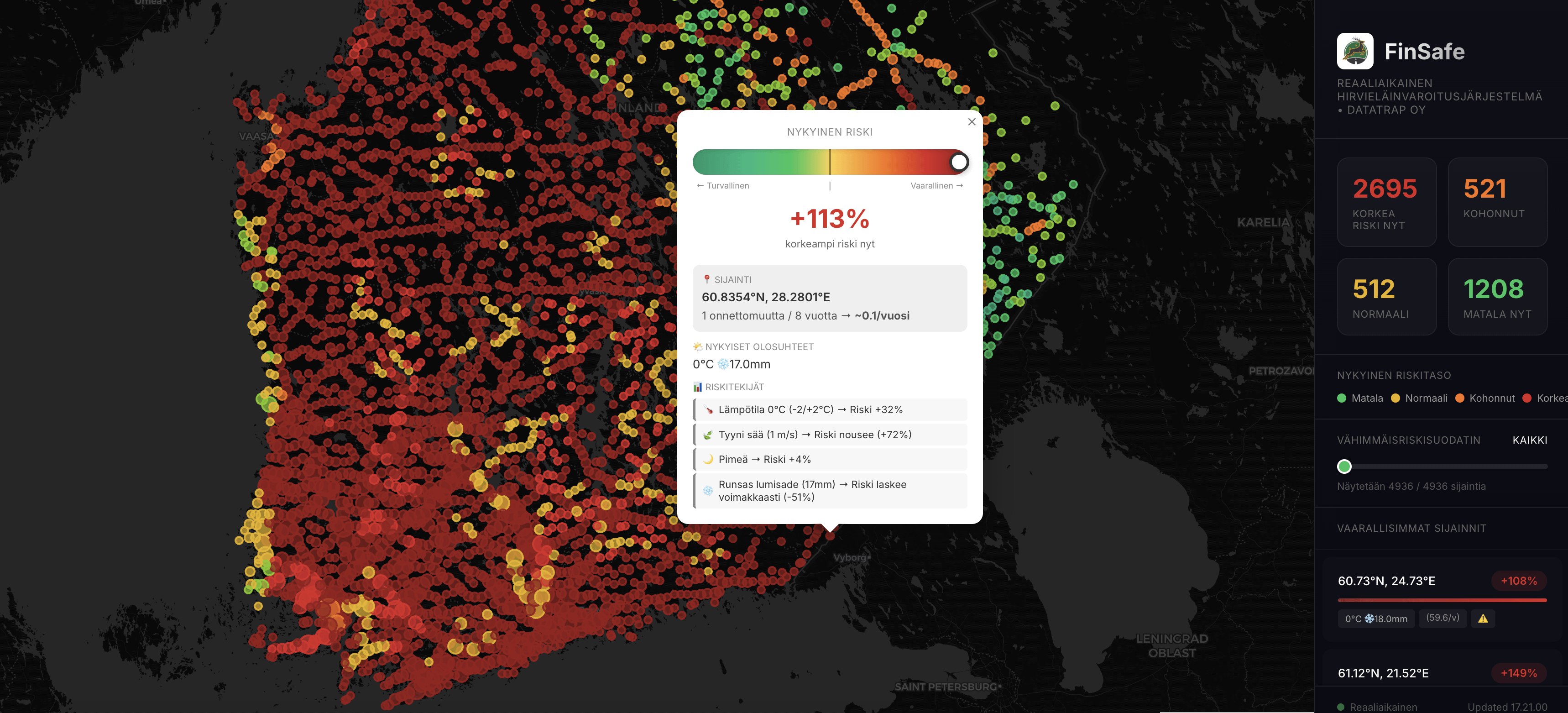
We analyzed 103,386 verified wildlife collisions in Finland and combined them with live weather, daylight simulation, and seasonal patterns.
The result is a real-time risk map that updates every 10 münutes and shows where wildlife-related accidents are most likely to occur right now — not just where they happened in the past.
Built in Riihimäki.
If people are interested, I can also share:
– a 24-hour risk simulation
– municipality-level dashboards
– or API access for research and pilots
https://i.redd.it/rfvlnmgafbeg1.png
Posted by orhangazikaramanoglu
13 Comments
Looks super fucking useful with 90% of roads being deepest red lol
No need to drive safely, every road is dangerous anyway.
This would be good. Or to have a route planner and tell when % where is high risk
https://preview.redd.it/g5g3qhy6ibeg1.jpeg?width=550&format=pjpg&auto=webp&s=ac4b389935200baec56249e8c1a00b9a936f0fbd
This is very interesting.
Question:
– does the data take in account the amount of traffic on the roads as well?
– what practical applications of the data is being seeked here? In other words, what is it for?
How can center of Helsinki is red while some middle of nowhere in Russian border is green? Do you consider those black suit people without reflectors are wildlife?
Basically it’s a traffic density map. If lots of cars, many accidents. What about my individual risk?
Does heavy snow really reduce the chance i.e. animals are moving around less, or does it affect e.g. traffic density instead? Maybe both?
Also, OP is clearly responding with an LLM. So probably this was 100% vibecoded as well and there are zero guarantees that it actually does anything worthwhile.
Have you normalized with drive count or km driven per accident
It’s kinda funny/coincidental that this morning I was thinking about exactly this concept and seeing it now on the sub
What if I want to ~~collide~~ avoid colliding with something else than deer? Description sounds like it doesn’t handle boars or badgers for example.
Quick clarification because this came up a lot:
This map is not saying “everything is dangerous”.
It highlights short segments where risk is unusually higher than normal at that moment.
The goal is fewer alerts, not more stress.

If I understand correctly, which probably is not true, you have modelled wildlife accidents on some sort of weather data and time of year? Then you predict how many wildlife accidents there should be now, given the model, using real time weather and date data? If this is correct, how do you then get the deviations towards baseline that you mentioned in a comment? My understanding is that the baseline is the result of the model and that does not make sense with the rest of what I just said.
Care to help med underatand?
On a quick glance, it looks like the map correlates highly with population density: can you actually read it where there are many animals moving, or does it just show where there are more cars, thereby increasing the danger of collision?