
")
Hey everyone,
I’m a developer based in Riihimäki, working on a small personal project around wildlife–vehicle collisions in Finland.
I shared an earlier version here, but it was removed — fair enough. The feedback itself was actually very useful, especially the point that “if everything is red, the map stops being meaningful.” You were right.
So I went back and fixed the real issue:
the colour thresholds, not the data.
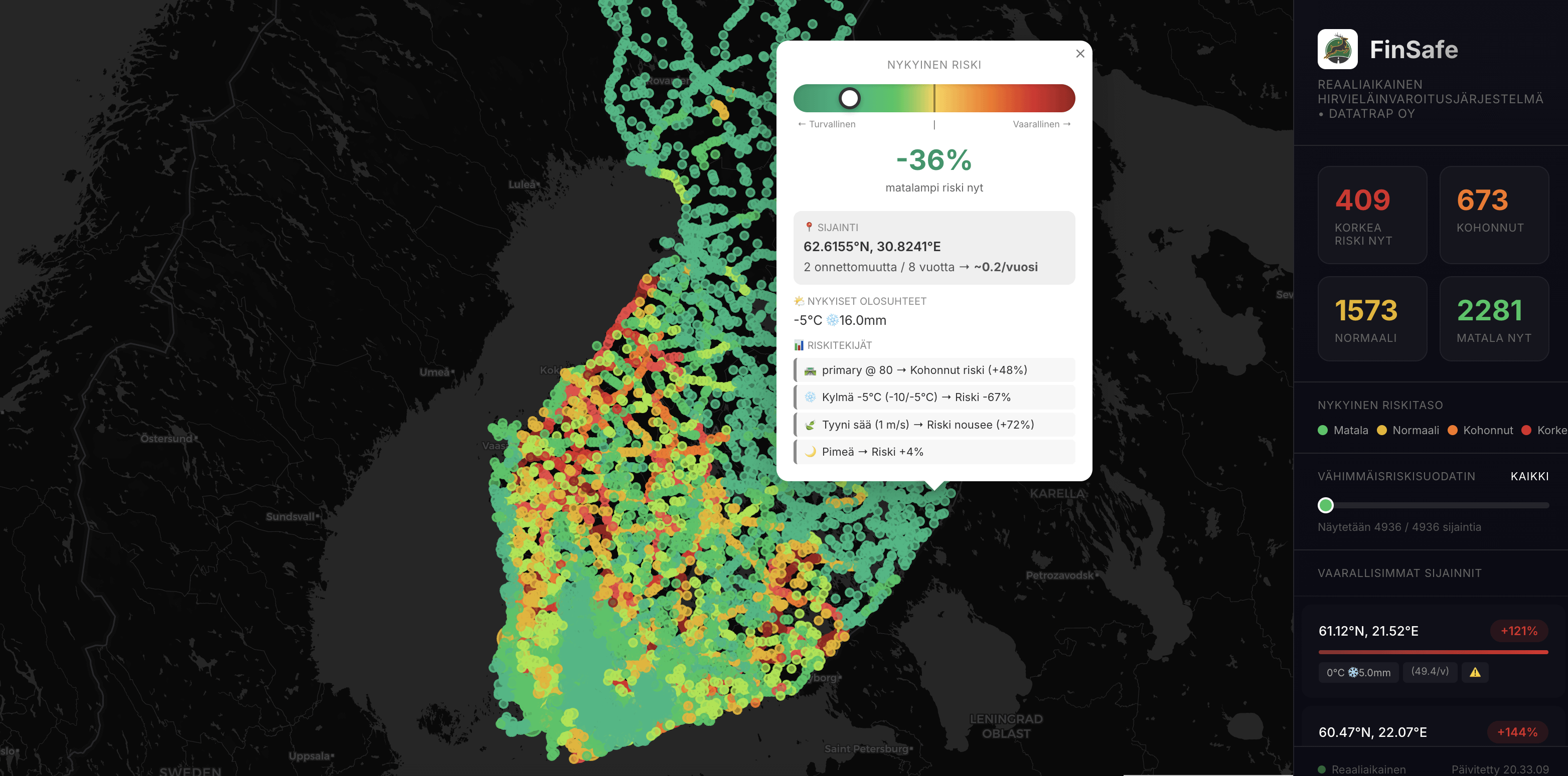
What this map is (and isn’t)
-This is not a prediction of individual accidents,
-It’s a risk deviation view, showing when conditions are unusually different from the long-term normal
-Most of the time, most places should look normal/green — that’s intentional
What changed since last time
-Reworked colour scale (winter ≠ emergency)
-Traffic-normalized accident data (not just “busy roads = red”)
-Live weather, daylight and snow conditions
-Short time windows (10-minute shifts) to show temporary spikes, not constant danger
The goal is not to scare anyone, but to highlight specific moments and road segments where paying extra attention might make sense.
I’m honestly just trying to make this readable and useful, not sell anything.
Does this version make more sense visually?
Or is a map still the wrong way to present this kind of information?
Appreciate any honest feedback critical included.
Thanks
https://i.redd.it/fwnft4s1qceg1.png
Posted by orhangazikaramanoglu
4 Comments
Why this needed a new post?
I didn’t read the previous post, but yeah this kind of color scale makes more sense where you can pick out meaningful risk spikes instead of everything being red.
If I interpret this correctly, you’re making predictions on where incidents are extra likely to happen at the moment. If that’s the case, then a very important aspect of this program would be to track how well your predictions have matched with real incidents as real data comes in. If you find meaningful correlation over time, this could be very valuable.
I’m red green blind and I find that difficult to read
Please let users adjust the color scheme themselves. For red-green colorblind people, this map is anywhere from hard to read to useless.