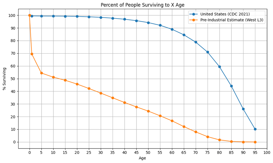
30% gone by their first birthday. That’s crazy to think of today.
Desperate_Ad_5563 on
So 67 is the new 95 now? With a dragging zero percent after age 85. That’s cool to see the visualization!
[deleted] on
[deleted]
sojuz151 on
Ild love to see a plot for percent survival but with middle ages graph scaled and 100% at 3 years.
otzitheicemann on
Very cool. Very grateful for hand-washing and vaccines
Away-Living5278 on
And we’ll get back there! Our current health secretary is working hard at it
Harlequin80 on
I’m really surprised it’s so linear in the pre industrial period once you get past infant mortality.
I would have thought you would see a significant increase in mortality around the median first child bearing age. My understanding is that 17th century England was seeing mother mortality rates of nearly 1.7% per birth.
mkosmo on
Well these charts (and the differences and rates of change) shatter the often-repeated notion that “average age was the same! just a lot more infant mortality!”
kelley8888 on
I know the point of this is the comparison, but is anyone else surprised that currently in the United States ~1 in 10 people don’t make it to 55yr old? I did not realize the total death rate reached 10% by 55
giordanopietrofiglio on
But at what cost? Children are banned from their highest form of self expression, mining and mineral extraction.
I have not read this book to find out what data the analysis is based on.
Anastariana on
I wonder what the blue curve would look like if you removed all the people who smoke, ate, or drank themselves to death. Would probably be a lot flatter for the most part then drop precipitously at the end.

15 Comments
30% gone by their first birthday. That’s crazy to think of today.
So 67 is the new 95 now? With a dragging zero percent after age 85. That’s cool to see the visualization!
[deleted]
Ild love to see a plot for percent survival but with middle ages graph scaled and 100% at 3 years.
Very cool. Very grateful for hand-washing and vaccines
And we’ll get back there! Our current health secretary is working hard at it
I’m really surprised it’s so linear in the pre industrial period once you get past infant mortality.
I would have thought you would see a significant increase in mortality around the median first child bearing age. My understanding is that 17th century England was seeing mother mortality rates of nearly 1.7% per birth.
Well these charts (and the differences and rates of change) shatter the often-repeated notion that “average age was the same! just a lot more infant mortality!”
I know the point of this is the comparison, but is anyone else surprised that currently in the United States ~1 in 10 people don’t make it to 55yr old? I did not realize the total death rate reached 10% by 55
But at what cost? Children are banned from their highest form of self expression, mining and mineral extraction.
OP failed to provide a link to a source: the legend hints that the historical model is from Coale and Demeney (1968?) https://www.google.com/books/edition/Regional_Model_Life_Tables_and_Stable_Po/7ESLBQAAQBAJ
I have not read this book to find out what data the analysis is based on.
I wonder what the blue curve would look like if you removed all the people who smoke, ate, or drank themselves to death. Would probably be a lot flatter for the most part then drop precipitously at the end.
Hank green has a really good video on this topic [https://www.youtube.com/watch?v=_AgIOKyYqls](https://www.youtube.com/watch?v=_AgIOKyYqls)
So this is a post about data. From a display point of view, why is there space below the zero line? You can’t have more than 100% die.
Crazy that we have more people making it to age 75 than they did to age 1.