

States are so boring. For the last few years, I have been dreaming of putting together a system that could forecast political attitudes at the local level using polling data. I have more free time now than I used to, so finally put the project together.
I know U.S. politics is let's say, oversaturated with polls and Donald Trump, but this is a question people care about so seemed like a good place to start.
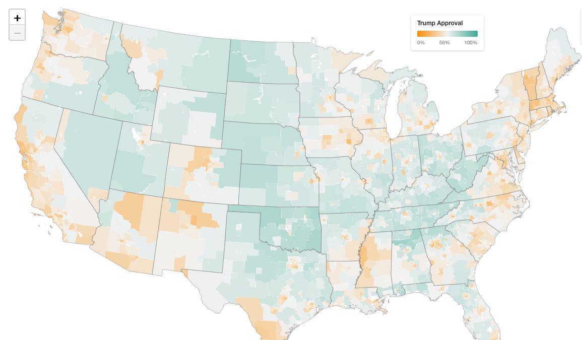
Posted by g_elliottmorris
22 Comments
So every county that no one lives in… Makes sense
Edit: of course people live there, but Nebraska is all corn fields, Nevada is all government lands, and no one lives in Wyoming.
/r/wherepeoplelive/
Every President’s approval rating drops after being elected. This isn’t showing anything.
So I should live in Vermont and avoid Oklahoma. That tracks.
Of all the states on here, I am most fascinated by South Carolina. That is some fascinating information. Visually, SC looks most like WA or NY, and that’s not the company I would expect (well, I’m not terribly surprised because I’m from there originally and the politics are much more nuanced than gerrymandering and outspokenness would suggest).
On topic: regarding formatting, I’m wondering if the intensity of red/orange might be skewing the perception of disapproval slightly.
Thank you so much. Truly beautiful.
Massachusetts remaining undefeated.
Why can’t I zoom in on that site?
These types of maps really need to remove federal lands. Keep the Native lands.
His approval rating should be lower than this, no
I thought his approval was trending towards 30% overall
I like the second cartogram map in the post vs the original map because it shows where the people are concentrated. First map makes it seem like most of US supports Trump because of the large swaths of land in the center of the US that are in fact very sparsely populated.
Since the interactive map isn’t laid out by county, how were the regions decided?
The orange obviously should have been Trump’s color.
the cartogram conveys it best I think (each dot is 100k people)
https://preview.redd.it/zrs7aexbsweg1.jpeg?width=1179&format=pjpg&auto=webp&s=bb34bd8f5dcb40a5dc37d3b8c087208e93303831
I found the table more interesting than the maps. It appears Trump’s low approval is across demographies except for his own voters, which itself is fairly concentrated demographically. Like, white non college voters tend to vote Republican, but approval is only 53%. I would like to see the totals. A lot of people tend to gaslight themselves when they disapprove the leadership, saying they didn’t vote or not remembering who they voted for
When will uneducated old men stop giving??
Do high school graduation rates next.
Florida is such a lost cause. Remember when it was a swing state? It’s fully R now
Population density map strikes again
The muted colors make it challenging to see the details. Is there a way to go with a more traditional blue/red/purple?
Sweet. Good focus areas for . . . help . . . during Reconstruction 2.0.
Colors could pop more. Pro-trump should *definitely be orange.
Otherwise, very nice map! State-level maps lose so much information.
Interesting that the cartogram map, which is more accurate and tells a different story than the standard, is placed second. The inaccurate map is first in the story, so that’s what’s showing up in the previews, but tells an entire different story than the accurate one.
The article writers should adjust it so the cartograph shows in the preview
West Virginia is incredible. Not even the urban effect of Charleston manages to bring Trump’s approval into negative territory, staying positive by a whisker at 51.1% (margin of error notwithstanding). From what I can see West Virginia is the only state where his net approval rating is positive in every single area. Even Wyoming has an area where it’s negative, Cheyenne’s Laramie County, where it’s 48.1%.