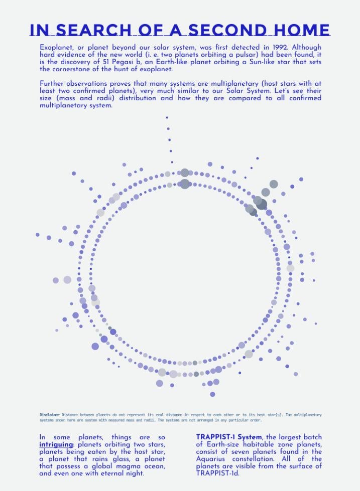
Share Facebook Twitter LinkedIn Pinterest Bluesky Threads [OC] Mass and radii of exoplanets in multiplanetary system Posted by adenurisqo
adenurisqo on January 23, 2026 10:18 am Data from [NASA Exoplanet Archive](https://exoplanetarchive.ipac.caltech.edu/) and processed in Tableau. Find the interactive version [here](https://public.tableau.com/views/InSearchofASecondHome/InSearchofASecondHome?:language=en-US&:sid=&:redirect=auth&:display_count=n&:origin=viz_share_link)
tilapios on January 23, 2026 10:26 am “DataIsBeautiful is for visualizations that effectively convey information” according to the !sidebar. With no color or size scale for the dots and no labeling of any sort of data axis, this visualization is conveying very little information.

2 Comments
Data from [NASA Exoplanet Archive](https://exoplanetarchive.ipac.caltech.edu/) and processed in Tableau. Find the interactive version [here](https://public.tableau.com/views/InSearchofASecondHome/InSearchofASecondHome?:language=en-US&:sid=&:redirect=auth&:display_count=n&:origin=viz_share_link)
“DataIsBeautiful is for visualizations that effectively convey information” according to the !sidebar. With no color or size scale for the dots and no labeling of any sort of data axis, this visualization is conveying very little information.