
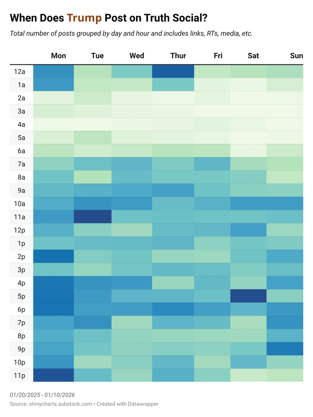
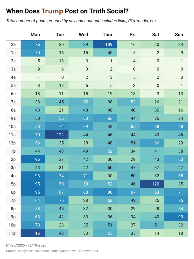
As part of an analysis on Trump's first year of his second term, I grouped all of his 6,606 Truth Social posts into days and hours (in EST: reasoning explained in a comment below). I thought it was an interesting visual with the heat map! I mostly used Rollcall's archive for the data and did lots of cleaning and analyzing in Python. The second image has the actual numbers for each hour of each day, but if you want to see the interactive version (I used Datawrapper for the viz), there's the link below, too. Let me know what you think of the data (not the actual content 😂).
ETA: For anyone that wants to see more of my analysis (and more charts), you can check out my completely free, no-need-to-subscribe, no-ads Substack post here. Just a heads up that it’s a bit of snark and politics, but the charts themselves are all based on the data. (And are almost all interactive Datawrapper charts.)
Posted by shinyro
19 Comments
Data: https://rollcall.com/factbase/trump/topic/social/?platform=all&sort=date&sort_order=desc&page=1
Interactive Chart from DataWrapper: https://www.datawrapper.de/_/awkdV/?v=2
You need to account for his current timezone
He posts so often, that this is more of a map of when he doesn’t post (2-5 am).
Is there any doubt about the concentration powers of a person who sends close to 20 public messages a day?
So he’s getting less than half the sleep a man his age needs.
O yeah. Dark blue. That’s a lot…
What should be my takeaway from this
[deleted]
We shouted into the void long enough that it never stops shouting back.
goddamn can we have one sub that isn’t all politics and trump all the time?
[deleted]
So he sleeps like four hours a night .
Usually he posts while he poops.
Which is an alarmingly high amount of posting………and shitting.
At least some of these have gotta be automated, or actually posted by a pr firm or something … right?
Or is this dude so coked out that he didn’t get a single full hour of sleep on that Thursday, and got a maximum of 2 hours per day??
You really need to put important info like the time zone in the image itself, not just in the description of the post.
One should also do a graph of truths that Trump posted. I imagine it would be a much smaller graph.
Saving for my daytrader schedule
When he’s not playing golf
I think he is not the only posting in his account