
![[OC] Affordability in European Cities (2026)](https://www.byteseu.com/wp-content/uploads/2026/01/udr6sj4v7yfg1-1494x1536.png "[OC] Affordability in European Cities (2026)")
This is a newer version of the previous post .
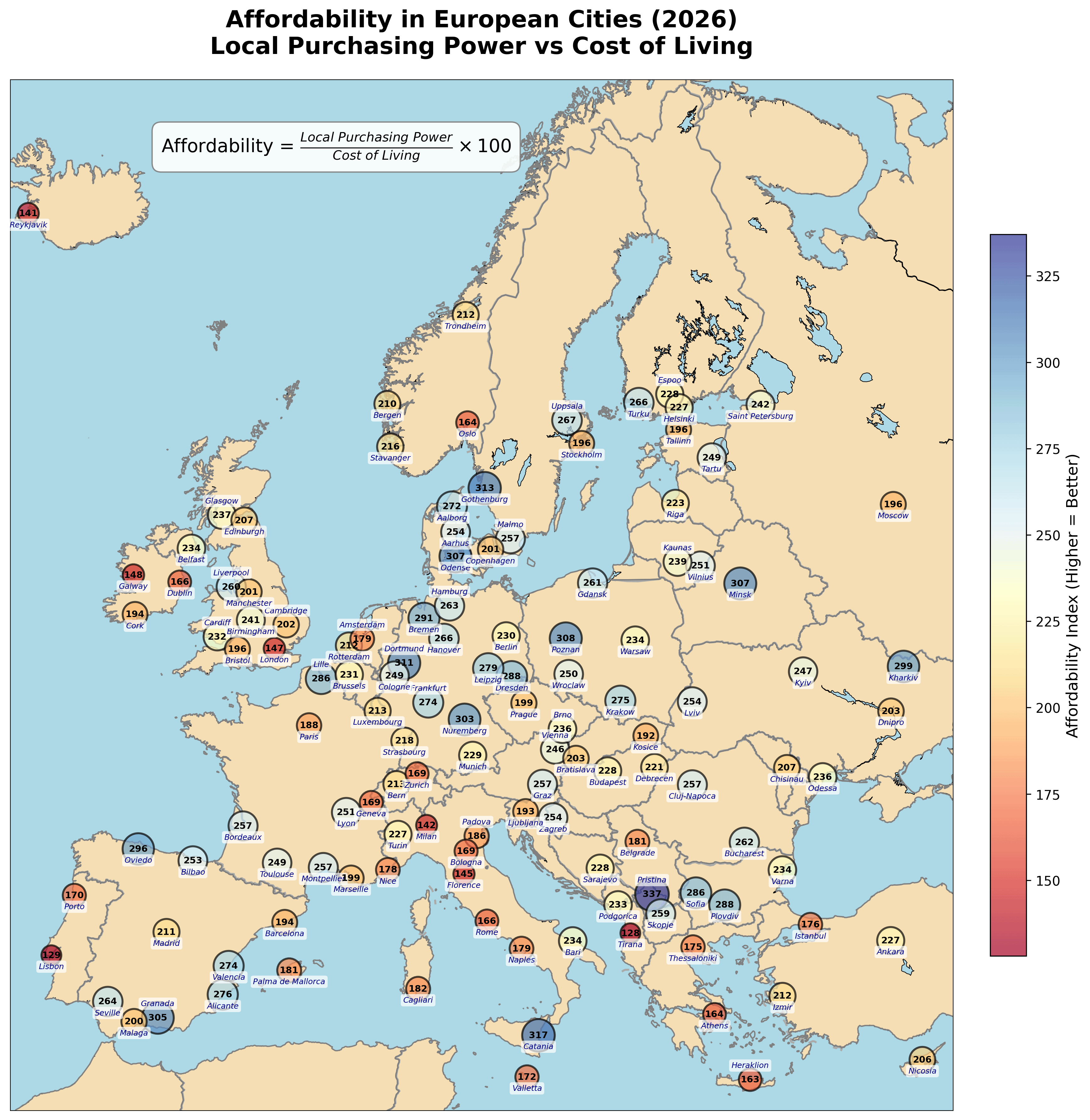
Data source: Numbeo
In the previous post, many people wanted to see the cost of living associated with local income.
So, I used the affordability index, which is just the ratio of local purchasing power to cost of living multiplied by 100.
For instance, Paris has an affordability index of 188, meaning that the average local income in Paris can cover 1.88 times the average daily expenses.
Lower values (reddish colors) indicate less affordable cities, higher values (bluish colors) indicate more affordable cities, with the average local income.
I expanded the list of cities while maintaining map readability. But some were not present in the data source.
Notice that some cities might have inflated or deflated numbers compared to your expectations. This might be due to a flaw in the data source or other conditions like low population for that city.
Posted by owlynx
11 Comments
Can you explain the choice of cities for some countries here? Cambridge is quite a small city
Would love to see an Affordability vs Population scatter plot
Wild how much of a difference 30 minutes across a bridge to Malmø does. And 70 minutes the other way to Odense, for that matter
Charkiv is mad affordable right now!! 😅
Numbeo is very unreliable.
and here i am considering moving to lisbon 🥴
Great info, decent resolution map too unlike a lot of recent posts.
Edit: Although I’d have not x100 as the explanation of ‘how many daily expenses the average income can afford’ makes a 1.5 or 2.5 easily relatable
That’s it; I’m moving to Prishtina!
What’s going on in Tirana?
Maybe I misunderstood, but what I understand from your link is that this “Cost of living” index does not include rent. I would love to see the same with the “Cost of living plus rent” index… I feel otherwise this map is not truly representing much, since rent is typically one of the main costs of living!
Stockholm being one of the least affordable and then going across to Gothenburg being one of the most affordable seems outright wrong. I have a really hard time the average salary in Gothenburg can cover 3x the average expenses