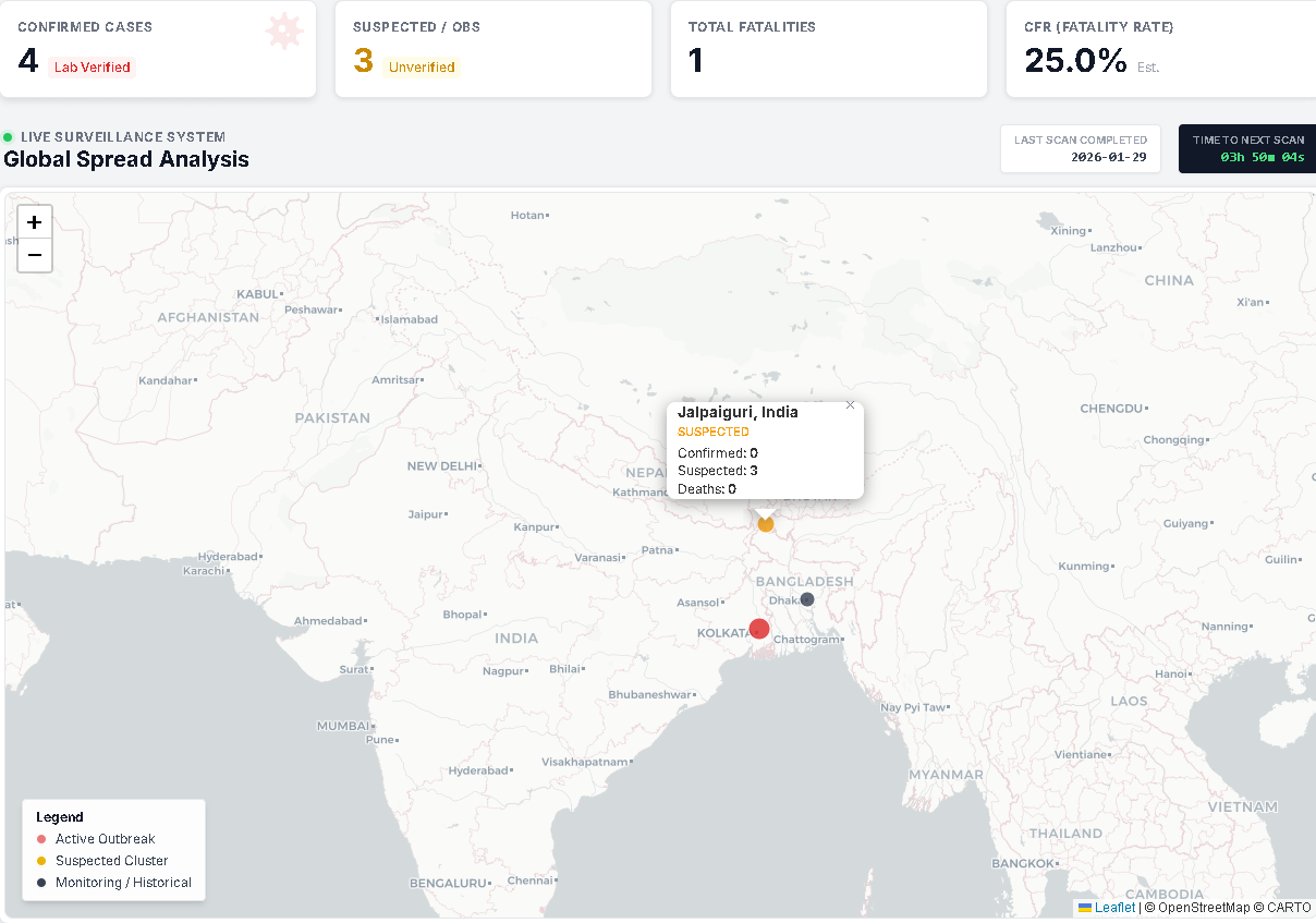
[OC] I built an automated tracker for the 2026 Nipah Virus outbreaks in South Asia. Here is the current spread.
Posted by Ok_Veterinarian446

![[OC] I built an automated tracker for the 2026 Nipah Virus outbreaks in South Asia. Here is the current spread.](https://www.byteseu.com/wp-content/uploads/2026/01/51ituxy03ggg1-1024x718.png "[OC] I built an automated tracker for the 2026 Nipah Virus outbreaks in South Asia. Here is the current spread.")
[OC] I built an automated tracker for the 2026 Nipah Virus outbreaks in South Asia. Here is the current spread.
Posted by Ok_Veterinarian446
2 Comments
Source: Aggregated reports from local Ministry of Health bulletins and WHO. Tool: Custom dashboard built with LeafletJS and Cloudflare Workers.
I built this because official data sources are currently lagging behind local news reports by 24-48 hours. This visualization separates ‘Confirmed’ (Red) from ‘Suspected’ (Orange) clusters to ensure accuracy.
Live version available here:[https://nipahwatch.com](https://nipahwatch.com)
Thanks for sharing.
Admittedly the news about this hasn’t reached me yet.
Out of curiosity, would you be willing to share sources, e.g. via GitHub? This looks like a nifty project that could be reused for other topics as well.