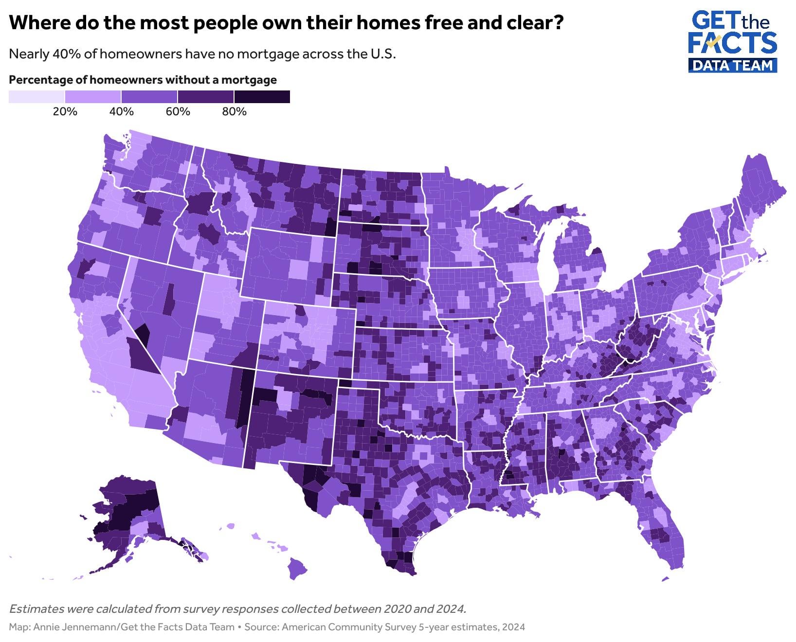
Hi everyone! This graph shows the % of people who own their homes, county by county. The data comes the American Community Survey estimates ending in 2024. Let me know if you have any questions about the graph!
*Source: American Community Survey, Visualization made with Datawrapper*
Mediocre-Tonight-458 on
I’m surprised by the relatively low rate of mortgage-free home ownership in California, given that one of the claimed effects of their Prop 13 restrictions on property tax increases has been to reduce turnover rates for existing homes.
marigolds6 on
This is a case where I really don’t like the scaling choice. Looks like there are zero counties under 20%, which basically wastes an entire classification. Meanwhile, 20-40% and 40-60% are huge ranges when the average is just under 40%. (Maybe a 7 color diverging scale leaving off under 20%?)
(Also, when you source is the ACS, you need to specify your geographic subunit, even if it looks fairly certain this is county/borough/parish.)
Bubblehead_81 on
I think it would be more informative to see this %owned vs home cost vs average income.
Tommyblockhead20 on
I’m surprised Ohio is lower considering it’s ~7th for lowest median housing cost to median income ratio. It’s up there with a lot of southern and western Midwest states, but looks more like a costal state on this map.
ExoticMushroom1016 on
I’ll just say it, the Native American reservations have the highest lack of mortgages.
PomeloPepper on
Upstate Alaska is looking pretty affordable!
eta: /s since it apparently wasn’t obvious enough
WashYourCerebellum on
HCL= mortgage; LCL = no mortgage
My take. Rural generational property transfer in LCL areas whether that be a rancher having it paid off or a multigenerational family living in their only asset. Second i recognize popular lcl second home or ‘homesteading’ (broadly defined) areas, where I’d expect more cash buyers and/or large down payments.
mp2146 on
This is essentially just a low resolution map of where people live.
Pilot_Enaki on
Look its anouther population map!
menictagrib on
A: In places no one wants to live in or move to.
Probably partially a result of the aging populace with young people going to rent in cities rather than buying a home there, even if it’s cheap.
IntergalacticPodcast on
People in my family are so close to paying off their home but don’t for tax purposes.
Purplekeyboard on
This looks like a reverse population map. Populated areas light, sparse areas dark.
BrettHullsBurner on
I’m not gonna lie, that is a way higher percentage than I would guess. I’m guessing the median age for those people is like 60+ years old. Unless there are a way higher percentage of trust fund type situations where the families are just ridiculously rich or have handed down a paid off home to their kids/grandkids.
BakeKnitCode on
My county has a pretty low rate, but I actually think that’s a good thing, because it’s indicative of there being a fair number of young homeowners here. In a lot of the US, the only people who can afford to own a home are people who bought their first home decades ago and have had time to pay off their mortgages.
necktiesnick on
I did not expect Ohio and Indiana to be like that but I guess if home prices are expensive due to higher population but salaries are lower due to avg cost of living in the area then that could explain it
turb0_encapsulator on
interesting that NYC is high compared to the suburbs and the rest of the northeast. I think families who own in the city never leave and pass the property down.
Wonderful-Ice7962 on
I find it weird that the poverty rate in each state and % of people who own their homes is almost inverse. What a wild world we live in.
Probably not correlated. Just odd.
Ometrist on
Is this just a reverse population density map
Confident-Mix1243 on
Should be corrected for age: homeowners are much older than average.
EVOSexyBeast on
This pretty clearly shows that the problem is land prices. Land is unaffordable near cities due to policy failures. The homes themselves are cheap as evidenced by the fact that people in these areas can afford to own their home despite lower wages.

![[OC] Percent of people who own their homes across U.S](https://www.byteseu.com/wp-content/uploads/2026/02/t55yg1xkwphg1-1536x1239.jpeg "[OC] Percent of people who own their homes across U.S")
21 Comments
Hi everyone! This graph shows the % of people who own their homes, county by county. The data comes the American Community Survey estimates ending in 2024. Let me know if you have any questions about the graph!
[And if you want to see other graphs about mortgage rates and trends in the U.S, you can find that here! ](https://www.wbaltv.com/article/mortgage-free-homeowners-map-census/70188576)
*Source: American Community Survey, Visualization made with Datawrapper*
I’m surprised by the relatively low rate of mortgage-free home ownership in California, given that one of the claimed effects of their Prop 13 restrictions on property tax increases has been to reduce turnover rates for existing homes.
This is a case where I really don’t like the scaling choice. Looks like there are zero counties under 20%, which basically wastes an entire classification. Meanwhile, 20-40% and 40-60% are huge ranges when the average is just under 40%. (Maybe a 7 color diverging scale leaving off under 20%?)
(Also, when you source is the ACS, you need to specify your geographic subunit, even if it looks fairly certain this is county/borough/parish.)
I think it would be more informative to see this %owned vs home cost vs average income.
I’m surprised Ohio is lower considering it’s ~7th for lowest median housing cost to median income ratio. It’s up there with a lot of southern and western Midwest states, but looks more like a costal state on this map.
I’ll just say it, the Native American reservations have the highest lack of mortgages.
Upstate Alaska is looking pretty affordable!
eta: /s since it apparently wasn’t obvious enough
HCL= mortgage; LCL = no mortgage
My take. Rural generational property transfer in LCL areas whether that be a rancher having it paid off or a multigenerational family living in their only asset. Second i recognize popular lcl second home or ‘homesteading’ (broadly defined) areas, where I’d expect more cash buyers and/or large down payments.
This is essentially just a low resolution map of where people live.
Look its anouther population map!
A: In places no one wants to live in or move to.
Probably partially a result of the aging populace with young people going to rent in cities rather than buying a home there, even if it’s cheap.
People in my family are so close to paying off their home but don’t for tax purposes.
This looks like a reverse population map. Populated areas light, sparse areas dark.
I’m not gonna lie, that is a way higher percentage than I would guess. I’m guessing the median age for those people is like 60+ years old. Unless there are a way higher percentage of trust fund type situations where the families are just ridiculously rich or have handed down a paid off home to their kids/grandkids.
My county has a pretty low rate, but I actually think that’s a good thing, because it’s indicative of there being a fair number of young homeowners here. In a lot of the US, the only people who can afford to own a home are people who bought their first home decades ago and have had time to pay off their mortgages.
I did not expect Ohio and Indiana to be like that but I guess if home prices are expensive due to higher population but salaries are lower due to avg cost of living in the area then that could explain it
interesting that NYC is high compared to the suburbs and the rest of the northeast. I think families who own in the city never leave and pass the property down.
I find it weird that the poverty rate in each state and % of people who own their homes is almost inverse. What a wild world we live in.
Probably not correlated. Just odd.
Is this just a reverse population density map
Should be corrected for age: homeowners are much older than average.
This pretty clearly shows that the problem is land prices. Land is unaffordable near cities due to policy failures. The homes themselves are cheap as evidenced by the fact that people in these areas can afford to own their home despite lower wages.