
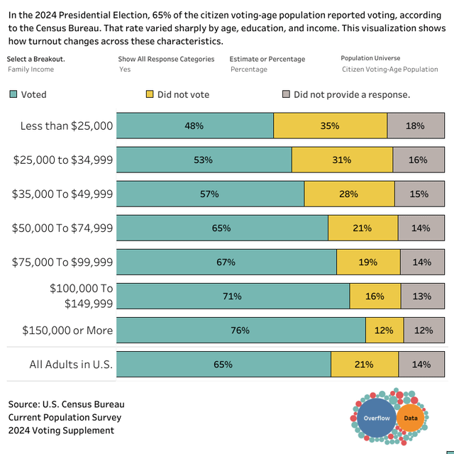
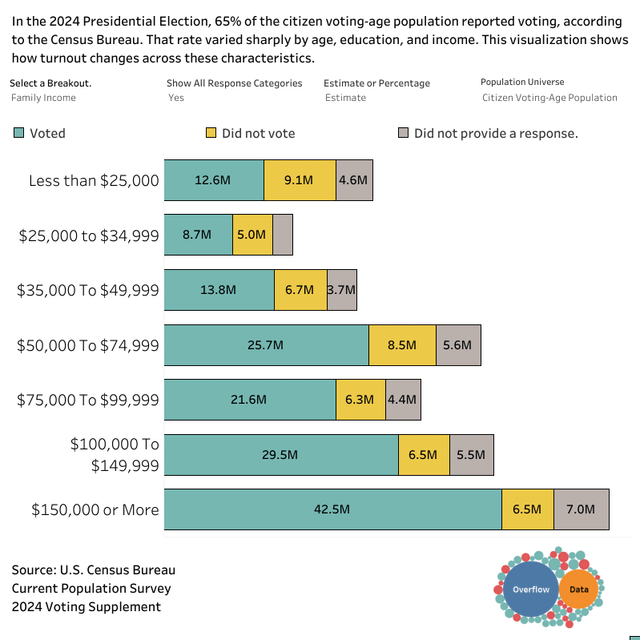
Using U.S. Census Bureau Current Population Survey 2024 Voting Supplement microdata, I visualized self-reported voting by family income. Bars show counts and percentages for “voted,” “did not vote,” and “no response,” among the citizen voting-age population.
Key takeaway: turnout increases steadily with income, from 48% in households under $25k to 76% at $150k+, compared with 65% overall.
Source: CPS 2024 Voting Supplement
Tool: Tableau
If you are interested in this type of data, there is an interactive version the visualization.
Posted by OverflowDs
17 Comments
Source: CPS 2024 Voting Supplement
Tool: Tableau
If you are interested in this type of data, there is an interactive version the [visualization](https://overflowdata.com/liberty/breaking-down-voter-turnout-in-the-2024-presidential-election/).
id be curious how that changes if voting was a day off
a lot of low income jobs cant take a teus off
That’s really a shame that as income decreases, likelihood to vote decreases. Are there ways to boost turnout in lower income thresholds?
Could this data be stratified against confounds. For example, it would be interesting to see if people of the same education level but making different salaries make the same or different decisions on voting. Or people of the same age but different income etc. The story of “poor people can’t vote” definitely has merit but need to adjust against other factors.
Nice charts!
Voting needs to be a paid holiday and I’m fucking sick of pretending it shouldn’t. Also yes mail-in voting needs to be normalized.
I love that I can tell when a viz is made in Tableau just from the text lol
$150k household income is lower middle class or lower class depending on family size. Would be interesting to see the brackets continue upward
Edit: should have specified regionally. I live in SF Bay area
I did skip over that you put it in your comment, and image says in top, this is “Family Income”.
I was trying to gauge if family, and so multiple people income, which 1 person bringing in 100+, that one is stay at home, shifting the voting pattern. While a family with a total lower, would struggle to arrange the time with kids and both couples or parents working.
and the source allows to look, doing Household Size, voted goes from 71% (61m) with 2 person household down to 63% with 3 (27.5m) and 4 (23.9m) people. Interesting.
It would be interesting the cross over of house holds with 3+ people and family income
There are 56 million people with a HHI above 150k?
Poor people also have a much more difficult time getting ID, getting time off to vote, and getting transportation to vote.
Older people vote and young people are poor. I feel like age breakdown with the same setup would make a good 3rd panel if possible.
is there any analysis on which side each income group voted?
I’d wonder when you hit diminishing returns (or reversal) on household income increasing voting turnout. 150K household income may be well off in some places, not so well off in others, so it feels like a low bracket to end this analysis at. Curious if the clear “upper classes” care about national politics as much as we think they do.
Results don’t surprise me at all. The rich new they were going to get richer off the stupidity of the poor.
There’s an inverse relationship between wealth or income and cynicism about participation in politics. Among the poor it is more common to think that politicians are big on promises to the working class, but really only care about serving their wealthy donors.
They didn’t ask me, or anyone I know, so I know this poll isn’t accurate.
Sadly, it should be the opposite