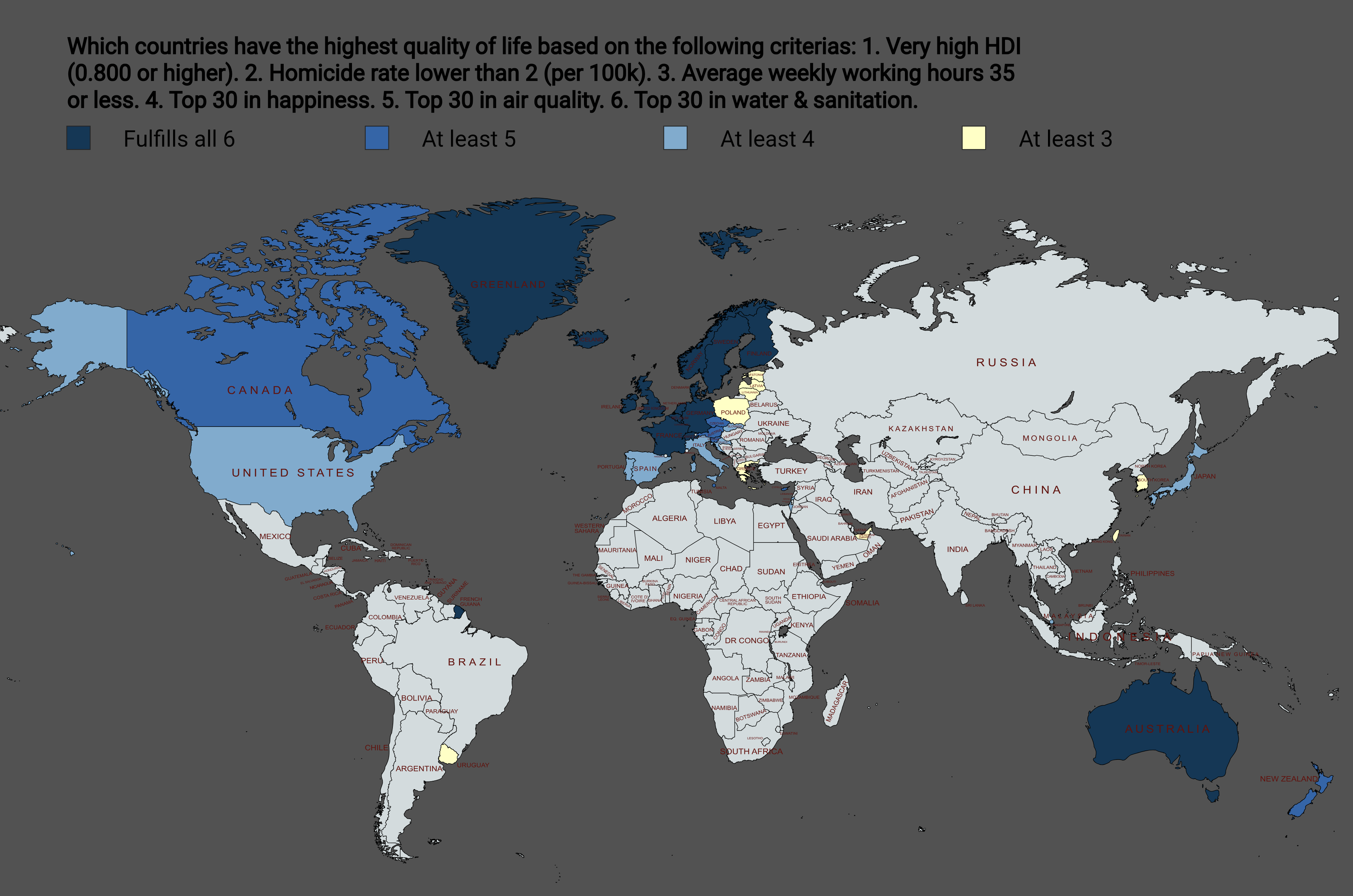
Trump wants Greenland to transfer some of that dark blue to the US.
poolgoso1594 on
Are South America, Africa and Asia greyed out or is that some other color that is not present in the legend?
woodzopwns on
In what world is the average weekly working hours for the UK 35? 37.5 is considered good, 40 is more common if you’re including unpaid lunch. Am I missing out?
akurgo on
They should include “Winter duration shorter than 7 months”.
curiouscomp30 on
Can you
Put this into words? Hard to see some of the dark blue map area for smaller countries
nailbunny2000 on
Having lived in Canada and the UK there is no fucking way it’s a higher quality of living in the UK.
komstock on
>very high HDI
HDI is about as sus as the ‘basket of goods’ we use to judge poverty, but ok.
>low homicide rate
valid metric if reported
>average weekly working hours under 35
“things just appear out of nowhere magically” tier thinking does not lead to prosperity. someone must do something at the end of the day
>top 30 in happiness
lol where’s the DPRK on this one. easily distortable
>top 30 air quality
valid metric if reported
>top 30 in water and sanititation
valid metric if reported
this is about ~30% shitty USA bad agendapost data minimum. not good data, not beautiful
Qurdlo on
So over half the map is white and that isn’t even on the color scale?
Haunting_Meal296 on
The country I know from experience has a high quality of life in the real sense of the word it’s not even depicted in this map lol
French Guiana is a surprising one to see dark blue, can anyone attest?
Emevete on
Of course Chile it’s the same than Chad.. Dumb map..
Eazy-Eid on
This map is kind of silly. For example, homicide rate may not affect your QoL at all if it’s in one really bad neighborhood in a big city nowhere near you.
KlM-J0NG-UN on
Iceland works the most hours in Europe on average I think
Atarosek on
what are stats for poland?
No_Error_4835 on
Self masturbatory dellusions
Blolbly on
I don’t really think “being in the top 30” is a good metric to use for this, because what if there was a hypothetical future in which all countries had near perfect scores in those metrics? It would basically come down to luck in order to get from 3/6 to 6/6
Flag11234567890 on
You obviously haven’t lived in California and it reeks of
angry_demon on
low population increases quality if life.
fkid123 on
And yet Thailand is full of Nordic, Aussies, Brits, Germans and French who would rather lose an arm than go back to their countries.
najumobi on
What the hell? How useful is this, when so much of the world isn’t shaded in?
EDIT: It didn’t even shade in a single country on the continent of Africa.
MugiwarraD on
have u tried getting healthcare in some of these countries? takes months in some cases
Careless-Nose413 on
So thats why Trump wants Greenland!
goldmanstocks on
I can almost guarantee Canada would have all 6, if it weren’t for the higher homicide rate being next to the US.
robodan918 on
they should include actual self-reported happiness
UK scores dead last
notataco007 on
Holy shit this is arbitrary. First of all those other factors already contribute to HDI, so it’s just double counting. Why 2 for murder rate? Why not 1.5 or 3? Why just murder rate? Why not crime rate? Way way more people experience crime than murder. You don’t think disposable income contributes to QOL? Why not retirement age?

![[OC] Which countries have the highest quality of life?](https://www.byteseu.com/wp-content/uploads/2026/02/e8s3fywd04ig1-1536x1018.png "[OC] Which countries have the highest quality of life?")
27 Comments
Trump wants Greenland to transfer some of that dark blue to the US.
Are South America, Africa and Asia greyed out or is that some other color that is not present in the legend?
In what world is the average weekly working hours for the UK 35? 37.5 is considered good, 40 is more common if you’re including unpaid lunch. Am I missing out?
They should include “Winter duration shorter than 7 months”.
Can you
Put this into words? Hard to see some of the dark blue map area for smaller countries
Having lived in Canada and the UK there is no fucking way it’s a higher quality of living in the UK.
>very high HDI
HDI is about as sus as the ‘basket of goods’ we use to judge poverty, but ok.
>low homicide rate
valid metric if reported
>average weekly working hours under 35
“things just appear out of nowhere magically” tier thinking does not lead to prosperity. someone must do something at the end of the day
>top 30 in happiness
lol where’s the DPRK on this one. easily distortable
>top 30 air quality
valid metric if reported
>top 30 in water and sanititation
valid metric if reported
this is about ~30% shitty USA bad agendapost data minimum. not good data, not beautiful
So over half the map is white and that isn’t even on the color scale?
The country I know from experience has a high quality of life in the real sense of the word it’s not even depicted in this map lol
Sources: [HDI](https://hdr.undp.org/data-center/country-insights#/ranks)
[Homicide Rate ](https://en.wikipedia.org/wiki/List_of_countries_by_intentional_homicide_rate)
[Average work hours](https://worldpopulationreview.com/country-rankings/average-work-week-by-country)
[Happiness ](https://worldpopulationreview.com/country-rankings/happiest-countries-in-the-world)
[Air Quality ](https://epi.yale.edu/measure/2024/AIR)
[Water & Sanitation](https://epi.yale.edu/measure/2024/H2O)
Tools: [MapChart ](https://www.mapchart.net/)
North-atlantic-centric stats
French Guiana is a surprising one to see dark blue, can anyone attest?
Of course Chile it’s the same than Chad.. Dumb map..
This map is kind of silly. For example, homicide rate may not affect your QoL at all if it’s in one really bad neighborhood in a big city nowhere near you.
Iceland works the most hours in Europe on average I think
what are stats for poland?
Self masturbatory dellusions
I don’t really think “being in the top 30” is a good metric to use for this, because what if there was a hypothetical future in which all countries had near perfect scores in those metrics? It would basically come down to luck in order to get from 3/6 to 6/6
You obviously haven’t lived in California and it reeks of
low population increases quality if life.
And yet Thailand is full of Nordic, Aussies, Brits, Germans and French who would rather lose an arm than go back to their countries.
What the hell? How useful is this, when so much of the world isn’t shaded in?
EDIT: It didn’t even shade in a single country on the continent of Africa.
have u tried getting healthcare in some of these countries? takes months in some cases
So thats why Trump wants Greenland!
I can almost guarantee Canada would have all 6, if it weren’t for the higher homicide rate being next to the US.
they should include actual self-reported happiness
UK scores dead last
Holy shit this is arbitrary. First of all those other factors already contribute to HDI, so it’s just double counting. Why 2 for murder rate? Why not 1.5 or 3? Why just murder rate? Why not crime rate? Way way more people experience crime than murder. You don’t think disposable income contributes to QOL? Why not retirement age?