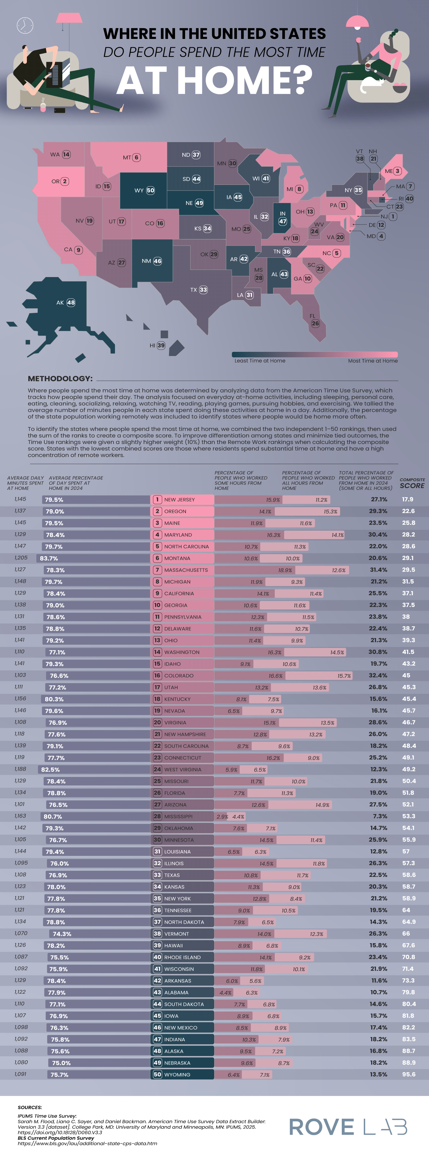
[OC] The 50 states ranked by where people spend the most time at home, based on the percentage of the population that works from home and the average daily minutes spent doing everyday at-home activities.
Posted by Rove_Lab

![[OC] The 50 states ranked by where people spend the most time at home, based on the percentage of the population that works from home and the average daily minutes spent doing everyday at-home activities.](https://www.byteseu.com/wp-content/uploads/2026/02/jnyyi03r8jig1-570x1536.png "[OC] The 50 states ranked by where people spend the most time at home, based on the percentage of the population that works from home and the average daily minutes spent doing everyday at-home activities.")
[OC] The 50 states ranked by where people spend the most time at home, based on the percentage of the population that works from home and the average daily minutes spent doing everyday at-home activities.
Posted by Rove_Lab
4 Comments
The tools used to create this data visualization were Adobe Illustrator and InDesign. The data source for the work from home percentages is the [BLS Current Population Survey](https://www.bls.gov/lau/additional-state-cps-data.htm), and the data source for the daily minutes spent at home is the [IPUMS Time Use Survey](https://timeuse.ipums.org/). The article with more information from our analysis can be found [here](https://rovelab.com/blogs/news/where-in-the-united-states-do-people-spend-the-most-time-at-home).
How the heck is Alaska one of the lowest? Isn’t it supposed to have only two seasons, polar bears and mosquitos?
Can you explain this dataviz to me? The format looks nice, but I don’t understand the composite score/rankings and can’t make any meaningful conclusions based on them.
Just could of said that people stay home where its super cold and super hot.