Ha well done, I thought it was real at first but I couldn’t put my finger on why the font looked a bit off.
Amazing work.
jaqk- on
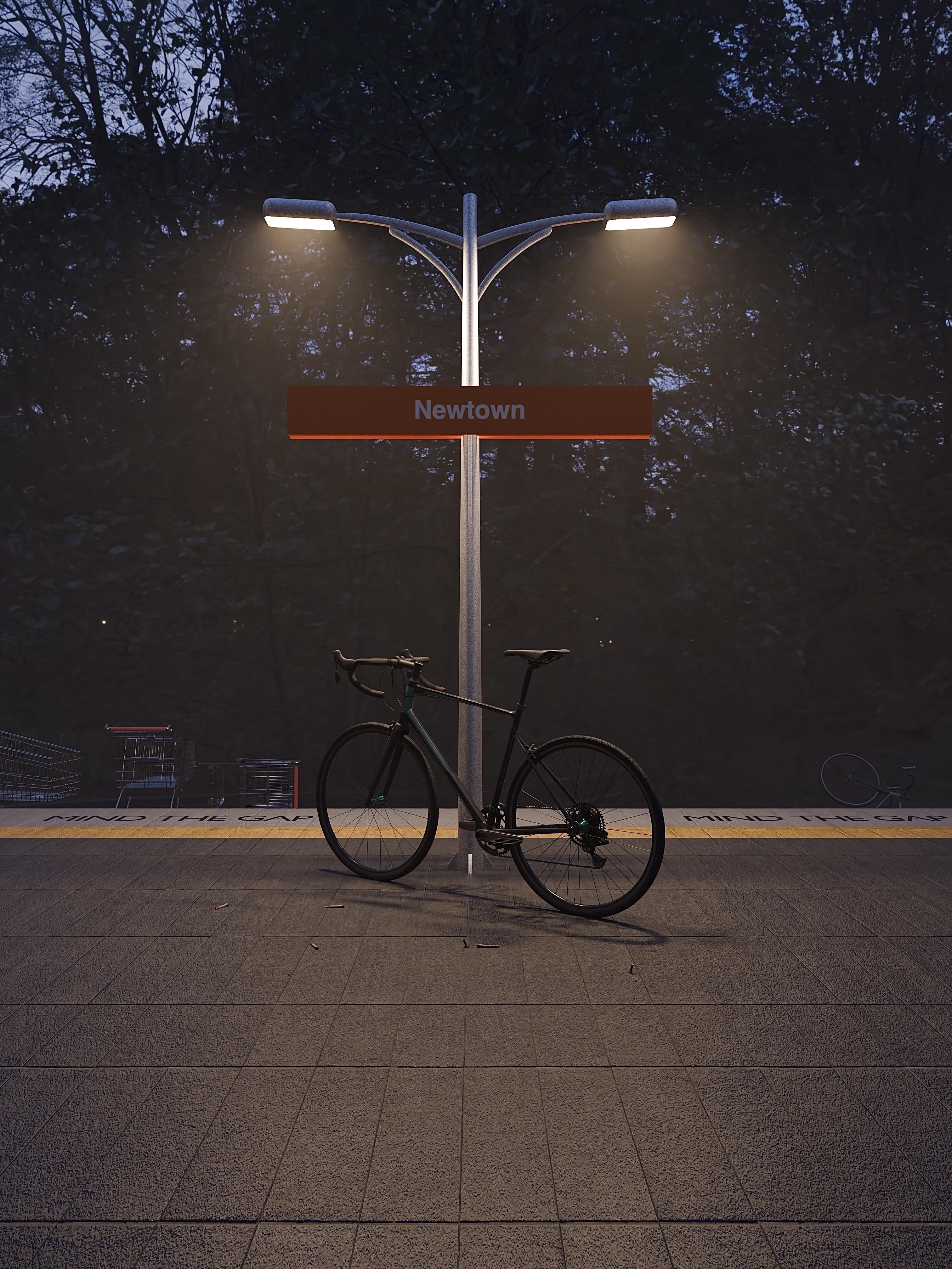
Very nice. The trollies especially are a nice touch
redstarpirate on
The half finished ciggie butts are a great touch!
ConanTheAquarian on
Needs more rubbish and a puddle of something questionable.
lIlIlIlIlIlIlIlIl_ on
This makes me feel the same way I feel when I see Hiroshi Nagai’s pieces for some reason – maybe because it’s just so close to home. Really cool!
kit_kaboodles on
The trollies kill me! So accurate
AndySemantic2 on
One question and I hope it doesn’t come off as a criticism of this lovely bit of work – why is the bottom of the sign uplit?
lilbittarazledazle on
Nice work mate, love the ciggy butts haha
You’ve inspired me to get back into C4D, cheers!
ID_Concealed on
To add some more organic shapes to the bike you could lean it slightly more and most bikes lent against a pole the front wheels are not aligned to the back wheels.
Anyways very good job 👏
Love it!
RedDeer505 on
Needs slight dip in concrete before the yellow line!
drfrogsplat on
Very impressive. And love the ideas of bushland at Newtown station.
If you don’t mind some nit picking – something’s not quite right with how the sign is mounted to the pole, and how the pole mounts to the ground (Sydney trains have a long history of shitty over-engineered, chunky concrete and big bolts!).
AdministrativeIce696 on
Not realistic. The bike still has both wheels.
WagsPup on
Awesome love it now make a nth beaches one with some teenage grommmet ratbags on those stupid motorbike looking fat tired e-bikes sticking their fingers up at the camera haha 😄
quietgavin5 on
Where is the hipster with his shoulder bag and ironic shirt that hasn’t been washed in two weeks?
Do better
Archon-Toten on
Way too clean to be Newtown and that bicycle has two too many wheels. The background should either the the old tram sheds or the other 5 tracks.

")
16 Comments
Ha well done, I thought it was real at first but I couldn’t put my finger on why the font looked a bit off.
Amazing work.
Very nice. The trollies especially are a nice touch
The half finished ciggie butts are a great touch!
Needs more rubbish and a puddle of something questionable.
This makes me feel the same way I feel when I see Hiroshi Nagai’s pieces for some reason – maybe because it’s just so close to home. Really cool!
The trollies kill me! So accurate
One question and I hope it doesn’t come off as a criticism of this lovely bit of work – why is the bottom of the sign uplit?
Nice work mate, love the ciggy butts haha
You’ve inspired me to get back into C4D, cheers!
To add some more organic shapes to the bike you could lean it slightly more and most bikes lent against a pole the front wheels are not aligned to the back wheels.
Anyways very good job 👏
Love it!
Needs slight dip in concrete before the yellow line!
Very impressive. And love the ideas of bushland at Newtown station.
If you don’t mind some nit picking – something’s not quite right with how the sign is mounted to the pole, and how the pole mounts to the ground (Sydney trains have a long history of shitty over-engineered, chunky concrete and big bolts!).
Not realistic. The bike still has both wheels.
Awesome love it now make a nth beaches one with some teenage grommmet ratbags on those stupid motorbike looking fat tired e-bikes sticking their fingers up at the camera haha 😄
Where is the hipster with his shoulder bag and ironic shirt that hasn’t been washed in two weeks?
Do better
Way too clean to be Newtown and that bicycle has two too many wheels. The background should either the the old tram sheds or the other 5 tracks.
Pretty cool though.
Now make one in Grindr.