
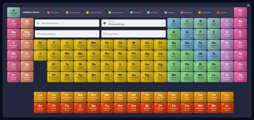
![[OC] Been lowkey obsessed w/ the Periodic Table of Elements since I was a kid, so I created an interactive Web version](https://www.byteseu.com/wp-content/uploads/2026/02/itzo4zhsdwig1-1024x485.jpg "[OC] Been lowkey obsessed w/ the Periodic Table of Elements since I was a kid, so I created an interactive Web version")
I dunno what it is about it, I've just always loved the density of data, and the relationship to everyday things we interact with, and it's amenability to visualizing using different technologies.
In this case I'm using Angular to visualize it, accompanied by Google Material for the CSS framework.
I recreate this table periodically (heh) every few years to keep my front-end skills sharp.
EDIT: One of the things I've never really been able to figure out is the mobile collapse… I have some ideas but I've never accomplished it elegantly. Hence, this visualization is best viewed on desktop displays.
Source:
https://www.allthethings.dev/tools/scientific/periodic-table-of-elements
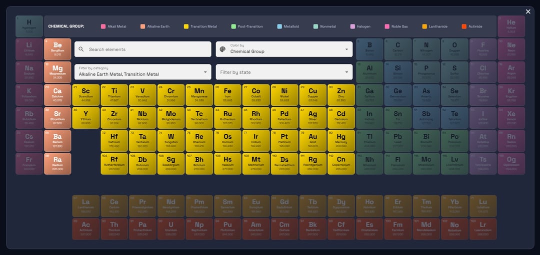
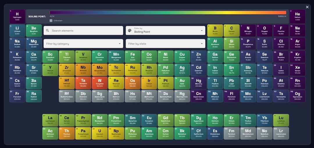
Dynamic Colors
– Category (alkali metals, transition metals, halogens, etc.)
– Standard state (solid, liquid, gas)
– Electron block (s, p, d, f)
– Atomic mass, electronegativity, atomic radius
– Ionization energy, electron affinity
– Melting point, boiling point, density
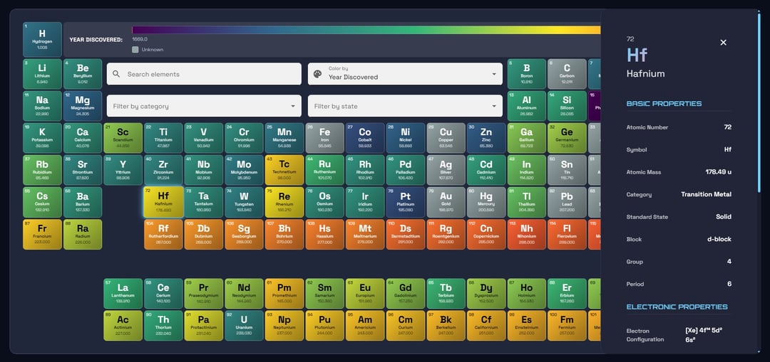
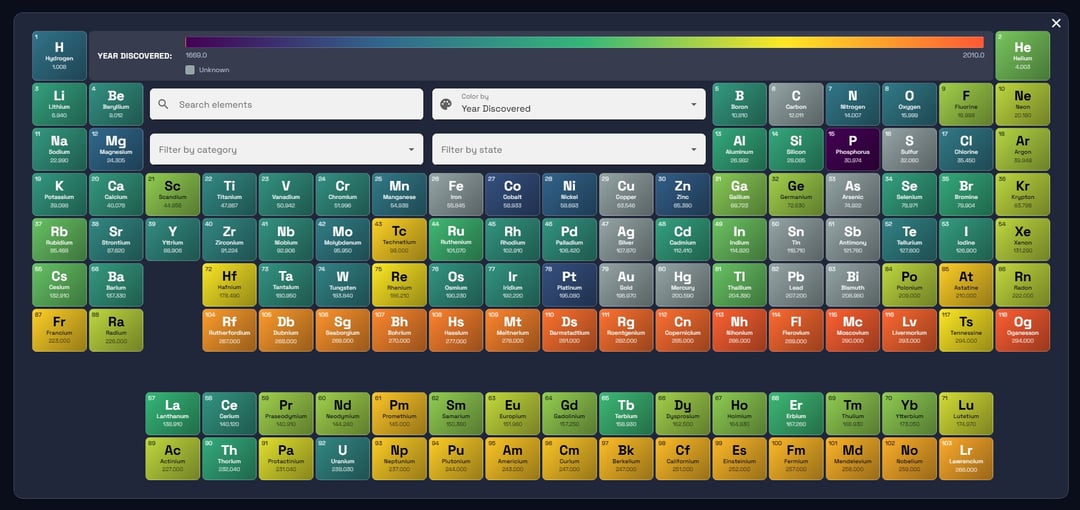
– Year discovered
– Color legend automatically updates and shows gradient scales for continuous metrics
– Smooth gradient backgrounds on each element tile
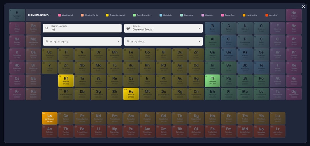
Search & Filter System
– Real-time search by element name, symbol, or atomic number (debounced for performance)
– Multi-select filter by chemical category
– Multi-select filter by standard state
– Filtered elements fade out while maintaining the table structure
– Quick reset button when filters are active
Comprehensive Element Details
– Click any element to view detailed properties
– Basic: Atomic number, symbol, mass, category, state, block, group, period
– Electronic: Electron configuration, electronegativity, atomic radius, ionization energy, electron affinity, oxidation states
– Physical: Density, melting point, boiling point (with units)
– Discovery: Year discovered and discoverer
– Desktop: Side panel that slides in from the right
– Mobile: Bottom sheet with swipe-to-dismiss
Fullscreen Expand Mode
– One-click expand to fullscreen viewport
– Auto-hides sidenav and back-to-top button
– Restores previous state when exiting
– ESC key support to exit quickly
– Element details work seamlessly in expand mode
– Tooltip on expand button
Posted by Dry_Tea9805
6 Comments
Built with Angular + Google Material
cool but not a data visualization. It’s literally the periodic *table* of elements.
More of a webdev showcase rather than data being beautiful.
Don’t delete it! This is still a very aesthetically pleasing and well conceived display of information and I’d vote to leave it up.
I love this. Brings up nostalgia for me. I built a basic periodic table using Microsoft Access back in my uni days (2 decades ago).
Love the format and I like the idea that there is an ability to search.
You’ll love the interactive periodic table wallpaper from Wallpaper Engine