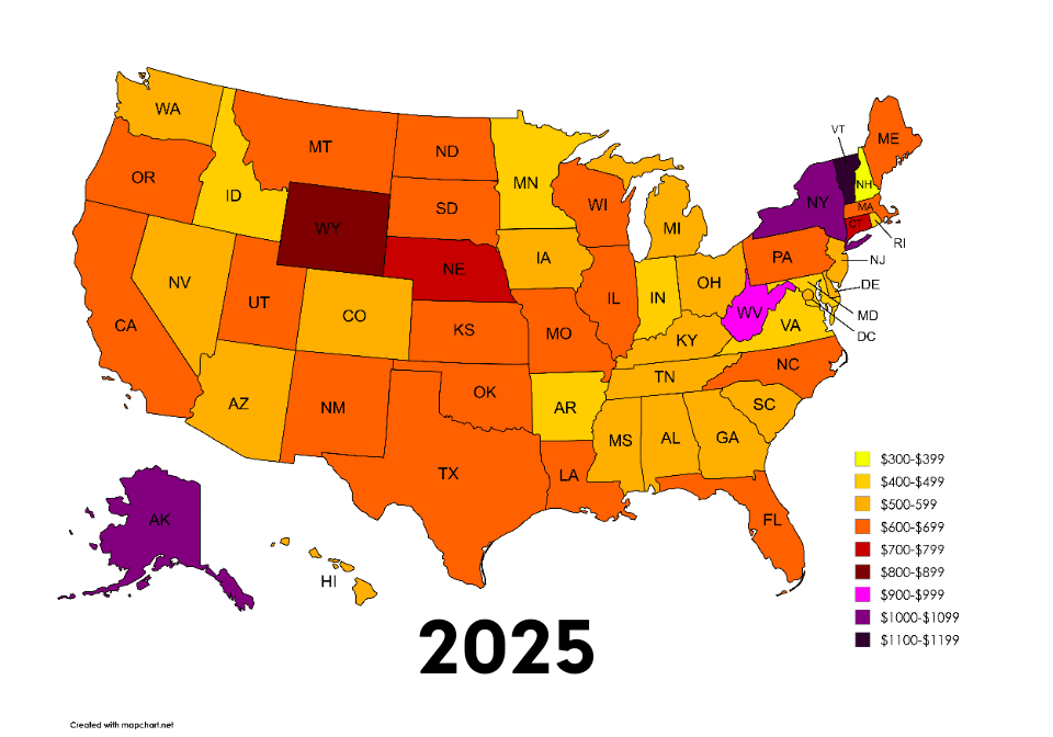
[OC] Average cost of health insurance per state before and after the Big Beautiful Bill
Posted by SpaceWestern1442

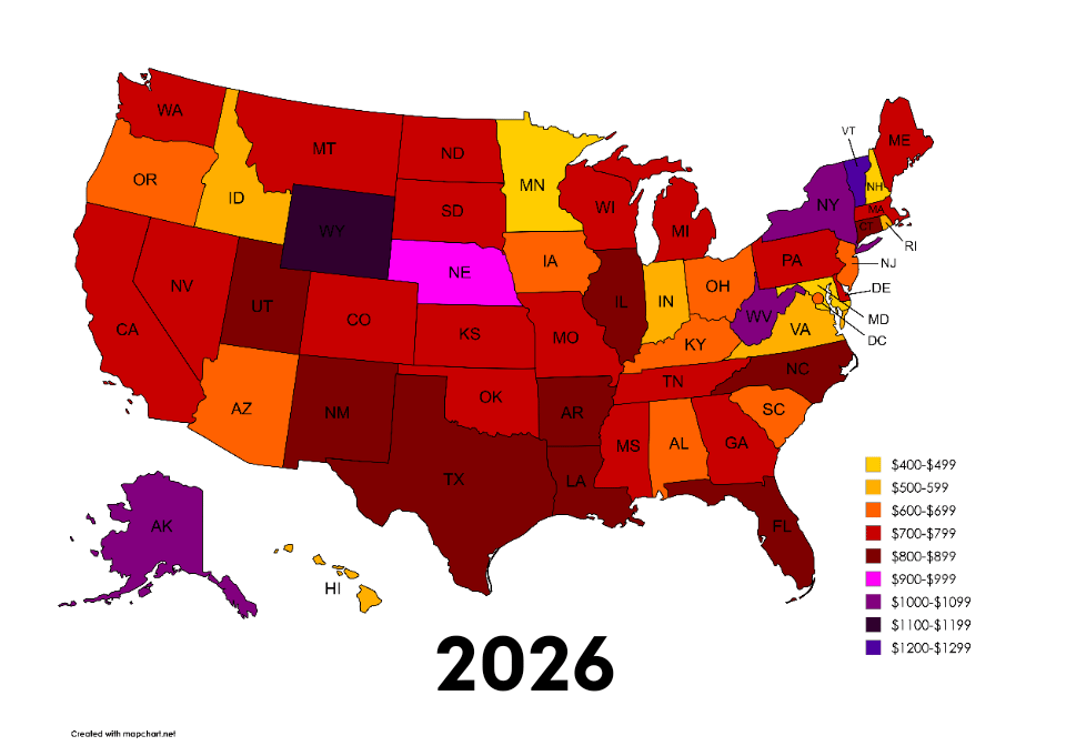
[OC] Average cost of health insurance per state before and after the Big Beautiful Bill
Posted by SpaceWestern1442
25 Comments
SOURCE
https://www.valuepenguin.com/average-cost-of-health-insurance
In between jobs rn, and I’m finding it cheaper to pay outta pocket for my visits than if I had had health insurance
This may only be my personal preference, but I absolutely hate your chosen color scale.
I’m just mildly annoyed that the legend is sorted the opposite way that I would have.
I like that it easy to see most places more expensive but most expensive corner in northeast didn’t change
also did the OBBA cause this and how?
Is it cost per month or per year? (not from US, just asking)
Indiana being immune to the consequences of being a red state should honest to god be studied. They always dodge the consequences of their actions and it’s as impressive as it is bewildering and infuriating.
what the fuck is this ratshit color scale
What is going on with Vermont?
One map showing how much the increase actually was (either in $ or %) would be a lot more informative.
This is not especially helpful, since even if you bother to figure out what the degree of color change between the two pictures is, you still don’t know if the price went from (for example) 600 to 899 (50%) or 699 to 800 (29%).
For all you know, a color change *could* represent a 1$ increase.
Edit: I’m not commenting on the cost of US insurance, this is strictly about why this data is not very beautiful…
(Although it might be worth adding that the title is also pretty inaccurate/clickbaity, since this is only **ACA marketplace** data. And that the source is a site trying to sell insurance. Which has its own map and data table, and the OP just… made it much worse.)
Color scale is difficult to parse. Anectotally, my family insurance tripled in CT, between rising costs and the expiration of tax benefits…
It’s cheaper to go to other country I guess if you have some issues
Im so curious and scared by the idea what people who get sick go through in this country 😨
Cost per what? I assume per month but that should be on the chart. And is it per person? or per adult?
Great idea to present, shit colors though.
On the bright side the majority of voters did get what they voted for. Affordable healthcare is for communists. Republicans fought tooth & nail against Obamacare because they were worried it may actually work.
Damn, when did Minnesota end up being on the lower end of the spectrum for insurance costs? Pretty much my entire life MN has been near the top for healthcare expenses (thank you Mayo Clinic and United Healthcare). Of course, we’ve always been near the top for expected outcomes as well, but still.
Large health insurers have been invading pharmaceutical, in home care, and even health care provider spaces. These insurance companies are negotiating rates with themselves and nobody seems to care
Why the different color key in each visualization?
I am starting to suspect that people purposely submit maps with obviously flawed color scales to this sub for some reason.
Jesus, why is Wyoming so expensive?
Winning sofa-king hard. 🤦♂️
That’s why Minnesota is awesome.
Can someone explain Wyoming
The increase had nothing to with the BBB. It didn’t extend Covid subsidies that were going to expire at the end of the year. Do blame a spending bill everytime money for a temporary program sunsets?
“Average” is doing a lot of heavy lifting here.
Don’t be an individual over 60 buying on the marketplace if you don’t want the numbers to be 4 colors higher on the first graph and *10* levels higher on the second graph.