
Link – propertypricemap.co.uk
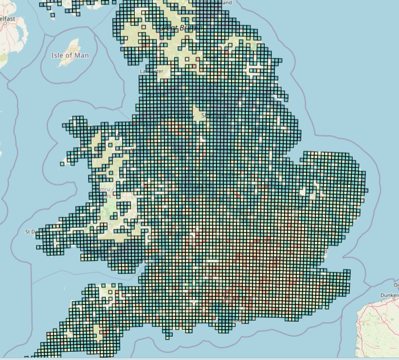
I built an interactive UK housing data map. It shows median sold prices on a fixed size grid (1 km, 5 km, 10 km, 25 km) so patterns are comparable across the country.
The main feature is Find My Area. You set priorities like budget, flood safety, schools, crime, station distance, and local age profile, and it scores every 1 km square from 0 to 100% so you can shortlist areas fast, especially if you do not know where to start or you are relocating.
You can also switch between metrics (median, change over time, £ per ft² in England), toggle overlays (flood, schools, crime, community age, stations), and right click anywhere to snap to the nearest postcode and get a local breakdown.
- What’s your overall impression of this, useful, confusing, somewhere in between?
- Does the “Find My Area” idea make sense straight away, or does it need better framing?
- If you could change one thing to make it feel more intuitive, what would it be?
- What would you add or remove to make it feel more like a product you would actually use?
This is not a Zoopla or Rightmove replacement. It is a reverse search tool that helps you figure out where you might want to live first, then you can dive into the actual property listings.
Data sources
- Sold prices (England and Wales), HM Land Registry Price Paid Data
- Sold prices (Scotland), Registers of Scotland (coverage can lag and may be partial)
- Floor area for £ per ft², EPC data (England only)
- Flood risk, Environment Agency (England only)
- Schools, Ofsted inspection data (England only)
- Crime, data.police.uk, aggregated to LSOA (England and Wales)
- Community age, Census 2021 (UK wide)
- Train stations, National Rail station location data (Great Britain)
Tools used
- Python for data processing (pandas, geopandas, pyproj)
- MapLibre GL JS for the interactive map
- Cloudflare R2 for storage and Cloudflare Pages for hosting
Posted by AdSeparate5752
10 Comments
I really like your UI, works really well on mobile. Is there any particular part of your project that you are most proud of?
man, i didn’t realise how cheap the isle of wight is compared to the rest of the south. i guess because it’s tricky to get to the mainland?
Oh look another personal web site. It’s like they’re breeding like flies.
its a nice map. one suggestion, at a certain zoom-out level nix the black lines between the squares so that the color is preserved, otherwise it just goes to all black. even in your screenshot its starting to look kind of dark
Scoring every 1km square from 0 to 100% based on your priorities is a brilliant approach to house hunting. The flood safety and school data layers alone would save people weeks of research. How accurate are the sold price estimates for rural areas?
This is incredibly well executed! The grid approach is so much cleaner and easier to read than trying to render raw, messy postcode boundaries at a national scale.
To answer your questions:
1. **Overall impression:** Extremely useful. The ability to toggle the overlays (especially flood risk and schools) on top of the grid is a killer feature for anyone actually looking to move.
2. **”Find My Area” framing:** It makes perfect sense as a reverse-search concept. It shifts the focus from “I want to live *here*, what are the prices?” to “Here are my parameters, *where* can I live?”.
3. **Feedback/Intuition:** One thing that might make it feel more like a full product would be a brief, 3-step onboarding overlay when the user first loads the page, just to explain the “right-click to snap” feature, as users might miss that if they don’t read the text.
Since you’re using MapLibre GL JS for this, I’m curious are you serving that massive 1km grid dataset via custom vector tiles (like PMTiles), or how are you handling the performance with that many polygons rendering in the browser?
Really awesome work on this.
Scoring each kilometer square individually is more useful than borough averages most tools offer. Flood safety and crime weighting shows real thought about priorities. How long did processing five years of sold data take?
Station distance filtering makes this essential for commuters balancing price and transit access. Users weighting priorities differently is smart since needs vary by life stage. Have you considered adding school Ofsted ratings to the scoring model?
Fixed grid sizes across the country make regional comparisons fair which most property tools fail at. The age profile priority is interesting since demographics shape daily life beyond what price captures. What tech stack did you build the map with?
Wtf is with all the ai comments on this post