[OC] The Globalization of European Football – Foreign player % in Europe’s top 5 leagues, 1996-2024
Posted by Correct-Moment-2458

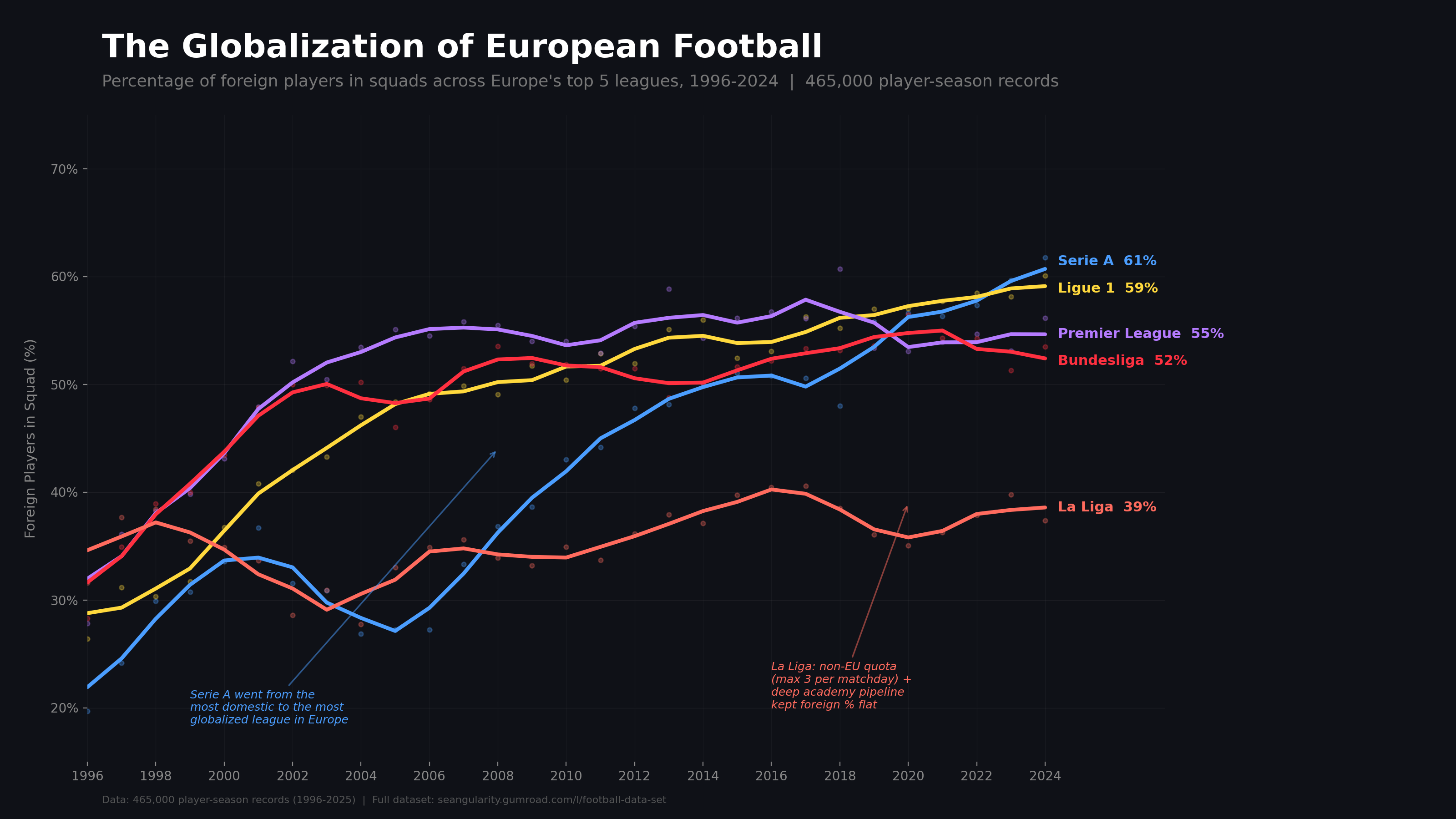
![[OC] The Globalization of European Football - Foreign player % in Europe's top 5 leagues, 1996-2024](https://www.byteseu.com/wp-content/uploads/2026/03/k83k4u7yk4ng1-1536x864.png "[OC] The Globalization of European Football – Foreign player % in Europe’s top 5 leagues, 1996-2024")
[OC] The Globalization of European Football – Foreign player % in Europe’s top 5 leagues, 1996-2024
Posted by Correct-Moment-2458
4 Comments
Well done. I spent minimal time on “WTF am I looking at” and could jump straight to insights, because the exhibit is laid out cleanly, and is well-documented.
I know what the data is, where it came from, and what the trends are.
I like that you smoothed the curves but kept the original data in; the trends are what matter, but you “honored the data” by keeping the year-to-year noise in- without distracting too much.
The title summarizes the chart.
Callouts aid interpretation and understanding.
The two callout lines don’t really point at the relevant curves; that’s my only nitpick.
If you want to convert data into insight, this is how it’s done, folks.
I think the reason why spain win world cup 2010
I wonder when Britain left the EU
I wonder what this data would look like for the top 6 or 7 teams in the leagues.