
![[OC]I built a system that visualizes CPAP sleep therapy data in advanced interactive charts](https://www.byteseu.com/wp-content/uploads/2026/03/4dy4zupf4kng1-1024x397.png "[OC]I built a system that visualizes CPAP sleep therapy data in advanced interactive charts")
CPAP machines produce an incredible amount of physiological data during sleep.
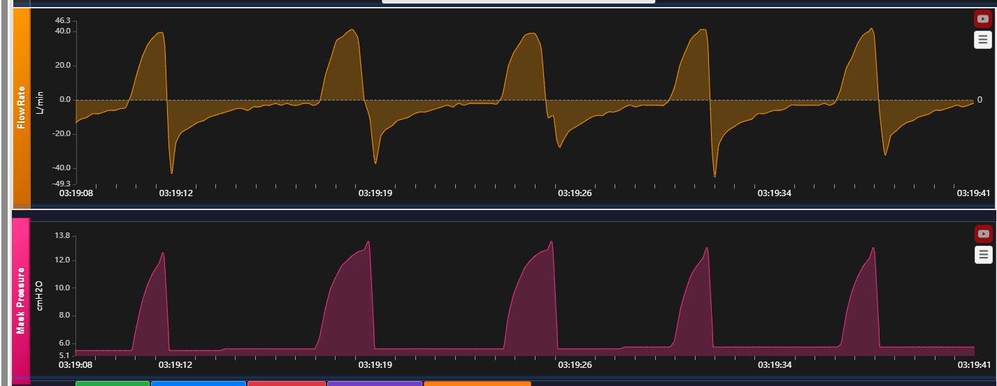
I built SomniCharts, a wb based platform that converts that raw therapy data into detailed visual analytics.
The system analyzes metrics like:
• airflow
• pressure curves
• respiratory events
• leak rates
• therapy effectiveness over time
The goal is to transform raw CPAP logs into clear visual insights that both patients and clinicians can understand.
Sleep medicine is actually a fascinating data science problem because sleep therapy produces continuous overnight physiological data streams.
We’re interested in feedback from data visualization enthusiasts about the chart design and analytics approach.
Posted by SomniCharts
4 Comments
looks like CPAP data is a goldmine for pattern detection )
**Details about the visualization**
Data source: CPAP therapy logs (flow rate, pressure, respiratory events, mask leaks).
Tools: custom web visualization pipeline built for SomniCharts.
The goal is to convert raw CPAP device logs into interactive charts so users can analyze therapy patterns across nights.
Happy to answer questions about the data processing or visualization approach.
really clean visualization for such complex physiological data
Sleep data from CPAPs generates so much info, turning it into interactive charts seems super helpful for tracking therapy.