
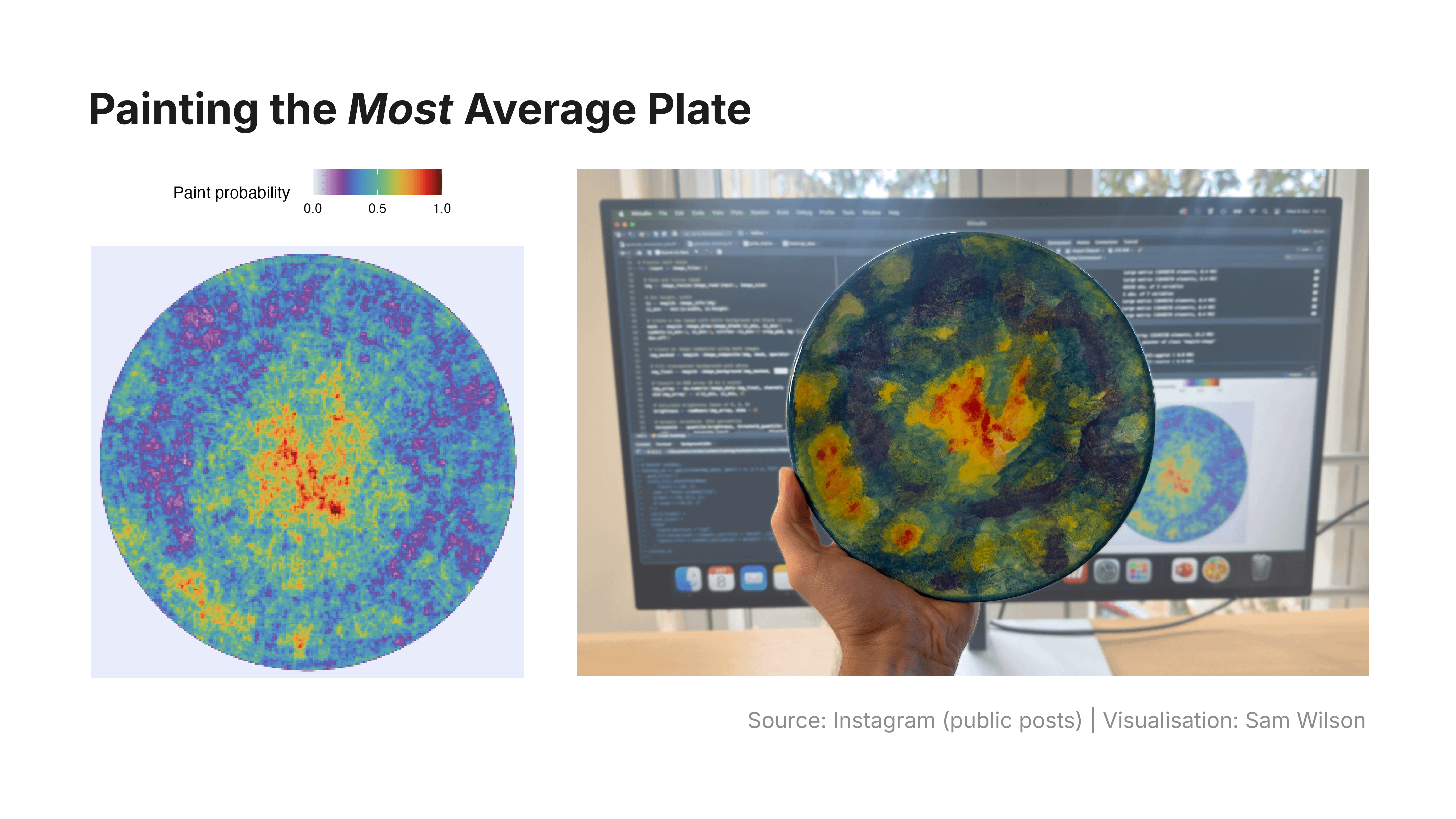
![[OC] I painted the most average plate](https://www.byteseu.com/wp-content/uploads/2026/03/cg22qefuy9og1-1536x864.png "[OC] I painted the most average plate")
I went pottery painting with friends. I’m not particularly artistically gifted, so instead of trying to paint the best piece of pottery, I settled for the most average.
I chose a plate (relatively flat and easy for analysis), collected 100 photos of hand painted plates, and wrote an R script to:
– Crop and align each plate photo
– Downscale them to 1024 × 1024 pixels
– Apply a dynamic brightness threshold
– Classify each pixel as painted or unpainted
This gave me a binary map of each plate – paint vs. no paint.
Combining all 100 maps produced a paint probability heatmap: the average of all designs.
I got some strange looks in the pottery studio but I think it was worth it.
Posted by anothersamwilson
16 Comments
Created using R (Tool), with photos taken from Instagram (Source).
For anyone interested in more details:
Surprisingly, this wasn’t a super robust analysis. The main limitation was the binary “paint or no paint” classification; it often missed very light colours (see the tree example in the attached image) and sometimes confused plate shadows or glare for paint or no paint. I tried to counter this by using a dynamic brightness threshold (based on the 10th percentile brightness across each plate), but there’s room for improvement or entirely different approaches.
Normally I’d avoid using a rainbow colour palette in data visualisations since they’re not optimal for accurate interpretation. But given this needed to be physically recreated with pottery paint, this choice made things much easier (and prettier).
Finally, the probabilities were scaled from 0 – 1 for plotting convenience. In reality, the likelihood of any pixel being painted ranged from 0.01 – 0.35, meaning no single pixel was painted on every plate, and at most 35 out of 100 plates shared paint in the same spot.
https://preview.redd.it/zwfrw7h20aog1.png?width=6667&format=png&auto=webp&s=2305b0d472c2f0788ecfb8dfa94cecedbc963baf
I can’t not deny, that it isn’t rather not uncool. Strange looks be damned.
This is amazing. Id love to see this as three maps based on the seperated rgb values of the sample plates, then use those as the rgb values of a merged image.
Same with CMYK
Thats not beautiful though. Not is it ugly. Its perfectly average…
Behold, the plate of all time
That looks like cosmic microwave background
That’s a mean painted plate.
This is fantastic material for r/ATBGE ! Love it
Now that’s my kinda averaging.
Impressionism by way of computer science. This plate would be right at home in Van Gogh’s house.
Bro painted the Cosmic Microwave Background plate
Idea for your next pottery excursion: Use a photo blender program to combine photos of another 100 plates and paint the resulting design blur.
how do you decide on the rotation? Is it arbitrary? (e.g., that one with an abstract collection of figures could very well be rotated)
What was you methodology for determining what the “top” of the plate was? Without that, the random rotation around the center axis would always result in a higher average density around the center, because the center is the same regardless of rotation. And average distribution would be more random the farther you went out from the center.
I thought this was a corneal topography…
Bro, I thought this was the cosmic microwave background radiation map until I read your explanation.