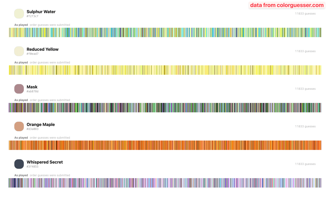
A few days ago I posted a chart showing what people guessed for colors. That drove a lot of traffic (and most of them for sure from here).
These graphics are from that day. Each line represent a guess sorted by hue.
Posted by kkiru

![[OC] That reddit thinks these colornames represent](https://www.byteseu.com/wp-content/uploads/2026/03/41ep976hjvog1-1024x622.png "[OC] That reddit thinks these colornames represent")
A few days ago I posted a chart showing what people guessed for colors. That drove a lot of traffic (and most of them for sure from here).
These graphics are from that day. Each line represent a guess sorted by hue.
Posted by kkiru
8 Comments
The data were collected [https://colorguesser.com/](https://colorguesser.com/) and processed with SQL and JavaScript (to make the charts).
interesting that whispered secret is percieved as purple in hue, and relatively light, wheras the color chosen is dark and warm.
I figured mask would be green because: Jim Carrie.
And as far as sulphur water goes, I’m surprised there’s so much blue. must be the “water” part?
https://preview.redd.it/jrv9mc95lvog1.png?width=592&format=png&auto=webp&s=e97cd18b1bc001ebfd9eff02d2456c51fa269e50
I’m happy to see a lot of other people also went with green for mask. I assume this was everyone else’s best point of reference too?
https://preview.redd.it/m52dh9j8ovog1.jpeg?width=1000&format=pjpg&auto=webp&s=f5ad206342e76606204aa44bf79359ae8cac7cd5
is there a multidimensional median?… I wonder
If you want the sample display to be informative and not just look pretty I think you should sort the samples somehow (e.g. by hue) to make it easier to gauge what color has been submitted how often.
Well. Guess what I’m doing today that I haven’t done since that day.
(Cool concept, you should be proud of coming up with it).
geolocation of the guesses might be more interesting than just order. Could just do longitude for similar aesthetics -and possibly a correlation to the order based on when folks are awake.
I took that test this time. I like the idea of showing us what we think certain colors are based on the names. What I didn’t like was a score and a color given to us afterward. I don’t understand why those colors were chosen and why I would want to try to score highest by guessing some arbitrary color. I liked the idea more to see what other people think.