use smaller subdivisions and you can basically make the map completely white. GDP and where it is generated are just really ill-defined.
BadSausageFactory on
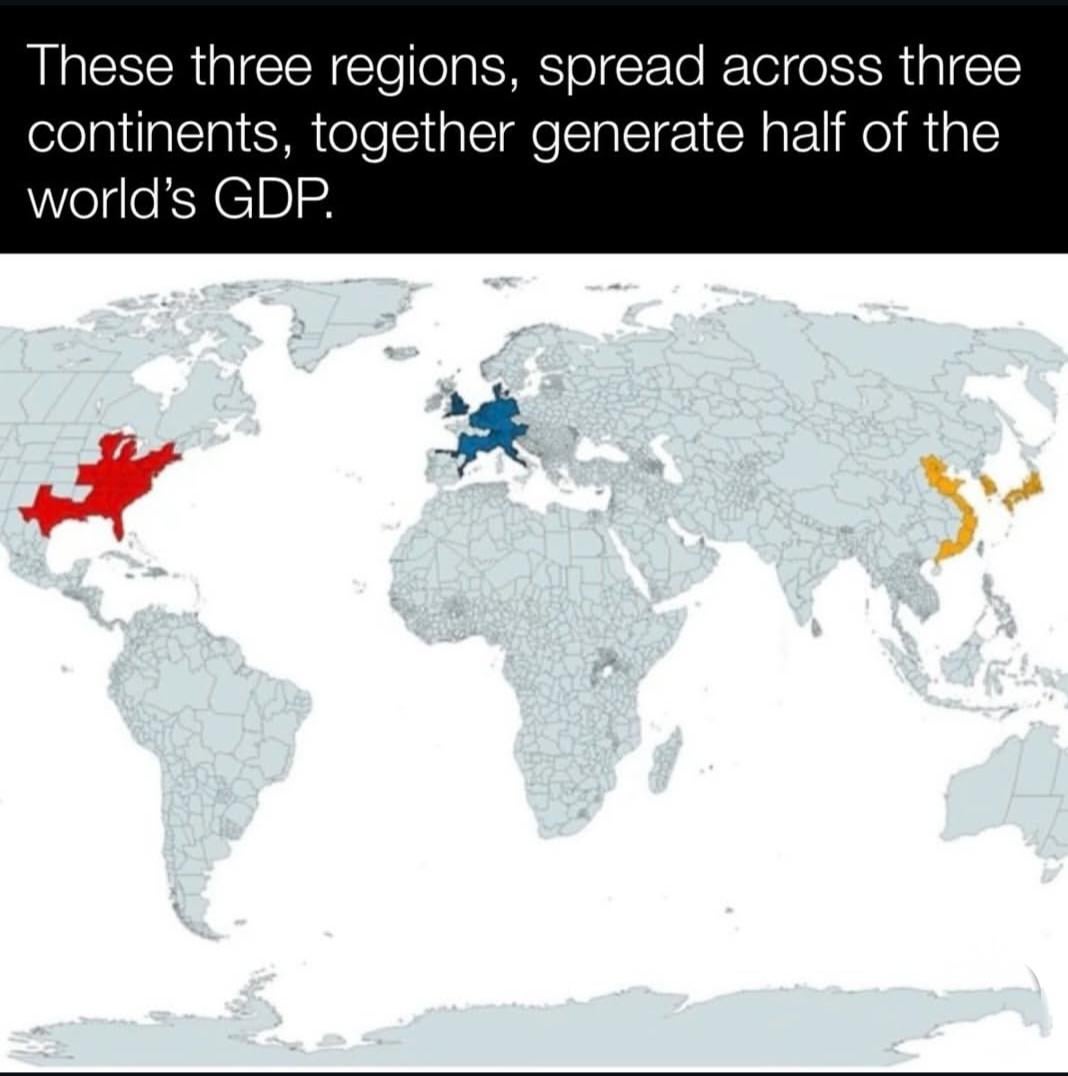
I’m not sure how a map of GDP in the US wouldn’t include california. but would include vermont.
NotAGreatDane on
GDP is misleading measurement for production
Atlatica on
Alternatively; these 3 regions would starve and collapse from a lack of natural resources without the white areas supporting them
menaghare on
Initially I thought it was Vietnam
straightdge on
If you consider just US healthcare GDP, and absolutely nothing else, still US has higher GDP per capita than China. Yet, the Chinese have similarly expected life expectancy as US and maybe higher healthy life expectancy. Just a point to prove that GDP stats don’t mean much in real terms.
chamomile_tea_reply on
Use county level data and this could get significant smaller, and glean a higher GDP percentage.
Just grab counties in downstate NY, Southern California, Boston area, and Dallas/Houston areas.
In Europe: London area, Berlin metro, Paris metro. Thats all.
And so on
ghost_desu on
GDP is less than worthless
Mooseycanuck on
What a silly map. There’s nothing fascinating about this. Is it saying ‘wow such a small area is creating half the worlds gdp’? What is the point of this map?
amythisside on
The red region is the major cause of global fuckups
derkuhlekurt on
The gray area alone is creating as much GDP as all the other colors combined.


25 Comments
use smaller subdivisions and you can basically make the map completely white. GDP and where it is generated are just really ill-defined.
I’m not sure how a map of GDP in the US wouldn’t include california. but would include vermont.
GDP is misleading measurement for production
Alternatively; these 3 regions would starve and collapse from a lack of natural resources without the white areas supporting them
Initially I thought it was Vietnam
If you consider just US healthcare GDP, and absolutely nothing else, still US has higher GDP per capita than China. Yet, the Chinese have similarly expected life expectancy as US and maybe higher healthy life expectancy. Just a point to prove that GDP stats don’t mean much in real terms.
Use county level data and this could get significant smaller, and glean a higher GDP percentage.
Just grab counties in downstate NY, Southern California, Boston area, and Dallas/Houston areas.
In Europe: London area, Berlin metro, Paris metro. Thats all.
And so on
GDP is less than worthless
What a silly map. There’s nothing fascinating about this. Is it saying ‘wow such a small area is creating half the worlds gdp’? What is the point of this map?
The red region is the major cause of global fuckups
The gray area alone is creating as much GDP as all the other colors combined.
Lazy ass Spanish and their siestas
Now do California and the mideast
Becomes more interesting when viewed side by side with a [population map](https://www.guideoftheworld.com/map/world/population/world-population-map.webp)
“Long ago, the three regions lived together in harmony. Then everything changed when the Fire Nation attacked”
California state included or no?
Crazy that half of the world’s GDP comes from Mississippi (and some other places)
Big Vietnam
And the other half is California?
What does GDP mean if there are children starving? And presidents raping children, and not being punished?
Why the US West Coast erasure?
Where does the other half come from?
California?
These 3 regions are exploiting the rest of the world* especially the first two
The other half is California.