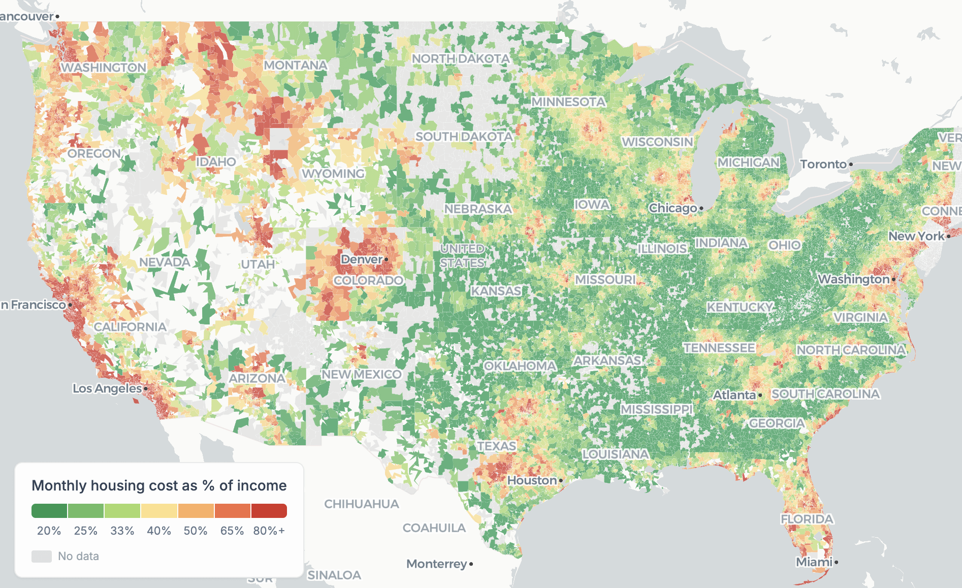
Sources: Zillow, Census ACS property tax rates, MoneyGeek insurance data. Cost = mortgage (6.5%, 30yr, 20% down) + tax + insurance + 1% maintenance, as % of income.
Posted by Global-Thought-1049

![[OC] Housing affordability is local, so I mapped 26,000 U.S. ZIP codes by cost burden, and at the median income, only 53% are affordable.](https://www.byteseu.com/wp-content/uploads/2026/03/v7atqv5o85pg1-1536x939.png "[OC] Housing affordability is local, so I mapped 26,000 U.S. ZIP codes by cost burden, and at the median income, only 53% are affordable.")
Sources: Zillow, Census ACS property tax rates, MoneyGeek insurance data. Cost = mortgage (6.5%, 30yr, 20% down) + tax + insurance + 1% maintenance, as % of income.
Posted by Global-Thought-1049
10 Comments
Did NJ break your color scale?
It looks like all developed/urban areas are marked as severely unaffordable. I have my doubts about that.
Love it so much!
Is there a minimum amount of housing data necessary for a zip code to be included? I don’t see any spots that don’t make sense to me intuitively, but since it’s color-based I just wonder if outliers might skew perception of certain areas one way or another.
This is not beautiful. The state labels are unnecessary and obscure much of the data.
Basically if there are people and its not the boonies its unaffordable?
Conveniently cutting off most of New England I see 🙄
Run the numbers as a percentage of total population.
Raw counts of zip codes are meaningless if 10% of zip codes are where 90% of Americans live..
So I guess the stat I’m looking for is “_____ percent of Americans live in a zip code that is unaffordable”
you’re the champ, thanks for finally doing this right. don’t let any one give you any criticism for this.
So you put giant state names over huge areas?
Edit: and major cities? Outside of Birmingham Alabama is literally under the Atlanta. Which is oddly in a different font.
One must note that in real life, a) not everyone needs to purchase a house, b) mortgage rates are lower than 6.5% and will likely drop, c) the income is just a median income, and for a house purchase, your income should be higher than that.
Not as useful map as appears.