
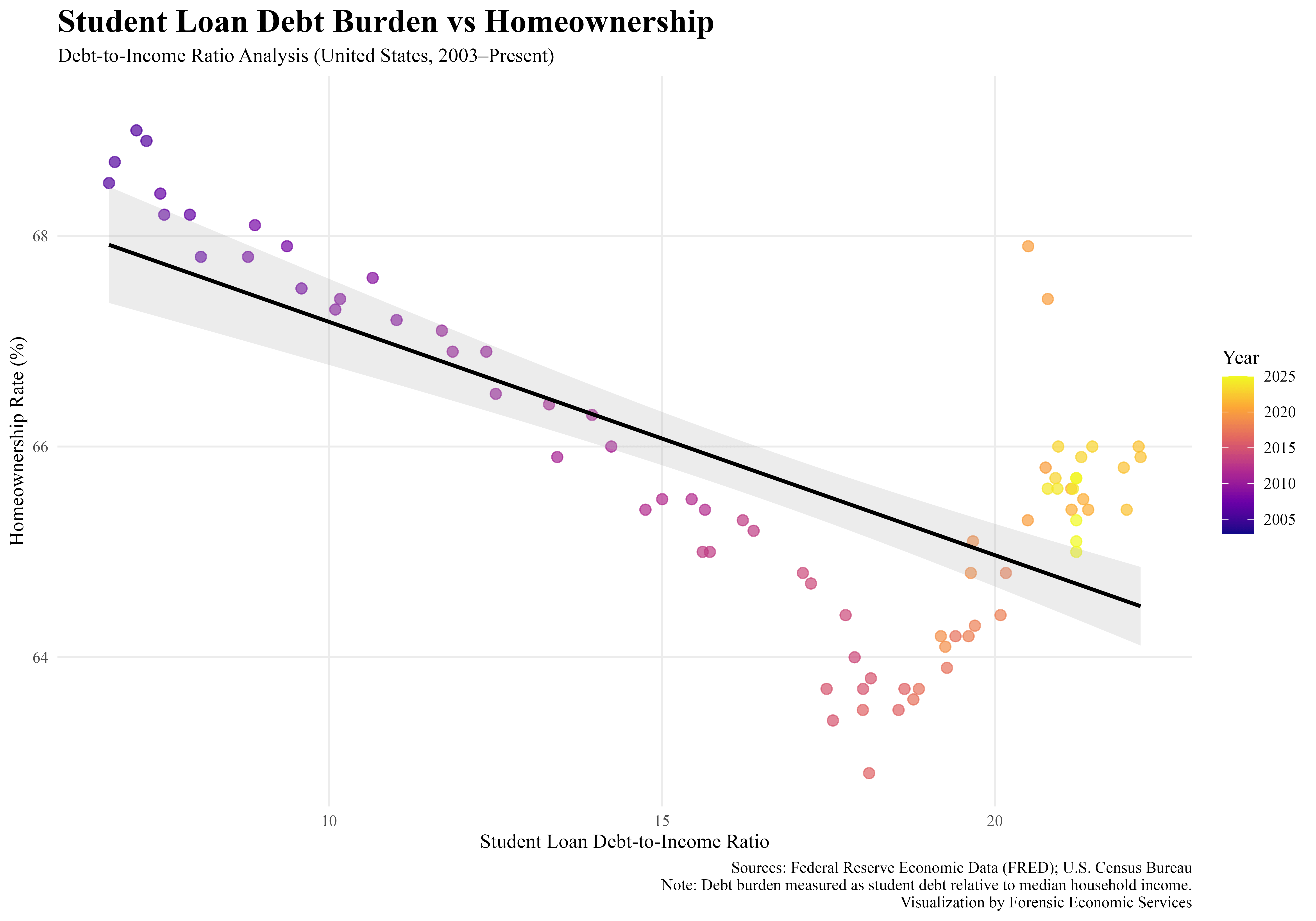
![Student Loan Debt vs Homeownership in the U.S. (2003–2025) [OC]](https://www.byteseu.com/wp-content/uploads/2026/03/txo9eiuq8opg1-1536x1075.png "Student Loan Debt vs Homeownership in the U.S. (2003–2025) [OC]")
Data sources:
- FRED (Federal Reserve Economic Data)
- U.S. Census Bureau
Visualization: R (ggplot2)
Is rising student debt holding back homeownership?
This chart plots the student loan debt-to-income ratio against the U.S. homeownership rate over time. Each point represents a year from 2003 to 2025, with color showing progression through time.
There’s a clear negative relationship: as student debt burdens increased, homeownership rates generally declined—especially through the 2010s. More recently, homeownership has partially recovered even as debt levels remain elevated.
This suggests student debt may be one piece of the puzzle—but not the whole story. Housing supply, interest rates, and demographics likely play major roles too.
We look forward to your feedback.
The team at Forensic Economic Services LLC | Rule703.com
Posted by forensiceconomics
34 Comments
Why are the Trump Republicans so against helping out with student loan debt?
there are way more than 20-something data points here
is this quarterly?
neat how debt to income ratio also appears to be strongly correlated to year
Funny how the X axis effectively shows elapsed time
Could this be explained by the age distribution of people in the US? Birthrates peaked in the 2000s so it makes sense there’d be a spike in student loans now that all those people are in college or recently graduated.
This is an interesting chart, but also a somewhat confusing one, at least to me. Using the color is an elegant way to show progress over time while still showing both D/I and the ownership rate, but it leaves me unsure on what’s happening at the end, where it seems like there’s a sharp change in a particular year, but it’s not clear what year exactly the shift occurs—something that I am doubly unsure about because the averaging line seems to suggest a much more straight forward drop as D/I gets higher.
This is a really good example that correlation != causation. While payments for student loans may be holding back homeownership the massive increase in home cost probably plays a larger role.
However, the shift from low-cost subsidized tuition AND home prices exploding both occurred at the same time. Showing a causal link between them would require more information than this plot alone
I think this is a very simple graph to show some form of correlation; however, it’s more complex than simply saying the more student loan debt one has lowers the probability of home ownership. For example, government spending and QE have more weight to home ownership than student loan debt. Stagnant wages with increased inflation has caused people with student loans not to have home ownership. Any sort of massive debt has an impact on home ownership such as credit card debt or auto loans being the next big one.
Ironically my high debt-to-income ratio helped me buy my first home. Qualified me for a state-sponsored first-time home buyer credit which helped with the down payment.
Why linear regression for non linear data?
To me, this looks like high-debt:low-pay equals low homeownership. VERY high debt may mean very high pay–Dentists, physicians, lawyers–and high rates of ownership.
Can you switch the ratio and the year, so ratio is color?
The x axis is supposed to be the most independent variable, which is year.
beautiful? We do not need residual analysis here, because it is clear that you cannot fit a line on this trend
Seems like you’d want to isolate for home ownership among ages most likely to have school debt.
So during Covid people had high student debt to income but still acquired homes. Probably directly related to the pause on federal loans over those 3 years. Source: I had federal loans and bought a house in 2021.
As.factor(year) will take away the gradient scale for the year.
There are a lot of ways to show this in a much easier to understand way
The line of best fit slapped in there that doesn’t fit the data at all bugs me more than it should lol
I wrote my dissertation on this exact topic back in 2016 for my MA in economics, using a difference-in-differences approach to compare borrowers to non borrowers over time.
The relationship between debt and homeownership is very nonlinear – the ones who have it worst are those who accumulate debt but have no degree to show for it at the end, which often is on the smaller end of the debt distribution. Conversely those who have the highest debt totals are often the most educated (doctors, lawyers, etc) and have higher homeownership rates.
Really interesting to see the Covid era effect on homeownership.
Can someone explain the beauty here?
There looks to be little relationship here. Just two variables that were dropping at the same time and then one started rising. This would be a fail for an undergrad
Guess after ~17% debt-to-income you hit the pile of people that just want all the debt
Personally, I would like to see much more student loan data in here.
25% debt-to-income ratio’s the top of the scale?
I’d need to make $400k a year to pull that off.
Here’s some feedback: The “homeownership rate” is NOT the percentage of people who own homes. Rather, it is the percentage of homes which are owner-occupied.
If a community has 10 homes, 1 of which are owner-occupied and 9 of which are rented, the homeownership rate is 10%. But it’s 10% whether that one home has 1 occupant or 5 or 10. There might be 20 people in there mooching off of grandma but because it’s grandma’s house it’s “owner-occupied”. Those 19 moochers should be bringing down the homeownership rate but they don’t because the homeownership rate doesn’t count people, it counts structures.
So this graph is really comparing apples to oranges. It is comparing a statistic about people to a statistic about buildings.
Not just non-linear, discontinuous. Not everyone realizes, especially since a “simple” trend is conceptually easier to understand.
What the fuck is this fit
Students get useless degrees that won’t make them any money.
Doing the two metrics vs time on the x axis would be a lot prettier
The regression line is misleading. The data are not linear. I don’t know what this pattern is called, but it also doesn’t make a lot of sense that the x axis is a *ratio.* It obscures information and makes it hard to tell what’s actually going on on the right side of the graph.
Correlation doesn’t necessarily equal causation…..
But I can only wonder why younger adults aren’t buying homes or having kids!
Is the debt to income ratio the ratio of total debt to yearly income, or is it the ratio of debt monthly payments to monthly income?
What’s that black line supposed to be? Because it’s surely not the trend – there are two distinctly different trends here, almost like something happened in 2016.
Wouldn’t that look like Covid and the freezing of student loans gave young people an opportunity to buy homes. Now orange man cancels debt relief for students and rates go back down