
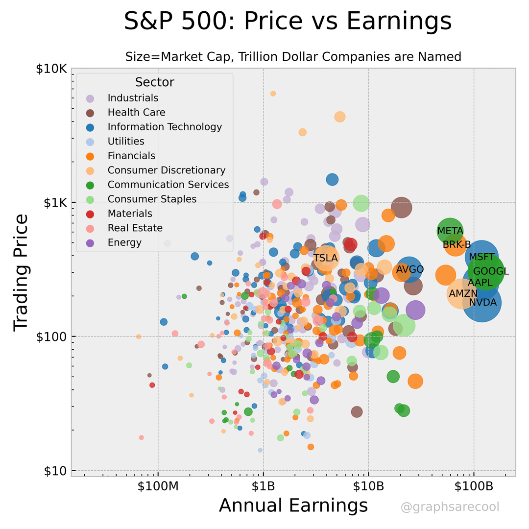
![[OC] Stocks are Back at Dot-Com Bubble Level Valuations](https://www.byteseu.com/wp-content/uploads/2026/03/82lj9zjpv7qg1-1024x1024.png "[OC] Stocks are Back at Dot-Com Bubble Level Valuations")
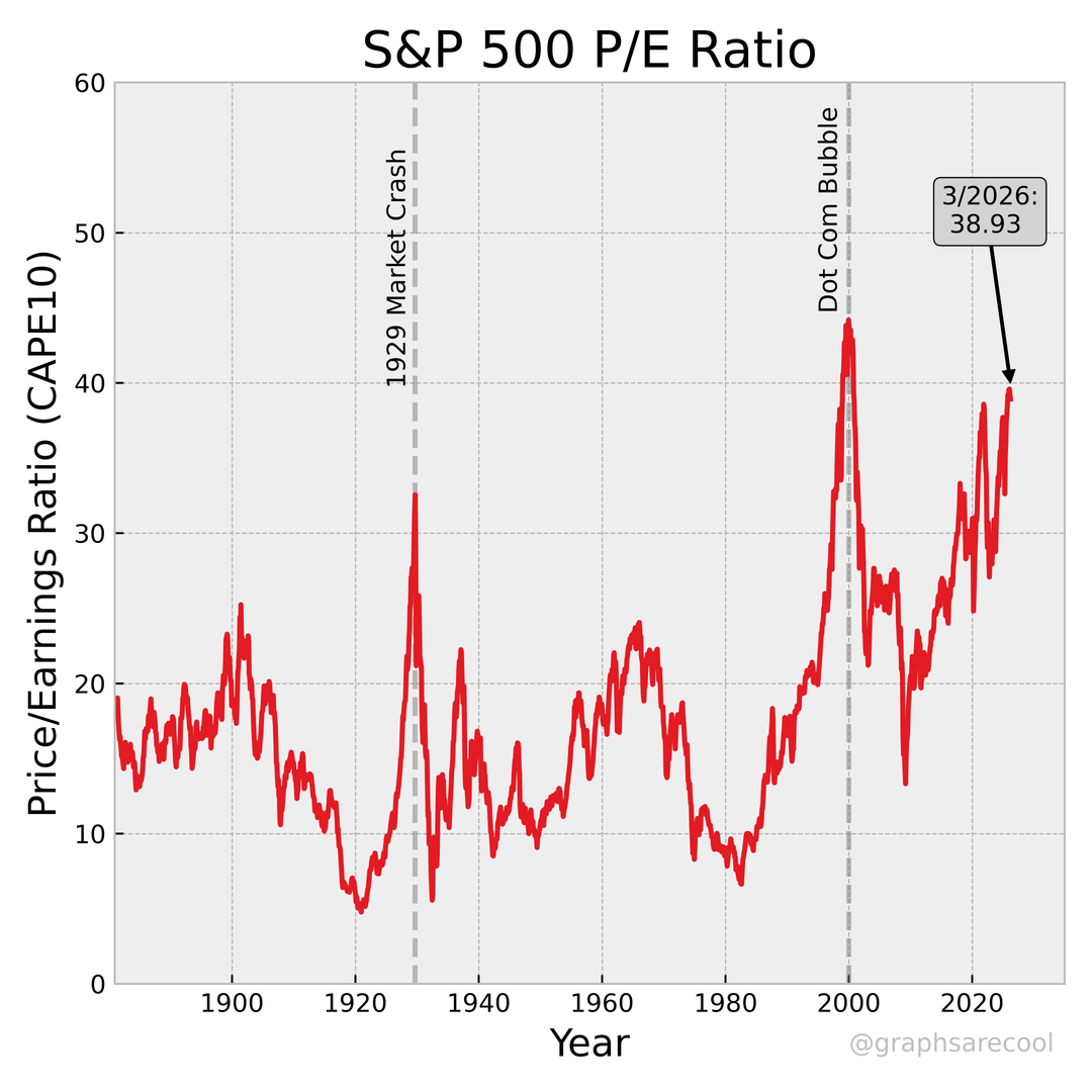
S&P 500 P/E ratio data (1881-Present).
Source: Shiller P/E data ( shillerdata.com ), Yahoo Finance.
First slide is cyclically adjusted P/E ratio of the previous 10 years from Shiller 1881-2025.
Second slide is all S&P 500 companies plotted by log trading price and log annual earnings. Points are colored by GICS sector and size by total current market cap.
More graphs available on Instagram.
Posted by graphsarecool
16 Comments
Source: [shillerdata.com](http://shillerdata.com) and Yahoo Finance
Tools: Python with matplotlib, pandas, numpy, and yfinance.
What date did you use for 03/26? Before or after the Iran war dip?
Honestly… at 33 bring on the crash. Would love to buy at the bottom for once
P/E ratio of modern 2020s companies do not care one bit about the P/E ratios of 1960s companies
Reversion to the mean is coming
“Trading Price” ?
That’s an arbitrary number.
Trading price is not the right metric to be using for the Y-Axis on the second graph, since it does not account for the number of shares. The correct Y-Axis is market cap, since that is the actual cost of the company.
Yay, The stock market is partying like it’s 1929.
Bring on the crash. Housing market too. Hope it all goes to shit
what was the last day this was updated? i imagine the nearly 10% correction would have altered this a bit
doesn’t buying etf index funds offset crash of some companies, should it happen?
Unfortunately PE has no meaning anymore
The problem is the large majority of that chart derives from monsterably stable companies with no debt and insane cash flow. This is not the dot com crash 2.0
Yet people are still gonna blame the upcoming correction entirely on the war lol
the 10 point increase between ‘92 and the .com bubble means that the next crash won’t happen until we reach 52 on the PE ratio. bring it on
This is kinda misleading, as SP500 has more established big companies.
Look at NASDAQ which had an averaged P/E of 300 before dot com bubbl burst, and now “only” at 30-40 P/E level.