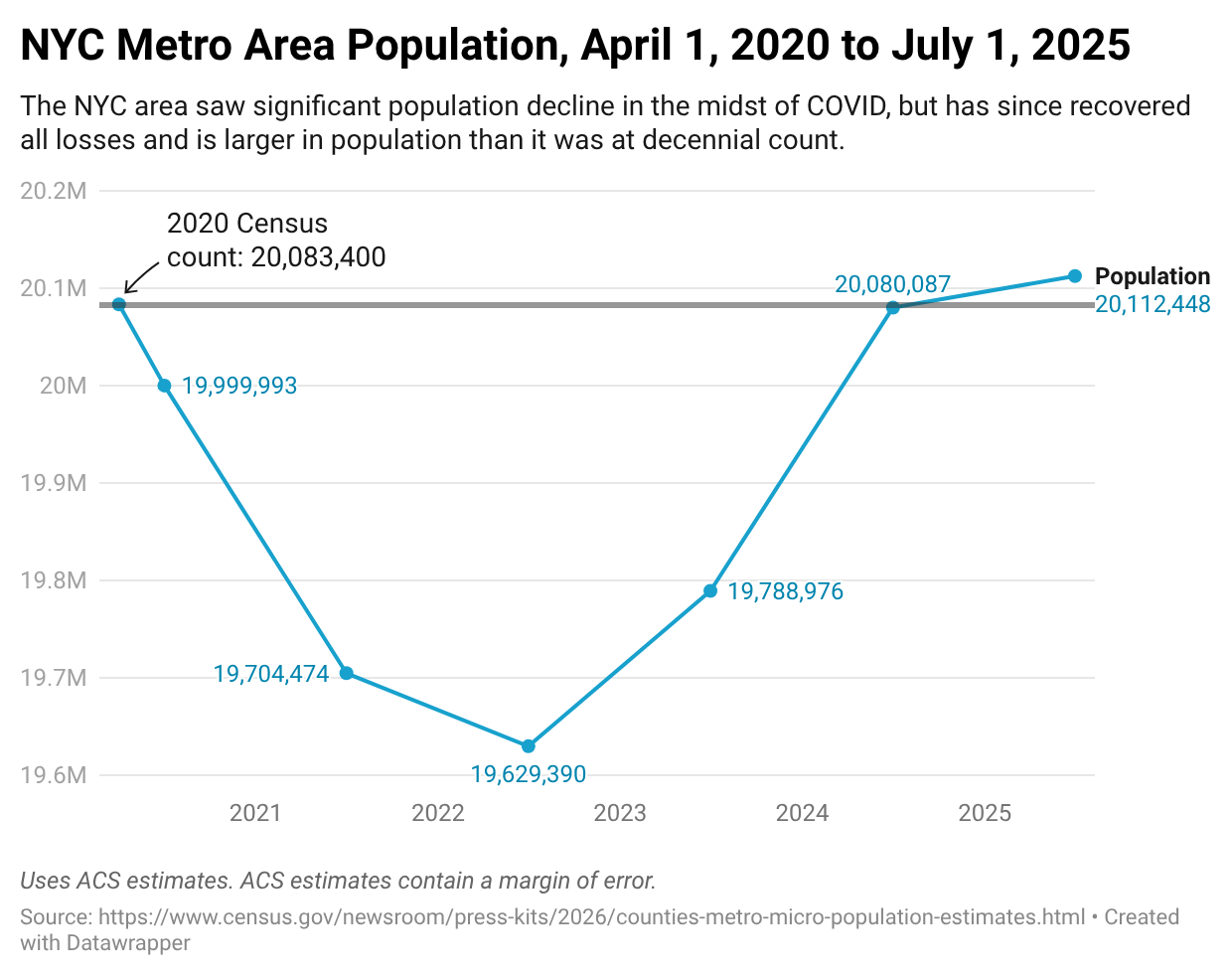
[OC] The New York City metro area has officially recovered all of its COVID-era population loss
Posted by StatisticUrban

![[OC] The New York City metro area has officially recovered all of its COVID-era population loss](https://www.byteseu.com/wp-content/uploads/2026/03/7ssn35s41hrg1-1024x811.png "[OC] The New York City metro area has officially recovered all of its COVID-era population loss")
[OC] The New York City metro area has officially recovered all of its COVID-era population loss
Posted by StatisticUrban
12 Comments
Data from the US Census Bureau, table “Annual Estimates of the Resident Population for Metropolitan Statistical Areas in the United States and Puerto Rico: April 1, 2020 to July 1, 2025” at [https://www.census.gov/newsroom/press-kits/2026/counties-metro-micro-population-estimates.html](https://www.census.gov/newsroom/press-kits/2026/counties-metro-micro-population-estimates.html)
Created in Datawrapper.
This sub is about beautiful data visualizations. This is just a boring old graph.
This is a monstrously deceptive graph, and there’s nothing about beautiful about it either. Looks like a 2% dip over 2.5 years, and subsequent return. A reasonably Y axis and some historical context would make this much less interesting-looking, but much more honest
Where’s the post Mamdani tax flight I was promised??
No one lives in NYC, there’s too many people
Interesting. A conservative from Kentucky told me everybody left because of Mamdani.
What’s crazy is for all this talk about urbanism, the city’s total available housing hasn’t kept up with population growth.
That’s a drastic curve for 5%!!! This is a terrible graph.
Wait so what happened to all the billionaires who were gonna leave once Mamdani took office?
It’s almost like it wasn’t that serious. Hm
i was told that NYC was dead….huh
Now put the y axis to zero to show how minimal of a difference this actually is at a 2.5% change