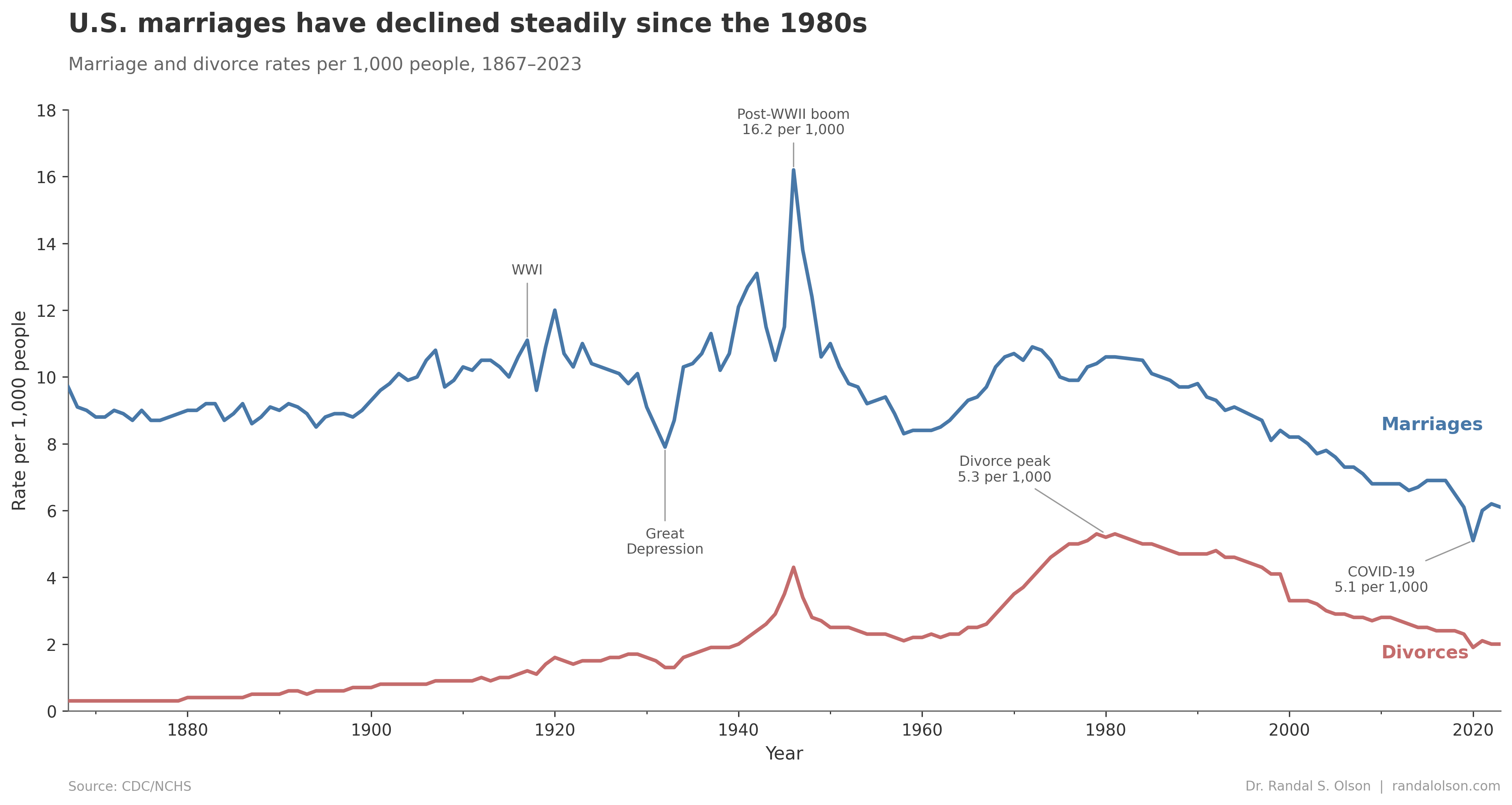
Data source: Data source: CDC National Center for Health Statistics (2000-2023), combined with historical data I scraped from CDC reports back in 2015 (1867-1999).
Tools: Python / matplotlib
BenjaminDrover on
It would make more sense to plot marriages per 1000 single people and divorces per 1000 married people.
rifleshooter on
I grew up in the 70’s and people living together was pretty scandalous. I recall my old Swede immigrant relatives being shocked at the cohabitation in the old country. By the time I graduated from High School in the 80’s, it was expected.
AccurateArcherfish on
Can you plot homicide rates too? I’m curious how seriously people take, “until death do you part.” /s
Ometrist on
Thought Covid would have caused more divorces lol
IBJON on
Big oof on the spike in divorces right after WW2 and right before the boom in marriages. Wonder how many of those were from soldiers marrying young before getting shipped out
makemeking706 on
Now add in second marriages against the rise step sibling p0rn.
bag_of_goldfish on
So as soon as women were allowed to get divorces and live in a society that allowed them to work and support themselves, it seems to have stayed at a pretty stable, if not slightly narrowing ratio of 1/2 marriages ending in divorce? Hard to conceptualize the relationship of number of marriages and number of divorces in this data.
owera1211 on
Might be interesting to divide the data out by age group
7FOOT7 on
How does this work? Does it mean that if there are 10 marriages per 1000 people that 20 people got married? So how long does it take for everyone to get married? 50 years? So at 5 per 1000 that’s about half the population never get married, worse with the number of divorces.

![156 years of marriage and divorce in the United States [OC]](https://www.byteseu.com/wp-content/uploads/2026/03/WU5LaLfCTHubh6bFK_JFeAqBcFFfU81rJWx6JY2DBis-1536x818.png "156 years of marriage and divorce in the United States [OC]")
10 Comments
Data source: Data source: CDC National Center for Health Statistics (2000-2023), combined with historical data I scraped from CDC reports back in 2015 (1867-1999).
Tools: Python / matplotlib
It would make more sense to plot marriages per 1000 single people and divorces per 1000 married people.
I grew up in the 70’s and people living together was pretty scandalous. I recall my old Swede immigrant relatives being shocked at the cohabitation in the old country. By the time I graduated from High School in the 80’s, it was expected.
Can you plot homicide rates too? I’m curious how seriously people take, “until death do you part.” /s
Thought Covid would have caused more divorces lol
Big oof on the spike in divorces right after WW2 and right before the boom in marriages. Wonder how many of those were from soldiers marrying young before getting shipped out
Now add in second marriages against the rise step sibling p0rn.
So as soon as women were allowed to get divorces and live in a society that allowed them to work and support themselves, it seems to have stayed at a pretty stable, if not slightly narrowing ratio of 1/2 marriages ending in divorce? Hard to conceptualize the relationship of number of marriages and number of divorces in this data.
Might be interesting to divide the data out by age group
How does this work? Does it mean that if there are 10 marriages per 1000 people that 20 people got married? So how long does it take for everyone to get married? 50 years? So at 5 per 1000 that’s about half the population never get married, worse with the number of divorces.
And is this first time married? Or all?