
![Germany's East-West happiness gap, 35 years after reunification [OC]](https://www.byteseu.com/wp-content/uploads/2026/03/hgfu5gpybnrg1-950x1024.png "Germany’s East-West happiness gap, 35 years after reunification [OC]")
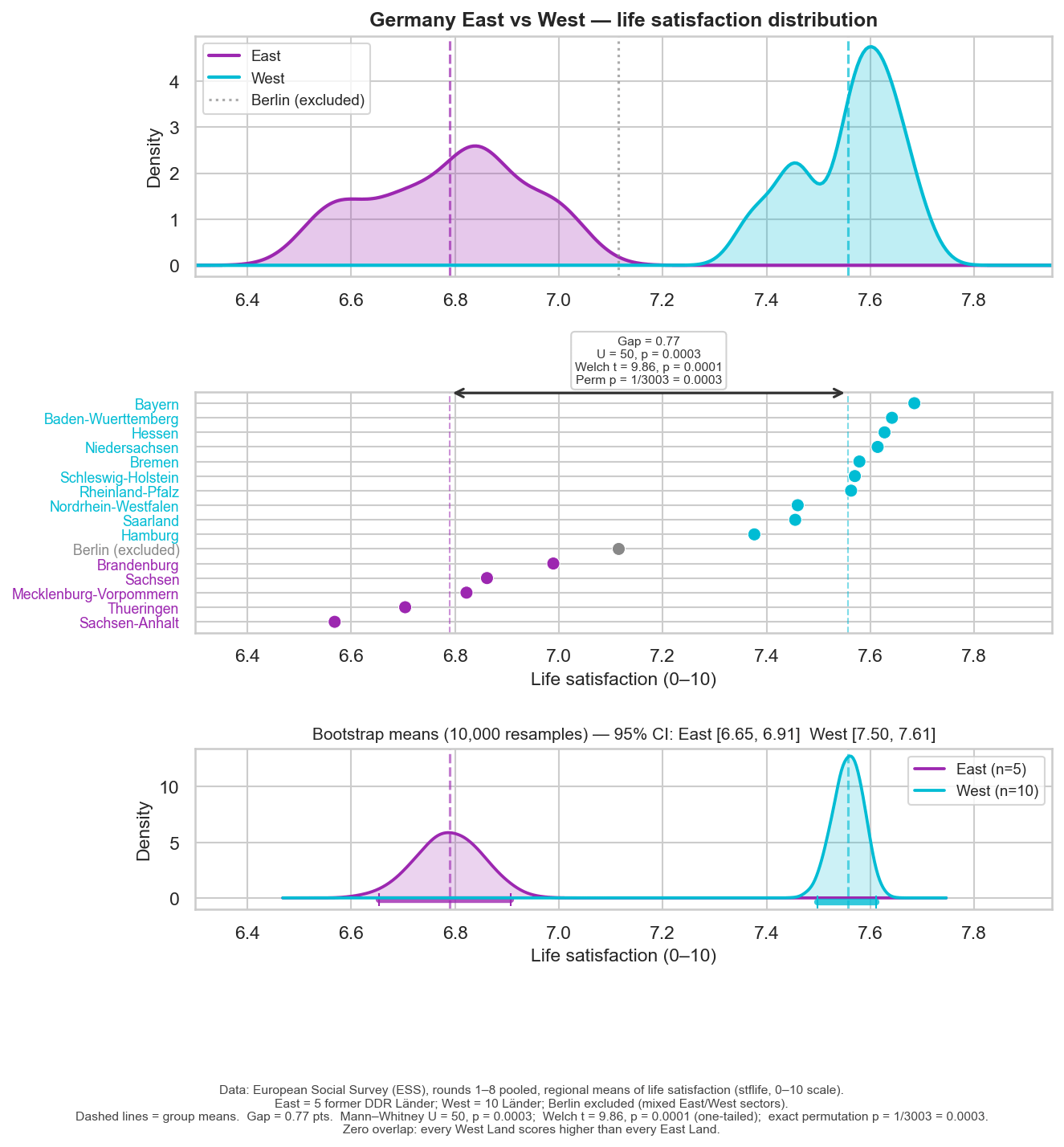
Life satisfaction from the European Social Survey (rounds 1–8, 2002–2016), weighted regional means for 16 German Länder. Berlin excluded from the statistical comparison — the unified city mixes former East and West sectors (shown in gray).
Top: density distributions for East and West. Middle: all 16 Länder ranked, with individual data points. Bottom: bootstrap 95% confidence intervals (10,000 resamples) — no overlap.
Gap = 0.77 points on a 0–10 scale. Exact permutation test across all 3,003 possible groupings: p = 0.0003.
Posted by Effective-Aioli1828
13 Comments
I wonder why Hamburg does so poorly. It’s doing well economically and there is no clear city-state factor since Bremen (which is less economically successful) fares better.
Although they may be significantly different the range we are discussing here is only 6.4 to 7.8.
It would be interesting to see this in comparison to other European countries.
What’s going on in Sachsen Anhalt?
Soviet authoritarian system of governance fucks up society for generations. Quelle surprise.
Very interesting graph actually
Interesting data, I would be interested to see if there is a trend along years, if east/west differences increase/decrase between the half older and half more recent datasets
?
I’ve seen some signals pointing in the same direction in more recent self-reported mood data, though obviously with a very different methodology and much more sampling bias.
What’s the point of bootstrap in this case? If it’s to calculate CI why not use the original data? (Genuine question)
> European Social Survey (rounds 1–8, 2002–2016),
Why is it 14 years but the numbers in the image look like a single point of time? Is this from a specific year?
Data: European Social Survey rounds 1–8 (2002–2016), weighted regional means for 16 German Länder. Tools: Python, matplotlib, scipy
“East Germans are 8% less happy than west Germans”
Way less exciting headline, no?
This graph feels like deliberate manipulation of opinion to me. The choice of x-axis range is arbitrary, making the data range feel much larger than it actually is
I don’t know what 0-10 scale means here, but assuming it’s linear, then we have a 7.7% effect size.
Am I the only one Lu one who thinks the data should be flipped so west is on the left and east is on the right??
I would be miserable too if I was surrounded by right wing idiots