I run for the exits every time some political scientist tries to create a single index for all possible varieties of institutional set-up (or even worse: tries to draw conclusions from it). It’s a translation of qualitative to (supposedly) quantitative measures that just loses too much detail to be workable.
Rooilia on
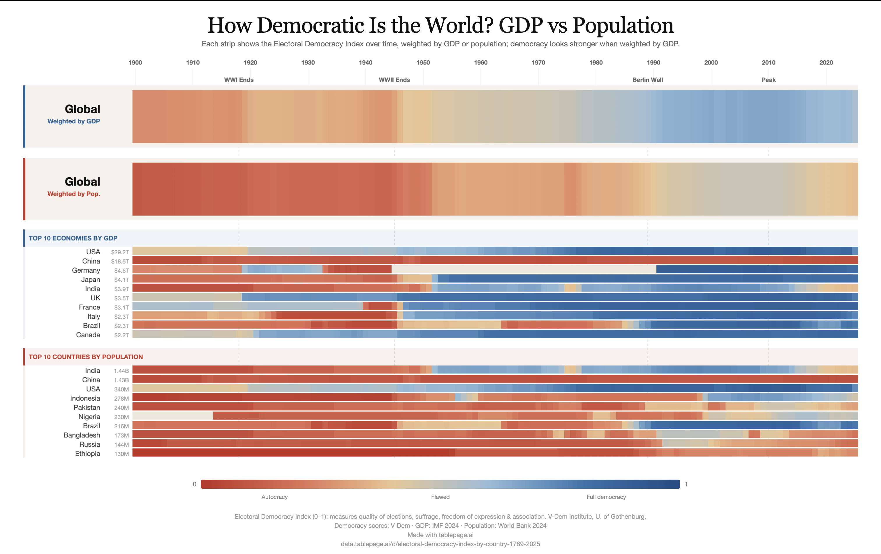
Why didn’t you implement the duality of Germany during the cold war?
goldbeater on
The States and Canada appear very Sinclair.nI would think there would be more of a difference given that there is a big difference.
ImpressiveMethod1659 on
I love this! Where did you get the data from?
(Edit: just saw the links for the data)
3rdhottestgirl on
Seeing the slightly blue strip turn red for the population at the end is so sad. We’re losing everything we hold dear
TA-MajestyPalm on
I’m sure people will nitpick but honestly really cool graphic showing how things change over time.
As someone living in the US seeing the “global” bar stay mostly on the red half is wild. Really puts things into perspective
Bigthunderrumblefish on
The world wishing that America was still as democratic as it was in 2010
YongeBlood on
I guess we are taking some liberties here on the definition of democratic

![[OC] How Democratic Is the World? GDP vs Population](https://www.byteseu.com/wp-content/uploads/2026/04/0ua0d1c4aksg1-1536x965.png "[OC] How Democratic Is the World? GDP vs Population")
9 Comments
Data:
V-Dem Electoral Democracy Index: [https://www.v-dem.net/data/the-v-dem-dataset/](https://www.v-dem.net/data/the-v-dem-dataset/)
IMF World Economic Outlook (WEO): [https://data.imf.org/en/datasets/IMF.RES:WEO](https://data.imf.org/en/datasets/IMF.RES:WEO)
World Bank Population, total: [https://data.worldbank.org/indicator/SP.POP.TOTL](https://data.worldbank.org/indicator/SP.POP.TOTL)
Explored with [data.tablepage.ai/d/electoral-democracy-index-by-country-1789-2025](http://data.tablepage.ai/d/electoral-democracy-index-by-country-1789-2025)
I run for the exits every time some political scientist tries to create a single index for all possible varieties of institutional set-up (or even worse: tries to draw conclusions from it). It’s a translation of qualitative to (supposedly) quantitative measures that just loses too much detail to be workable.
Why didn’t you implement the duality of Germany during the cold war?
The States and Canada appear very Sinclair.nI would think there would be more of a difference given that there is a big difference.
I love this! Where did you get the data from?
(Edit: just saw the links for the data)
Seeing the slightly blue strip turn red for the population at the end is so sad. We’re losing everything we hold dear
I’m sure people will nitpick but honestly really cool graphic showing how things change over time.
As someone living in the US seeing the “global” bar stay mostly on the red half is wild. Really puts things into perspective
The world wishing that America was still as democratic as it was in 2010
I guess we are taking some liberties here on the definition of democratic