Here are some maps about the sources of utility-scale power generation and a slide on net electricity balance to add context. There are two important caveats:
1. There is a small amount of distributed generation that isn’t captured in the data. This is probably responsible for Hawaii’s small deficit in electricity production in this data. It isn’t able to import electricity but that difference is likely made up by rooftop solar. In most states, this amount is negligible.
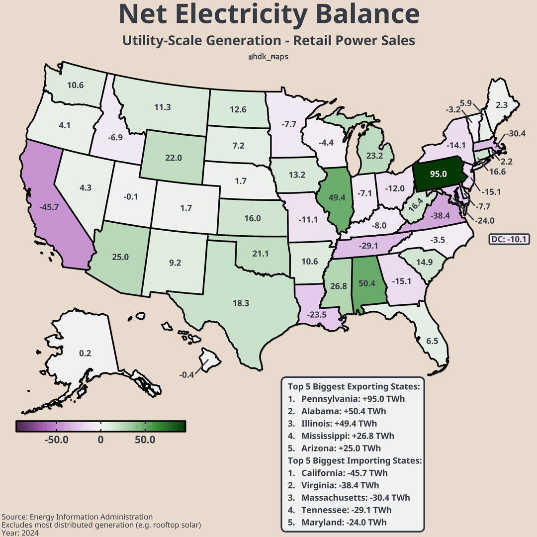
2. There is a significant amount of trading of electricity between states. I included the final slide on net electricity balance because some states have electricity supplies that look cleaner than they are because they import dirtier energy from other states. For example, when I was growing up in Seattle there was some controversy around Puget Sound Energy buying electricity from a coal power plant in Montana. I suspect something similar is happening in my current home state of Virginia, which needs to import (on net) around 28% of its electricity. While Virginia generates very little power with coal, West Virginia is a net exporter of electricity which relies heavily on coal.
3. Another less important note on net electricity balance is that it doesn’t account for losses in transmission, which is a major reason for why the state-level surpluses add up to more than the deficits.
get_eia <- function(endpoint, api_key, params = list(), years = NULL) {
base <- paste0(“https://api.eia.gov/v2/”, endpoint)
if (is.null(years)) {
res <- GET(base, query = c(list(api_key = api_key), params))
json <- fromJSON(content(res, “text”), flatten = TRUE)
return(json$response$data)
}
results <- lapply(years, function(y) {
message(“Pulling year: “, y)
query <- c(
list(api_key = api_key),
params,
list(start = y, end = y)
)
res <- GET(base, query = query)
json <- fromJSON(content(res, “text”), flatten = TRUE)
df <- json$response$data
if (!”period” %in% names(df)) {
df$period <- y
}
Sys.sleep(0.2)
return(df)
})
out <- bind_rows(results)
return(out)
}
gen_all <- get_eia(
“electricity/electric-power-operational-data/data/”,
api_key,
list(
frequency = “annual”,
`data[0]` = “generation”,
`facets[sectorid][]` = “98” #Electric Power = 98
),
years = 2024
)
cons <- get_eia(
“electricity/retail-sales/data/”,
api_key,
list(
frequency = “annual”,
`data[0]` = “sales”
),
years = 2024
) #retail sales
citizensnips134 on
Bad colors. 0% should be distinct, not on the gradient, like grey or red.
KellerTheGamer on
Could we get the last map as a portion of the total power usage? Feels like that might be more useful in some ways
901pohbear on
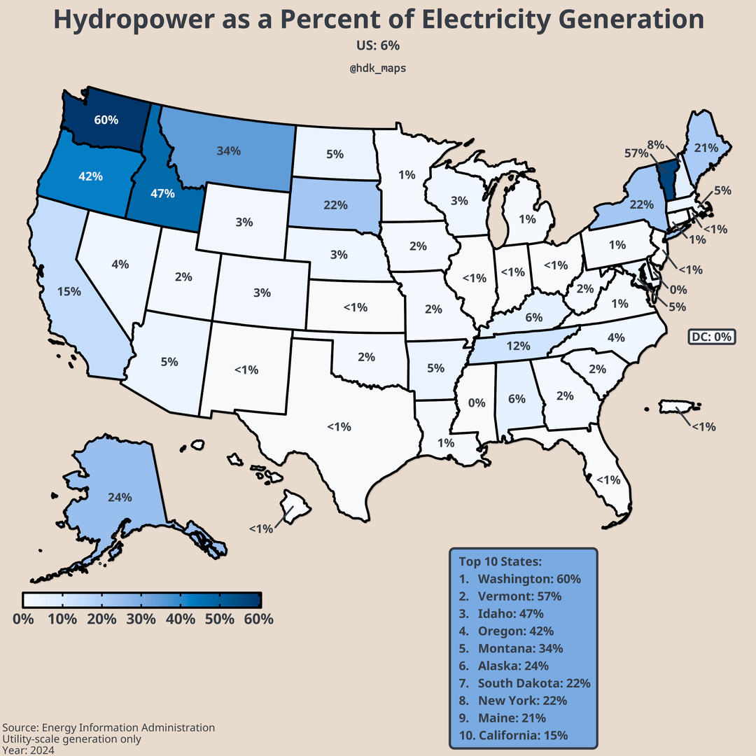
Very surprised Tennessee doesn’t have more hydropower
GeorgeCauldron7 on
I thought Texas had an isolated power grid? How is it an exporter?
ennuiui on
I think something’s missing for Hawaii. These charts show that it gets 8% of its power from wind, 8% from solar and less than 1% from hydro, but 0% from nuclear, natural gas and coal. Where does the rest of its power come from?
Edit: ah, I think we’re missing a slide on power from petroleum power generation.
YoBroMo on
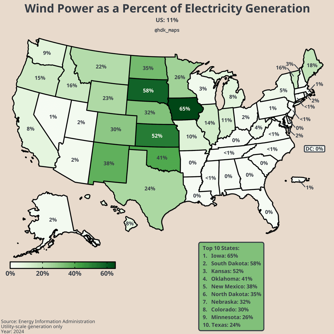
Iowa is impressive. At least all that wind is useful.
michaelswallace on
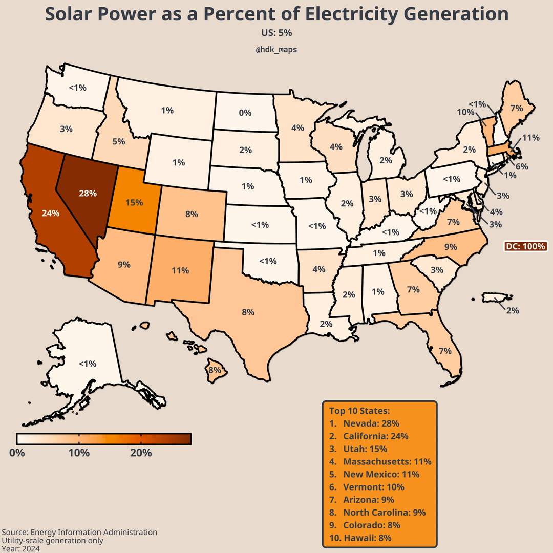
I like how DC is 100% solar. Obviously there’s not any big power plant in the city and it’s importing it’s power, but I like to think that one single home has a rooftop solar panel that counts as all of the energy generated within city limits.
the_kid1234 on
Seems like California could use some more reactors.
Helicase21 on
This isn’t really useful or correct when thinking about the grid. It’s a fine visualization but utilities in one state owning, or contracting for via power purchase agreement, generation located in another is a really common state of affairs. Not to mention cross-state utilities.
5timechamps on
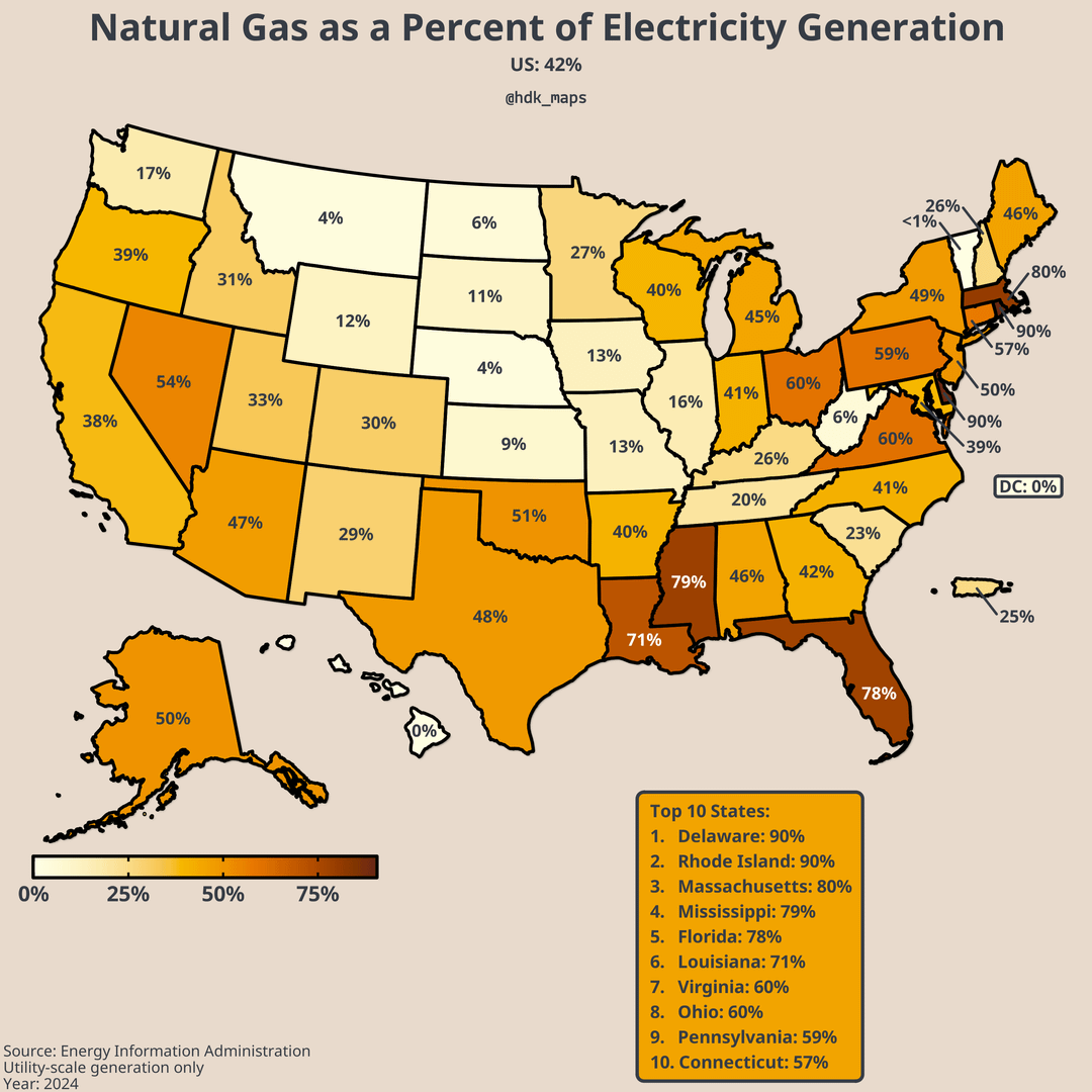
I would be really interested to see PA’s mix 20 years ago…crazy that they are down to just 5% coal. I know they had several large natural gas plants come online the last 10 years or so.
So_spoke_the_wizard on
Wild that some of the most green energy hostile states have the highest percentage of wind power.
hornswoggled111 on
Wtf Florida. The place should be nearly fully solar.
And the irony of them being so vulnerable to climate change.
godspareme on
Arizona is really lacking in solar power generation for being the sunniest state in the US.
Satherian on
I’d love to see the same maps, but for each grid
KudosOfTheFroond on
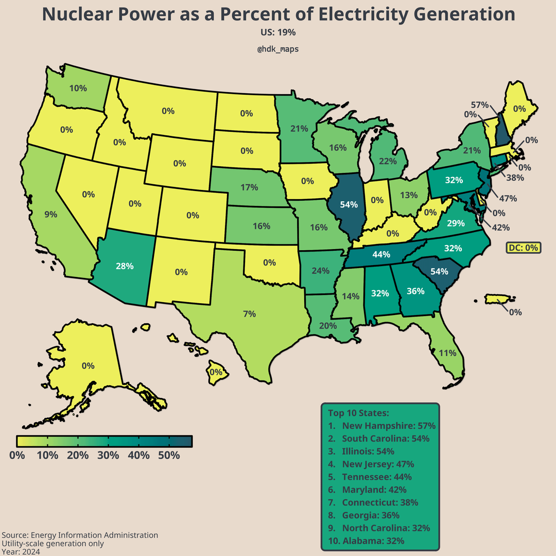
What’s the deal with New Hampshire having such a high rate while every state surrounding it is at 0?
Kerbidiah on
Crazy to see LA so high on gas and so low on hydro when they have so much water flowing through the state constantly
Numbers have grown. Most energy west of the Mississippi now comes from renewables (wind, solar, batteries, hydro). California today was 33% solar. Texas was 13% solar.
How there isn’t more solar rolled out nation wide is baffling. Easily one of the biggest energy policy bungles in our nations history that will continue to set us back decades.
KnotSoSalty on
Just a few years ago California nearly shuttered Diablo Canyon, it’s last nuclear power plant.

![[OC] Sources of Utility-Scale Power Generation in the US](https://www.byteseu.com/wp-content/uploads/2026/04/w76ckusi0ssg1-1024x1024.png "[OC] Sources of Utility-Scale Power Generation in the US")
22 Comments
Here are some maps about the sources of utility-scale power generation and a slide on net electricity balance to add context. There are two important caveats:
1. There is a small amount of distributed generation that isn’t captured in the data. This is probably responsible for Hawaii’s small deficit in electricity production in this data. It isn’t able to import electricity but that difference is likely made up by rooftop solar. In most states, this amount is negligible.
2. There is a significant amount of trading of electricity between states. I included the final slide on net electricity balance because some states have electricity supplies that look cleaner than they are because they import dirtier energy from other states. For example, when I was growing up in Seattle there was some controversy around Puget Sound Energy buying electricity from a coal power plant in Montana. I suspect something similar is happening in my current home state of Virginia, which needs to import (on net) around 28% of its electricity. While Virginia generates very little power with coal, West Virginia is a net exporter of electricity which relies heavily on coal.
3. Another less important note on net electricity balance is that it doesn’t account for losses in transmission, which is a major reason for why the state-level surpluses add up to more than the deficits.
Data: US Energy Information Administration API
Tools: R (packages: dplyr, ggplot2, sf, usmap, tools, ggfx, grid, scales, cowplot, showtext, sysfonts, colorspace)
library(httr)
library(jsonlite)
library(tidyverse)
get_eia <- function(endpoint, api_key, params = list(), years = NULL) {
base <- paste0(“https://api.eia.gov/v2/”, endpoint)
if (is.null(years)) {
res <- GET(base, query = c(list(api_key = api_key), params))
json <- fromJSON(content(res, “text”), flatten = TRUE)
return(json$response$data)
}
results <- lapply(years, function(y) {
message(“Pulling year: “, y)
query <- c(
list(api_key = api_key),
params,
list(start = y, end = y)
)
res <- GET(base, query = query)
json <- fromJSON(content(res, “text”), flatten = TRUE)
df <- json$response$data
if (!”period” %in% names(df)) {
df$period <- y
}
Sys.sleep(0.2)
return(df)
})
out <- bind_rows(results)
return(out)
}
gen_all <- get_eia(
“electricity/electric-power-operational-data/data/”,
api_key,
list(
frequency = “annual”,
`data[0]` = “generation”,
`facets[sectorid][]` = “98” #Electric Power = 98
),
years = 2024
)
cons <- get_eia(
“electricity/retail-sales/data/”,
api_key,
list(
frequency = “annual”,
`data[0]` = “sales”
),
years = 2024
) #retail sales
Bad colors. 0% should be distinct, not on the gradient, like grey or red.
Could we get the last map as a portion of the total power usage? Feels like that might be more useful in some ways
Very surprised Tennessee doesn’t have more hydropower
I thought Texas had an isolated power grid? How is it an exporter?
I think something’s missing for Hawaii. These charts show that it gets 8% of its power from wind, 8% from solar and less than 1% from hydro, but 0% from nuclear, natural gas and coal. Where does the rest of its power come from?
Edit: ah, I think we’re missing a slide on power from petroleum power generation.
Iowa is impressive. At least all that wind is useful.
I like how DC is 100% solar. Obviously there’s not any big power plant in the city and it’s importing it’s power, but I like to think that one single home has a rooftop solar panel that counts as all of the energy generated within city limits.
Seems like California could use some more reactors.
This isn’t really useful or correct when thinking about the grid. It’s a fine visualization but utilities in one state owning, or contracting for via power purchase agreement, generation located in another is a really common state of affairs. Not to mention cross-state utilities.
I would be really interested to see PA’s mix 20 years ago…crazy that they are down to just 5% coal. I know they had several large natural gas plants come online the last 10 years or so.
Wild that some of the most green energy hostile states have the highest percentage of wind power.
Wtf Florida. The place should be nearly fully solar.
And the irony of them being so vulnerable to climate change.
Arizona is really lacking in solar power generation for being the sunniest state in the US.
I’d love to see the same maps, but for each grid
What’s the deal with New Hampshire having such a high rate while every state surrounding it is at 0?
Crazy to see LA so high on gas and so low on hydro when they have so much water flowing through the state constantly
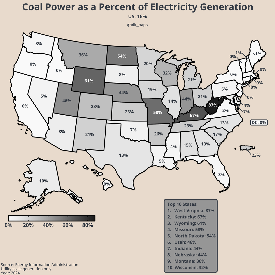
Pennsylvania is the power house of the america.
How does this count [Intermountain Power Plant](https://en.wikipedia.org/wiki/Intermountain_Power_Plant) which is located in Utah, but operated by Los Angeles DWP.
Numbers have grown. Most energy west of the Mississippi now comes from renewables (wind, solar, batteries, hydro). California today was 33% solar. Texas was 13% solar.
[https://www.eia.gov/electricity/gridmonitor/dashboard/daily_generation_mix/regional/REG-CAL](https://www.eia.gov/electricity/gridmonitor/dashboard/daily_generation_mix/regional/REG-CAL)
How there isn’t more solar rolled out nation wide is baffling. Easily one of the biggest energy policy bungles in our nations history that will continue to set us back decades.
Just a few years ago California nearly shuttered Diablo Canyon, it’s last nuclear power plant.