
![Beijing has warmed dramatically over the past century — especially from 2010 onwards 🔥 [OC]](https://www.byteseu.com/wp-content/uploads/2026/04/7832x2ays5tg1-1536x1024.png "Beijing has warmed dramatically over the past century — especially from 2010 onwards 🔥 [OC]")
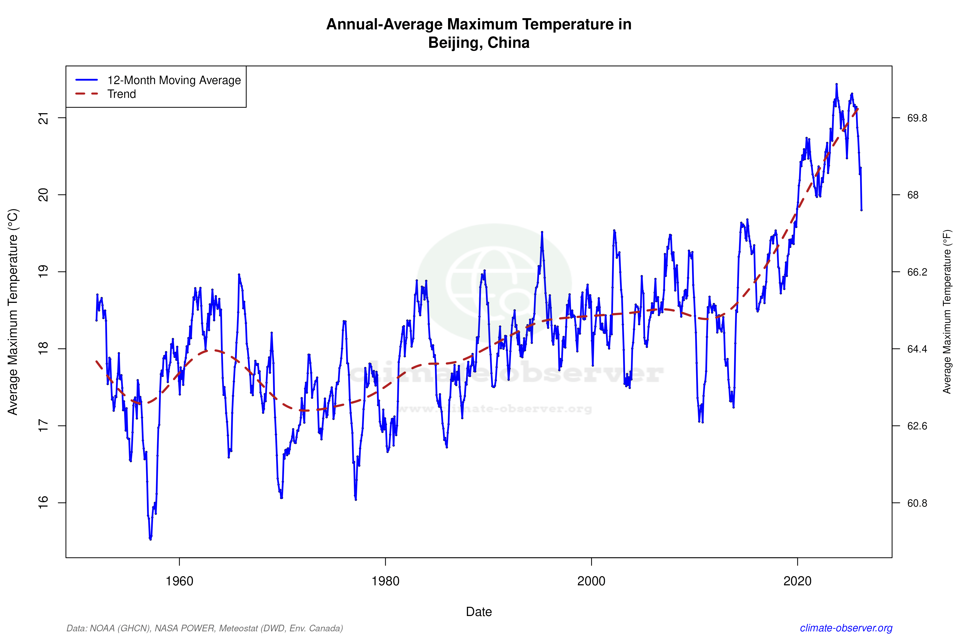
This chart shows the evolution of maximum temperatures in Beijing since the 1950s using an annual moving average.
While there’s natural variability in individual years, the longer-term trend points to a steady increase. The past decade stands out, with fewer cooler years and more frequent higher-temperature observations compared to earlier decades.
There does seem to be a recent cooling however, but will be interesting to see how this pans out and if it ever reverts to more cooler levels.
Webpage: https://climate-observer.org/locations/CHM00054511/beijing-china
Posted by BarqaLFC
7 Comments
I think we have 10 or less years to enjoy the Earth as we know it, but that’s just me.
As much as this is concerning when it comes to climate change, personally I think 20°C is definitely a better temperature than 18°C.
Fun fact, burning coal is one of the primary reason fish has so much mercury inside them.
Even with the warming increasing there will also be invisible impacts.
I wonder what happens when we disentangle the effect of urban heat island from changing local climate patterns
Why is the maximum temperature used? I would have thought using an hourly temperature would be better for this?
This data is useless without know exactly where the meter for it was located the entire period. And it is unlikely to even be the same one and the same place, given the time frame. You could get these readings simply from being in a park in 1960, which became a car park in 2015. By itself, this is meaningless data.
That cooling isn’t really meaning much though, I saw a video on Iceland having had multiple cold years and by the end of that same year they were just full on warming schedule again. We in the Netherlands had a dip around 2010, and then 2013 but those were the last single-digit (°C of course duh) years while single-digit annual averages were average in the past.