
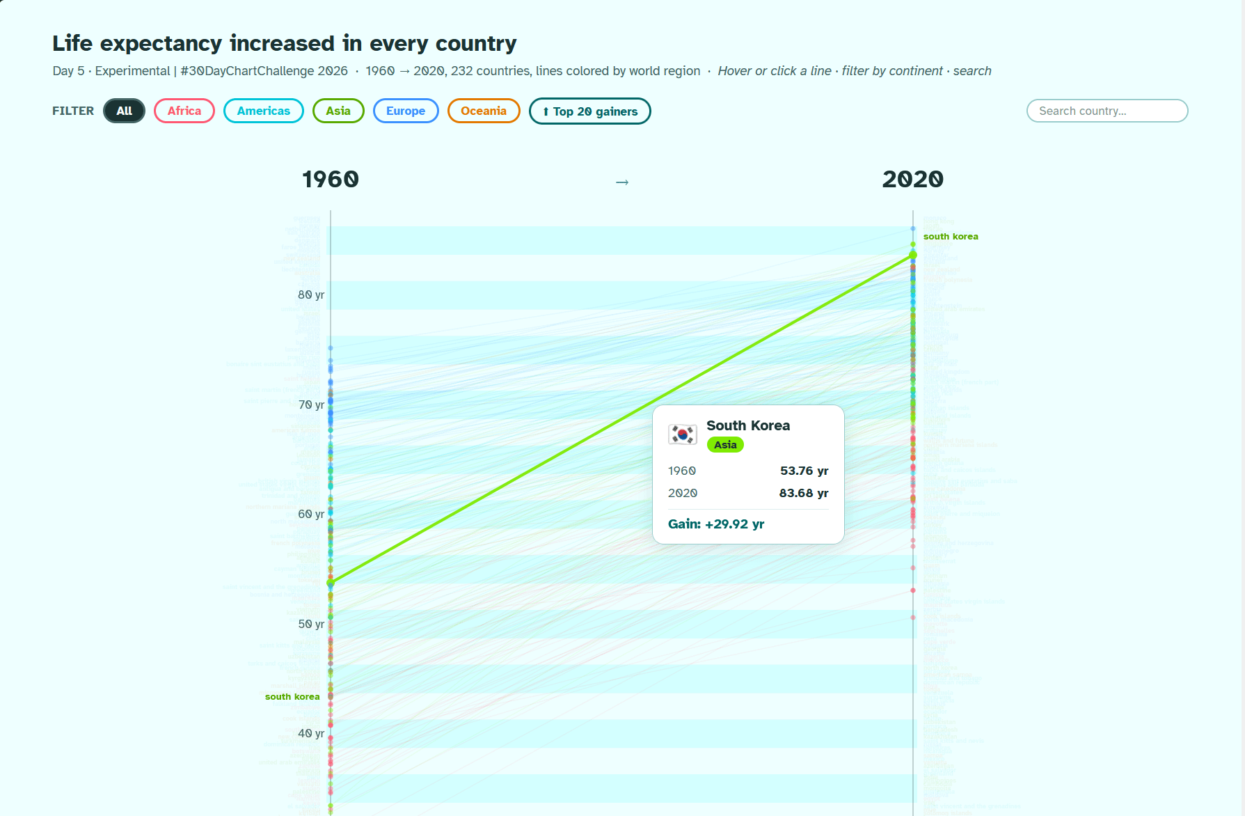
![[OC] Life expectancy increased across all countries of the world between 1960 and 2020 -- an interactive d3 version of the slope plot](https://www.byteseu.com/wp-content/uploads/2026/04/e3p9sit69btg1-1536x1006.png "[OC] Life expectancy increased across all countries of the world between 1960 and 2020 — an interactive d3 version of the slope plot")
INTERACTIVE PLOT: https://ikashnitsky.phd/x/d3/05-experimental.html
Tools: R, d3, perplexity
Data: Our World in Data
R code: https://github.com/ikashnitsky/30daychart2026/blob/main/src/05-experimental.r
Perplexity chat: https://www.perplexity.ai/search/day-5-experimental-for-today-i-ldYZ2qw3Q3qBmwhhF902CQ
Posted by ikashnitsky
2 Comments
I’m curious what this looks like if you filter out infant mortality. As in, conditioned on making it to age 15, what is your life expectancy? and how that’s changed
This is really clean. The slope view makes the global trend obvious, but what stood out to me was how tight most countries cluster by 2020.
Did you notice any regions where progress stalled or slowed compared to others? Feels like there’s probably some interesting outliers hiding in there.