Data: World Inequality Database via {wid}
Tool: R
🔗 #rstats code: https://github.com/ikashnitsky/30daychart2026
🧙♂️ pplx chat: https://www.perplexity.ai/search/day-9-wealth-let-s-explore-wor-OrnqM3hMTa2y1_VvXZDOYA
Posted by ikashnitsky

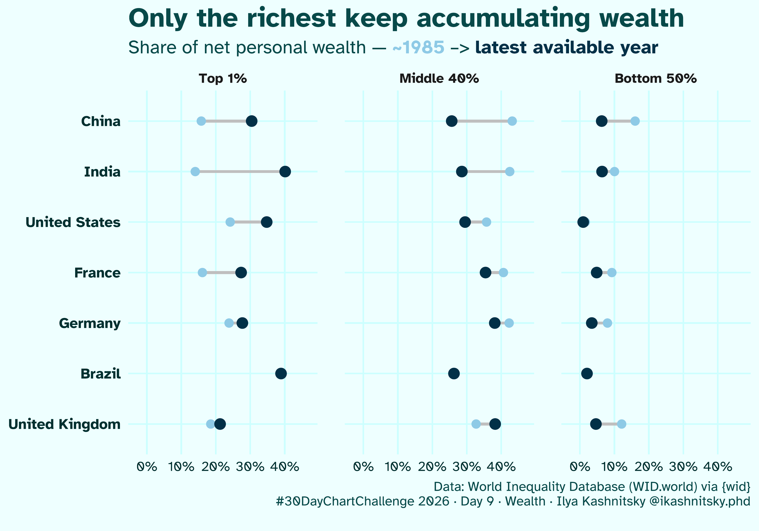
![[OC] Wealth distribution changes since 1985: richest get filthy rich 👑](https://www.byteseu.com/wp-content/uploads/2026/04/qrq8c3k7v4ug1-1536x1075.png "[OC] Wealth distribution changes since 1985: richest get filthy rich 👑")
Data: World Inequality Database via {wid}
Tool: R
🔗 #rstats code: https://github.com/ikashnitsky/30daychart2026
🧙♂️ pplx chat: https://www.perplexity.ai/search/day-9-wealth-let-s-explore-wor-OrnqM3hMTa2y1_VvXZDOYA
Posted by ikashnitsky
26 Comments
This would look better with the percentage on the vertical and year on the horizontal axis. You could make the countries different colors and the whole thing would be much more intuitive.
The rich got filthy rich. Everyone else got quite a bit richer.
Since 1985, the pie has grown tremendously. China is the clearest example of that. In 1985, the GDP there was about 310B. Today, in 2026, it’s around 20000B. That’s a 65x increase. Going with rough numbers from the graph, the middle class was sharing 139B. Today, they share 5000B. That’s a 36x increase. Adjust for a 40% population increase, and you still get about 25x.
Of course, in other places the difference is less dramatic. In my opinion, you still need to be a nutcase to preach against the rich getting filthy rich as a side effect.
The title on the chart doesn’t match the data. This is share of wealth, not absolute wealth.
If in 1985 we all shared $100 say, the 1% have $30, middle $40, bottom $30.
If now we all share $300 and say the top have $150, the middle have 90, the bottom have $60.
They are all more wealthy, they have all accumulated wealth, just the increase is uneaven. You would rather be poor now rather than then.
Did Brazil stay exactly the same, or there is no 1985 data? If no data, why even include it in the plot?
The presented data does not support the headline in the slightest. “Share of wealth” does say nothing about the absolute amont of wealth.
I don’t understand what the x axis represents
This visualization is a bit hard to read. Maybe making the time ends more clear? 1985 to now.
but it is quite scary appreciating the data it quantifies the disappearing middle class in America and the oligarchy currently running the country.
Everyone is heading towards Brazil.
Confusing visualization.
I’ve never seen a chart before with top 1% on the left and bottom 50% on the right. Usually they go from left to right.
Regarding the data … It’s not very helpful. Share of net wealth doesn’t really translate to quality of life. The bottom 50% in China are many times better off now than they were in 1985.
With the UK middle bucking the trend quite significantly? Am I reading that right? It would certainly go against the accepted narrative over here.
What a lousy way to display data
The title asserts that “only the richest keep accumulating wealth” but figure only tracks the ratio of all total wealth held by each group. This is problematic for at least two reasons. First, it could be that people in the non-rich groups are also accumulating wealth even if their share of wealth is dropping. Second, it’s possible that people have transitioned between these groups since 1985 — eg, from the top 1% to the middle 40% or out of the bottom 50%. To a great extent, this figure is misinformation as presented; the most ethical thing OP could do with this post at this point is delete it.
Ngl situation is dire in India
Your title and your graph show different things. For example, the Chinese economy has grown 64x since 1985.
So a person whose personal share of net wealth has declined by 95% would still be doing many times better today than they were in 1985 in absolute purchasing power.
Can you also include top 0.1% and bottom 90%
Ofc ppl come out of the woodworks and defend the rich – even on a thread like this. How long does it take until we understand? Do we want kings back?
I don’t even know what this is saying.
If the graph is not easily understood as soon as its read – then it’s not great or beautiful. They aren’t meant to be deciphered.
I don’t understand the data as displayed in this graph. I’ve worked on a plethora of data visualization about wealth inequality, and the divide of wealth in the USA in particular has increased substantially. The data here claims a wildly different story. Further, China has actually decreased their billionaire count in the last decade, and the wealth gap along with it. I don’t know how it compares to 1985, but I think it is important to note.
Socialism with Chinese characteristics = capitalism.
I like how in the US, the bottom 50% just always had nothing.
Visually I find this chart hard to read, but perhaps it’s just me.
bro just draw arrows sheesh
Ok, am I dumb or is the top ~10% missing from this?
Bottom 50: 0-49th percentile
Middle 40: 50-89th percentile
Top 1: 99th percentile
Would also be interesting to see how scandinavia performs
The size of the pie is more important than the distribution of the pie. In other words, everyone is better off.
This is only looking at distribution and not overall wealth. Overall wealth has grown too, everyone’s getting richer!