

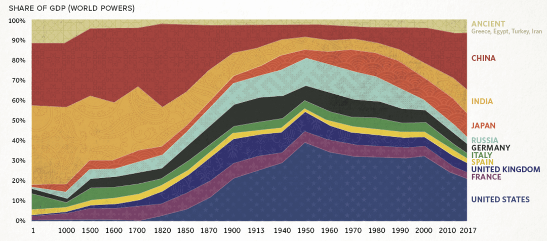
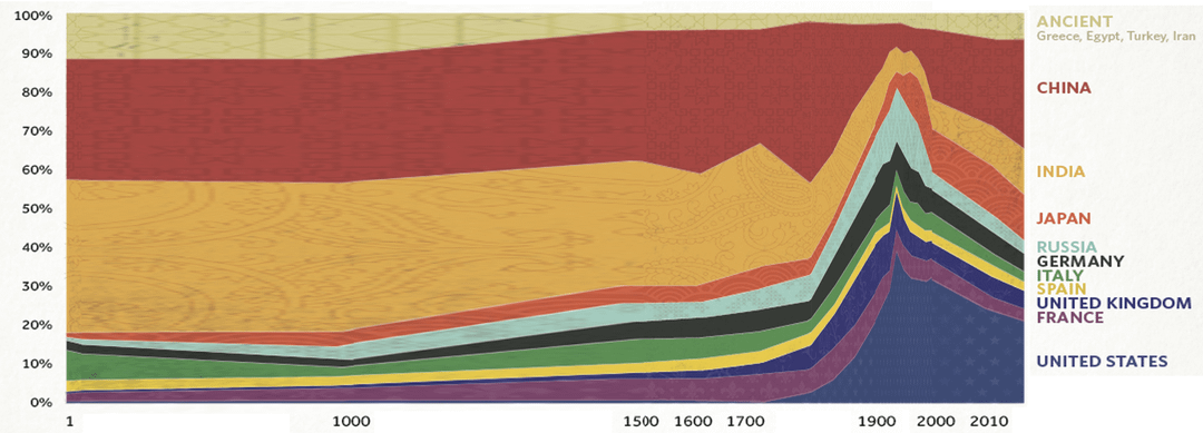
Annoyed by this chart's nonsense x-axis… I get that it looks prettier and that we don't have a lot of hard data on economies between 1 and 1500… but still couldn't resist the urge to do a quick re-stretch of their data to a consistent scale… https://www.visualcapitalist.com/2000-years-economic-history-one-chart/
Posted by DestructiveSeaOtter
24 Comments
What is that inflection point in the late 1940s? End of WWII?
Props to Spain, France and Italy for keeping it pretty stable for the whole history. And to the guy who calculated GDP of Spain in 1 a.d. somehow.
It’s too bad GDP is unreliable before the first half of the 20th century and complete garbage before the Industrial Revolution
Really well done! When I first saw this graph I had the same urge lol although mine was a lot less pretty because I just stretched different sections of the chart lol
It looks pretty but any pre-1900 GDP data is shot in the dark guesses.
i learnt at school UK had 25% of global gdp at peak, and london was busiest port in the world, is this not true
OMG I love this fix! The original spacing was driving me nuts lol, this makes so much more sense visually.
How exactly did Spain not increase in GDP when they had the largest colonial empire?
What the heck is Russia before 1000? Did I miss something in history lessons?
the whole graph is unreliable, shows china as the same contribution to global gdp in 2017 as US + france + UK when it had just over half of the combined gdp of the 3 (china had ~12.88 trillion USD gdp in 2017, US france and uk combined had 24.88 trillion (US alone had 19.68 trillion))
Great fix, and I love that it highlights how central India and China were to history.
But it also raises so many questions
– Where are the Islamic empires? Mongol Empire?
– Italy, Spain, and France didn’t exist in 1 AD.. Or 1000 AD.. so what do those lines mean?
– Iran, Turkey etc are lumped together as ancient civilizations … but they still exist??
So now I don’t know what I’m looking at
How does that work
Like (almost) all of these countries only got their recent border within the last 100 years. Heck, most of them didnt even exist.
Great Britain came out of nowhere at the start of 19th century to quickly become a big power, and interesting how at the same time India declined.
Great chart though. But I do wish we also had Netherlands and Portugal which were big powers around 16th 17th centuries. Also Turkey should’ve been its own category given the Ottoman power around 15th century. The chart gives too much weight in the past 300 years even though it begins all the way at year 1.
Why isn’t pre-Columbian America included? I quickly scanned the source and I didn’t see an explanation. I might have missed it.
Ok this isn’t real though.
– There’s no representation of Africa or pre-US Americas.
– No Mongols
– No Middle East
– More importantly, what does it measure? The reason for the dramatic difference in the power of nations is each person’s productive capacity *above subsistence activities*. The simple reason why empires formed was state capacity to improve and capture productivity, leading to the extra resources needed for technology, military, infrastructure, etc. But for the vast majority of human history and in the vast majority of places, people basically just scraped by. GDP in the modern sense applies little to millions or billions of people living on the land and just feeding themselves.
What about ancient Rome? It had like 30 % of the worlds total population
India getting completely robbed of GDP for almost 300 years, the reversion to the mean will happen because of population and colonialism being gone
I really don’t mind the x-axis scale on the first one. In my opinion, you made it harder to visualize the only part of the graph that have trustworthy data.
Ancient Greece is making a comeback then is it.
Is Ancient Greece’s economy still going?
Yeah… Charts about broad estimates of guessed numbers of extrapolated historical conjectures of various currencies that had unknown values on a global market that didn’t exist…
Was there ever an era in which GDP data is reliable across the world? Like are we really taking 1st century historical guesses, mixing them with Renaissance bookkeeping and Cold War Soviet reports and pretending like this data is anything other than misinformation?
Not to mention that none of these countries existed for these entire time periods. The geographical area covered by China now was several countries in AD 1000 and was subsumed into Mongolia for the entier 12th century. Italy in AD 1 was THE ROMAN EMPIRE. Greece and Egypt were wholly subsumed under its government and had been for more than a century. The Mongol Empire in 1227 spread from Korea to Poland and yet somehow its GDP does not even appear as a blip? The Arab Empire spread from Persia to Spain in 1000AD but apparently there were no financial transactions during that time? Africa somehow doesn’t exist? The Malian Empire?
And the stretched version still doesn’t equalize the x-axis and has the decade from 2000 to 2010 the same size as the previous century.
What are we even doing here?
Displays the data better unedited IMO. The world changes faster and faster the closer you get to the present day. Compressing earlier history and expanding later history captures that elegantly.
I feel like this chart has skipped the British empire…