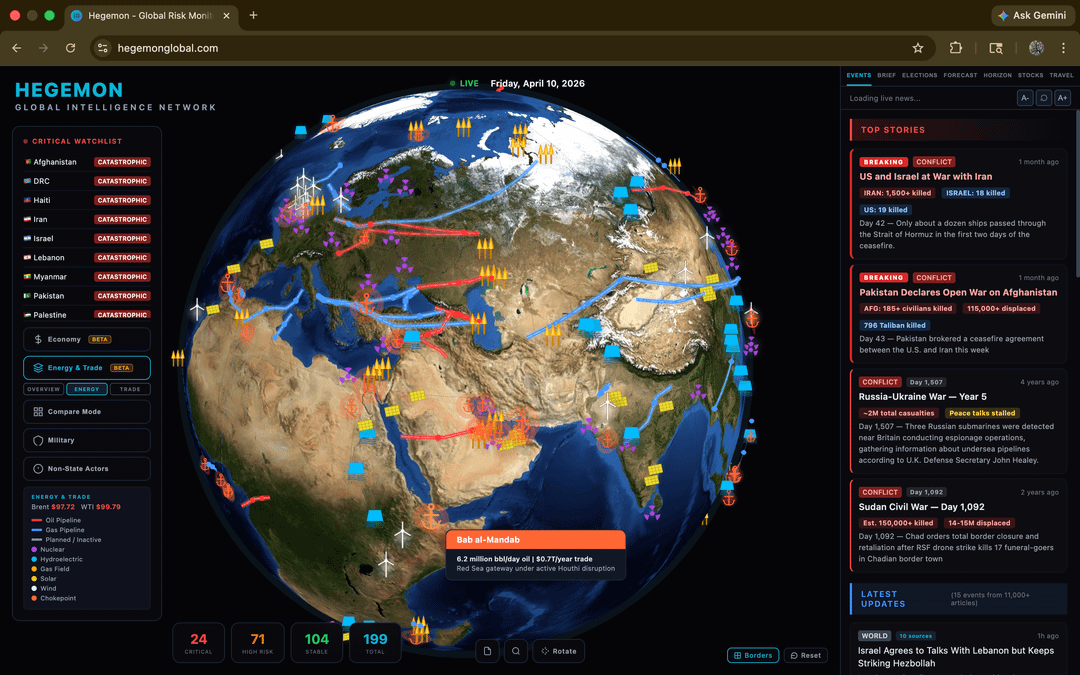
[OC] Major updates to my geopolitical intelligence platform. I added energy infrastructure, economic risk profiles, AI intelligence briefings, election tracking, non-state actors, travel advisories, and expanded all datapoints. 199 countries, hundreds of sources, and free. Would love any feedback!
Wouldn’t it be easier to have a flat map? Just for visualisation. For the events, I would probably want to have a separate tab for that, and have the focus of the globe/map with it, maybe a small 1/4 part of the UI will be focused on the news that are incoming/new.
The energy and trade tab is hard to see which places are going from where, maybe a filter of countries where users can focus on are good? With legend filters as well.
Oops there’s a bug I found. Energy Trade Tab -> Trade -> Compare -> For now I clicked Oman and it just went dark lol.
mfive_ on
Bookmarked. Great Overview, concise status reports for countries with news links to back it up.
Weirdly enough reminds me a lot of the browser game nationstates . net
The military view could use some UI help. The cubes are often clumped up and sometimes janky to click. Smaller or dynamic icons or more zoom might fix that.
Equivalent-Ask2542 on
Incredible! One thing I found: the Russia-Ukraine War is summarised and below that are the headlines of recent news. Why are the first 5 headlines all from today and then there is a gap to the sixth headline of 26 days? I am sure the war did not pause so I assume it is a filter or request-response issue. Just wanted to let you know. Keep it up, very cool project!
Vancocillin on
Reminds me of a game Terra Invicta.
I looked on the site as to how all the info is aggregated and displayed, but couldnt find an “about” button. Is it AI skimming news websites, or is it organized more by people?
mortenlu on
Seems upcoming elections should be sorted by date.
Noxxstalgia on
When I zoom in the giant dots are the same size. Makes it hard to select stuff in Israel and area.
lotionan on
You are missing like 98% of all nuclear power plants in this map.
Is the TikTok vibe coded template? Looks good but it’s just too much noise. There’s no use case for YET ANOTHER news aggregator
Moldovah on
This is so freakin cool bro
DesperateSteak6628 on
This is very cool. Bookmarked. 2 things:
– I’d love to resize lateral bars to get more space at least for the stories and briefs on the right
– apart from dot size, it would be cool if selecting a dot for a country would highlight the strongest countries connected to that criticality level (like, Ukraine and Russia, Irsael and Palestine and Iran and Lebanon…)
Edit/ also clicking on energy infra icons open a tiny side window instead of a large central pop-up, hard to read (I am on a ultra-wide monitor if this makes sense)
Anonymous_So_Far on
Cool concept. I click to move the map and it continues moving after I stop clicking. The added roll isn’t needed, and makes me not want to use it. Windows and chrome if it matters
Where do you get your data from? Oil production in particular? It doesn’t look right and a good portion of African countries are missing (ie Ivory Coast, Cameroon, Chad, Niger)
eufemiapiccio77 on
Are all the comments just paid bots and shills. This is vibe coded slop template that’s on TikTok
Scotty1928 on
Okay this looks interesting!
HPoltergeist on
– Dot sizes stay the same when zoomed in.
Dot sizes should shrink proportionally with zooming in.
– Scroll rate remains proportional to the globe size, so it speeds up when zoomed in.
Scroll rate should decrease as the user zooms in to make fine scrolling possible.
– The menus should recognize the back button on mobile and not exit the page.
The menus should go back/close current panel instead of exiting the page when the back button is pressed.
– Others pointed out missing data, news, dates, connections, and information, etc.
Make sure to collect data completely before you add/display it in your app.
Misinformation can make a lot of things worse. Some situations are already delicate enough.
Also misinformation is considered a crime at some places.
Be careful.
maaklos on
This is so cool. I love the 3D globe as opposed to a flat 2D map for some reason; I think seeing everything in its spatial relation is really useful. I’d love to ask, where do you see yourself headed with it? Like what’s the vision? Is it just an aggregator or will there be something else added? And how do you see the community of users?
ntc1995 on
hello, this looks amazing, thanks for sharing! Could you also please share the code via GitHub as well.Thanks!
rclonecopymove on
Where are you getting leader names?
Might be an idea to clarify head of state Vs head of government.
Had a look at Ireland leader is out of date.
Also one of the news stories is about New Ireland a small island in Papua New Guinea.
I was trying something somewhat related like a facebook (the original kind not the social network) of governance with each country when you click it would show:
System of government in a short description.
Head of State.
Head of government.
Cabinet members and briefs.
Finding a easy to scrape source of current names was difficult.
TriggerHydrant on
holy shit this is insane! If you really want some brutal feedback [ask Sally](http://cynicalsally.com) and imma try it right now!
SantaC23 on
Just a simple – thank you! 👍
VitoRazoR on
Really really cool!
There are a few risk factors missing which definitely contribute to the security situation in and between countries:
– migration flows
– food and water supply / security
– natural disasters (earthquakes, fires, volanoes, floods)
When I open the site it shows map indicators which I can’t find a button in the left menu to go back to. They contain the Energy Profile information. It’s a bit unclear what this homepage is once you have found the other views on the left, which are very to the point.
ErenYeager91 on
what is next? statements, deals? maybe connect countries with color that represent how close they are to each other. military contracts maybe, selling weapons? just a thought. this is very interesting, let me know if you need help.
CulturalAspect5004 on
I like it! How about working together on it? I would 100 % support a project like this with my work for free if it’s open source and open data.
Deadlament on
Really impressed with the visualisation of all of the shit going down for more or less everyone at the moment. Thank you for sharing.
ForgottenAlias on
Some of the “non-state actors” are literally the government of some places, like the Taliban. And the fact that there’s no non-state actors in America feels fairly incorrect as well.
Infamous_Return2657 on
Just checked it and wanted to tell that it looks really impressive! A bit problem that dots stay the same size while zooming in, but still an interesting platform to explore
Overly-hydrated on
Super cool concept! I’ve always wanted to build something like this. Here’s my feedback:
– impact of critical watchlist nodes is unclear, I recommend making them different sizes depending on global impact
– the strait of Hormuz being essentially closed should also be impacting nodes in the gulf besides Iran
– Energy and Trade edges are cool but hard to understand, maybe due to their uniformity
GarlicCancoillotte on
I really, really like the idea. Well done.
HDauthentic on
Will check this out on PC when I get home
funderfulfellow on
Is this like a trendy thing to do now? There are so many of these. Here are a couple that I can think of.

![[OC] Major updates to my geopolitical intelligence platform. I added energy infrastructure, economic risk profiles, AI intelligence briefings, election tracking, non-state actors, travel advisories, and expanded all datapoints. 199 countries, hundreds of sources, and free. Would love any feedback!](https://www.byteseu.com/wp-content/uploads/2026/04/pvzqtxndhbug1-1024x640.png "[OC] Major updates to my geopolitical intelligence platform. I added energy infrastructure, economic risk profiles, AI intelligence briefings, election tracking, non-state actors, travel advisories, and expanded all datapoints. 199 countries, hundreds of sources, and free. Would love any feedback!")
31 Comments
Wouldn’t it be easier to have a flat map? Just for visualisation. For the events, I would probably want to have a separate tab for that, and have the focus of the globe/map with it, maybe a small 1/4 part of the UI will be focused on the news that are incoming/new.
The energy and trade tab is hard to see which places are going from where, maybe a filter of countries where users can focus on are good? With legend filters as well.
Oops there’s a bug I found. Energy Trade Tab -> Trade -> Compare -> For now I clicked Oman and it just went dark lol.
Bookmarked. Great Overview, concise status reports for countries with news links to back it up.
Weirdly enough reminds me a lot of the browser game nationstates . net
The military view could use some UI help. The cubes are often clumped up and sometimes janky to click. Smaller or dynamic icons or more zoom might fix that.
Incredible! One thing I found: the Russia-Ukraine War is summarised and below that are the headlines of recent news. Why are the first 5 headlines all from today and then there is a gap to the sixth headline of 26 days? I am sure the war did not pause so I assume it is a filter or request-response issue. Just wanted to let you know. Keep it up, very cool project!
Reminds me of a game Terra Invicta.
I looked on the site as to how all the info is aggregated and displayed, but couldnt find an “about” button. Is it AI skimming news websites, or is it organized more by people?
Seems upcoming elections should be sorted by date.
When I zoom in the giant dots are the same size. Makes it hard to select stuff in Israel and area.
You are missing like 98% of all nuclear power plants in this map.
VIbe Coded apps still can’t get CSS right
https://preview.redd.it/ozn3nbad2cug1.png?width=694&format=png&auto=webp&s=fa1a37f7d616bae66997015896b5a83eb3def52a
Compare is broken on Firefox.
https://preview.redd.it/aoqixqpl3cug1.png?width=2882&format=png&auto=webp&s=a7682e13d76dfbdec0d988a110696eb30afdae1e
Is the TikTok vibe coded template? Looks good but it’s just too much noise. There’s no use case for YET ANOTHER news aggregator
This is so freakin cool bro
This is very cool. Bookmarked. 2 things:
– I’d love to resize lateral bars to get more space at least for the stories and briefs on the right
– apart from dot size, it would be cool if selecting a dot for a country would highlight the strongest countries connected to that criticality level (like, Ukraine and Russia, Irsael and Palestine and Iran and Lebanon…)
Edit/ also clicking on energy infra icons open a tiny side window instead of a large central pop-up, hard to read (I am on a ultra-wide monitor if this makes sense)
Cool concept. I click to move the map and it continues moving after I stop clicking. The added roll isn’t needed, and makes me not want to use it. Windows and chrome if it matters
Where do you get your data from? Oil production in particular? It doesn’t look right and a good portion of African countries are missing (ie Ivory Coast, Cameroon, Chad, Niger)
Are all the comments just paid bots and shills. This is vibe coded slop template that’s on TikTok
Okay this looks interesting!
– Dot sizes stay the same when zoomed in.
Dot sizes should shrink proportionally with zooming in.
– Scroll rate remains proportional to the globe size, so it speeds up when zoomed in.
Scroll rate should decrease as the user zooms in to make fine scrolling possible.
– The menus should recognize the back button on mobile and not exit the page.
The menus should go back/close current panel instead of exiting the page when the back button is pressed.
– Others pointed out missing data, news, dates, connections, and information, etc.
Make sure to collect data completely before you add/display it in your app.
Misinformation can make a lot of things worse. Some situations are already delicate enough.
Also misinformation is considered a crime at some places.
Be careful.
This is so cool. I love the 3D globe as opposed to a flat 2D map for some reason; I think seeing everything in its spatial relation is really useful. I’d love to ask, where do you see yourself headed with it? Like what’s the vision? Is it just an aggregator or will there be something else added? And how do you see the community of users?
hello, this looks amazing, thanks for sharing! Could you also please share the code via GitHub as well.Thanks!
Where are you getting leader names?
Might be an idea to clarify head of state Vs head of government.
Had a look at Ireland leader is out of date.
Also one of the news stories is about New Ireland a small island in Papua New Guinea.
I was trying something somewhat related like a facebook (the original kind not the social network) of governance with each country when you click it would show:
System of government in a short description.
Head of State.
Head of government.
Cabinet members and briefs.
Finding a easy to scrape source of current names was difficult.
holy shit this is insane! If you really want some brutal feedback [ask Sally](http://cynicalsally.com) and imma try it right now!
Just a simple – thank you! 👍
Really really cool!
There are a few risk factors missing which definitely contribute to the security situation in and between countries:
– migration flows
– food and water supply / security
– natural disasters (earthquakes, fires, volanoes, floods)
When I open the site it shows map indicators which I can’t find a button in the left menu to go back to. They contain the Energy Profile information. It’s a bit unclear what this homepage is once you have found the other views on the left, which are very to the point.
what is next? statements, deals? maybe connect countries with color that represent how close they are to each other. military contracts maybe, selling weapons? just a thought. this is very interesting, let me know if you need help.
I like it! How about working together on it? I would 100 % support a project like this with my work for free if it’s open source and open data.
Really impressed with the visualisation of all of the shit going down for more or less everyone at the moment. Thank you for sharing.
Some of the “non-state actors” are literally the government of some places, like the Taliban. And the fact that there’s no non-state actors in America feels fairly incorrect as well.
Just checked it and wanted to tell that it looks really impressive! A bit problem that dots stay the same size while zooming in, but still an interesting platform to explore
Super cool concept! I’ve always wanted to build something like this. Here’s my feedback:
– impact of critical watchlist nodes is unclear, I recommend making them different sizes depending on global impact
– the strait of Hormuz being essentially closed should also be impacting nodes in the gulf besides Iran
– Energy and Trade edges are cool but hard to understand, maybe due to their uniformity
I really, really like the idea. Well done.
Will check this out on PC when I get home
Is this like a trendy thing to do now? There are so many of these. Here are a couple that I can think of.
https://monitor-the-situation.com/
https://world-monitor.com/