Chefs kiss from me. Fun way and very understandable way to use charts.
Focux on
One look and this is indeed nonsense, Shanghai Tower and Guangzhou CTF aren’t there
noval5 on
Why were so many European cathedrals suddenly increasing their height in the late 1800s?
ottawalanguages on
really cool work! although I think the bar on the right and the connecting lines to the bar on the right are not needed … a simple time axis would suffice!
Dennyisthepisslord on
This is The great pyramid and Lincoln cathedral erasure simply because they would break the chart isn’t it
jjgm21 on
Thank you for using the correct name for the Sears Tower.
thuja_life on
Where’s the CN Tower in Toronto?
MrTrollMcTrollface on
Where is the great pyramid? Nonsense
grain_farmer on
I feel like this is some kind of smear campaign against Lincoln Cathedral, the tallest building in the world for 200 years, breaking the 3,800 year streak of Egypt.
I think we can all agree overall Africa is still in the lead in terms of cumulative years.
pydry on
It’s refreshing to see this sub being used for its original purpose instead of spamming political propaganda in the form of graphs.
Strong0toLight1 on
the cologne cathedral is an incredible piece of architecture
NoBSforGma on
OMG I’m so sorry you posted this. Now Trump will want to spend $20 billion of taxpayer dollars to build “The World’s Tallest Building” that will be one foot taller than the Burj Khalifa.
ICanGetLoudTooWTF on
Now *this* is beautiful data, unlike most of the stuff that makes it to the top of this sub!
Li-Ing-Ju_El-Cid on
There should be Khufu’s Pyramid, give Africa a credit.
sir_mrej on
Pour one out for the Singer building
RustyNK on
I knew the Burj Khalifa was tall, but I didnt realize how much taller than any American buildings it was.
klaus_meier on
Why was the St. Marien Church in Stralsund, Germany not considered? It was 151 m from 1549 until 1647.
R4ndyd4ndy on
Could we stop counting spires that are not usable floors? The highest floor is a way better measurement of the highest building. The burj khalifa has a 240m spire on top that isn’t actually useful.
ricochet48 on
This data is presented terribly.
mickeysbestbud on
This is a really weird way to represent this data. I get what it is saying, but when I see a bar chart like this I think of them adding or compounding to each other. These are buildings, they aren’t built on top of one another getting taller. I’d rather see building heights compared to each other, not summed.
dvjz on
Hard to understand graphic.
Ghoszeker on
Where is africa? I just read that Morocco inaugurated a 250m tower and its only the 3rd tallest building in africa.
Frustrated9876 on
The only problem is that there’s a bunch of buildings missing? Where’s the Wilshire Grand (335m) or the sales force tower (326m)?
hanzoplsswitch on
Imaging as a village peasant in 1650 going to Strassbourg and seeing the cathedral for the first time.
Interesting that it doesn’t list the CN tower (533m) in Toronto, Canada.
tashkiira on
Gotta be careful about the definition of ‘building’.
By some definitions, the CN Tower takes over in 1976 at 553m, displacing Sears Tower, and neither Petronas Towers or Taipei 101 would be on the chart. The data source doesn’t include a definition of building at all.
Quiet-Permit-3740 on
Woolworth building so underrated as a part of this list.
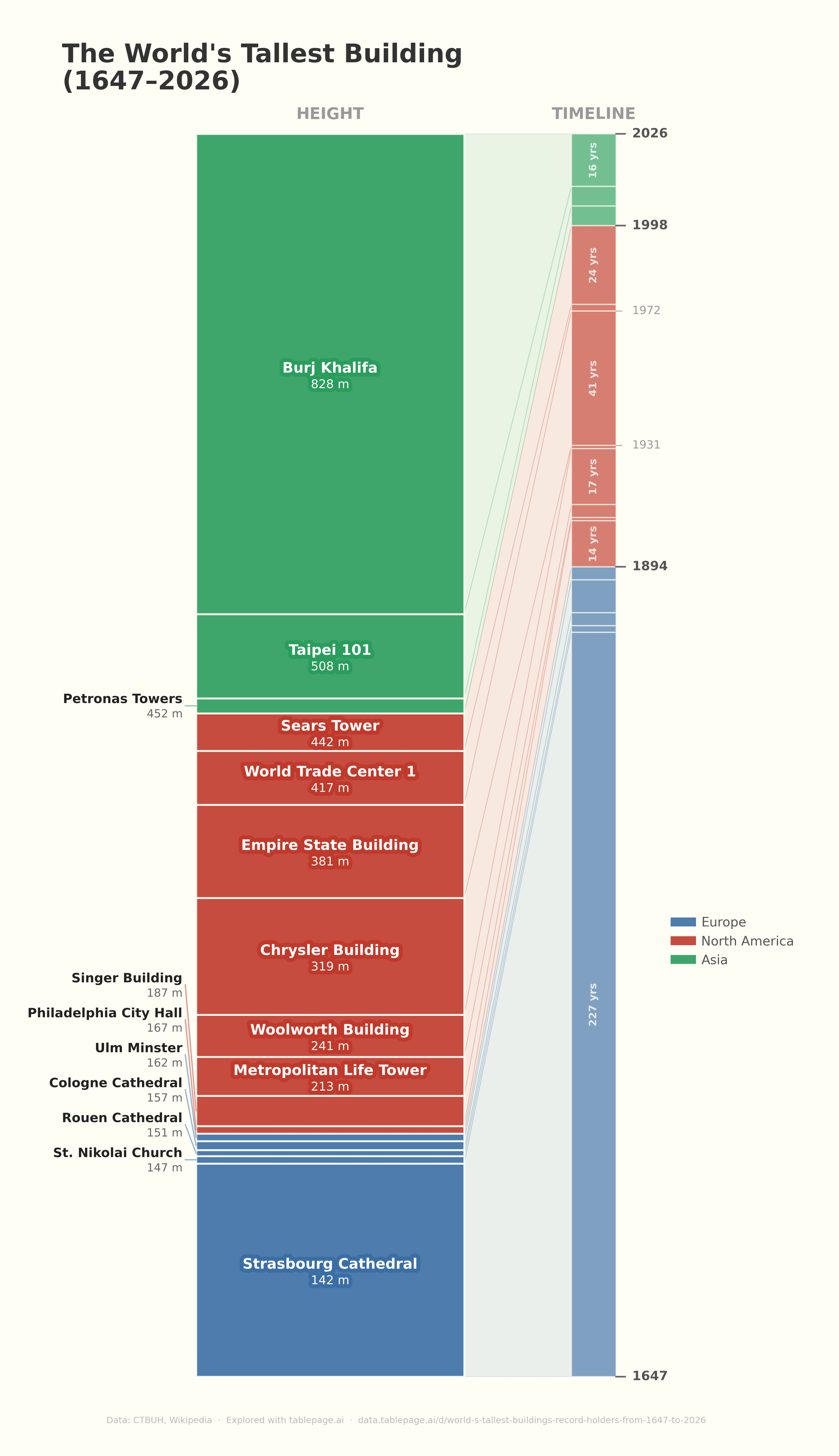

![The World's Tallest Building (1647-2026) [OC]](https://www.byteseu.com/wp-content/uploads/2026/04/wvhzkjhkn6vg1-885x1536.png "The World’s Tallest Building (1647-2026) [OC]")
45 Comments
I don’t understand the proportions at all. Can’t say it’s intuitive or beautiful, although the concept is interesting
[deleted]
I would put the names of the buildings on/next to the timeline as well. It is hard to match the names left buildings to the right
Not sure how people aren’t understanding this graphic, I think they’re both really clear and easy to understand.
It is missing 40 Wall Street in between Woolworth & Chrysler though.
Eiffel Tower was the tallest building in the world at release.
What about the Washington monument from 1884 to 1889 and the Eiffel Tower from 1889 to 1930?
https://en.wikipedia.org/wiki/History_of_the_world%27s_tallest_structures
Chefs kiss from me. Fun way and very understandable way to use charts.
One look and this is indeed nonsense, Shanghai Tower and Guangzhou CTF aren’t there
Why were so many European cathedrals suddenly increasing their height in the late 1800s?
really cool work! although I think the bar on the right and the connecting lines to the bar on the right are not needed … a simple time axis would suffice!
This is The great pyramid and Lincoln cathedral erasure simply because they would break the chart isn’t it
Thank you for using the correct name for the Sears Tower.
Where’s the CN Tower in Toronto?
Where is the great pyramid? Nonsense
I feel like this is some kind of smear campaign against Lincoln Cathedral, the tallest building in the world for 200 years, breaking the 3,800 year streak of Egypt.
I think we can all agree overall Africa is still in the lead in terms of cumulative years.
It’s refreshing to see this sub being used for its original purpose instead of spamming political propaganda in the form of graphs.
the cologne cathedral is an incredible piece of architecture
OMG I’m so sorry you posted this. Now Trump will want to spend $20 billion of taxpayer dollars to build “The World’s Tallest Building” that will be one foot taller than the Burj Khalifa.
Now *this* is beautiful data, unlike most of the stuff that makes it to the top of this sub!
There should be Khufu’s Pyramid, give Africa a credit.
Pour one out for the Singer building
I knew the Burj Khalifa was tall, but I didnt realize how much taller than any American buildings it was.
Why was the St. Marien Church in Stralsund, Germany not considered? It was 151 m from 1549 until 1647.
Could we stop counting spires that are not usable floors? The highest floor is a way better measurement of the highest building. The burj khalifa has a 240m spire on top that isn’t actually useful.
This data is presented terribly.
This is a really weird way to represent this data. I get what it is saying, but when I see a bar chart like this I think of them adding or compounding to each other. These are buildings, they aren’t built on top of one another getting taller. I’d rather see building heights compared to each other, not summed.
Hard to understand graphic.
Where is africa? I just read that Morocco inaugurated a 250m tower and its only the 3rd tallest building in africa.
The only problem is that there’s a bunch of buildings missing? Where’s the Wilshire Grand (335m) or the sales force tower (326m)?
Imaging as a village peasant in 1650 going to Strassbourg and seeing the cathedral for the first time.
Data is ugly.
Here is a better chart
https://www.reddit.com/r/dataisbeautiful/comments/gp9se7/oc_world_tallest_buildings_during_the_ages/
Interesting that it doesn’t list the CN tower (533m) in Toronto, Canada.
Gotta be careful about the definition of ‘building’.
By some definitions, the CN Tower takes over in 1976 at 553m, displacing Sears Tower, and neither Petronas Towers or Taipei 101 would be on the chart. The data source doesn’t include a definition of building at all.
Woolworth building so underrated as a part of this list.
The [Ostankino tower](https://en.wikipedia.org/wiki/Ostankino_Tower) is 540.1 m tall and was the tallest structure in the world already in 1961, way before Taipei 101 was built.
What is the size of the rectangles on the left indicating?
This would be so much better with time on the horizontal axis and height on the vertical
there’s no reason for buildings to be this tall. none.
Now I want to see when the construction started / finished to visualize the race to the top.
Maybe the world’s tallest freestanding structure should get an asterisk mention: CN Tower, 1976 – 2010, 553 m
I didn’t know that Philly city hall is taller than cologne cathedral
Would 2 World Trade Center be just behind 1WTC and taller than the Empire State Building? There was only a 6 ft difference between the two.
This graph is incorrect.
The Eiffel tower was built in 1889 and at 330m tall it was the tallest building for several decades.
Really cool visual, did you try doing time on an x axis? Might be too busy without a scroll bar or a play button.
It’s interesting how once the tallest move continents it doesnt go back.