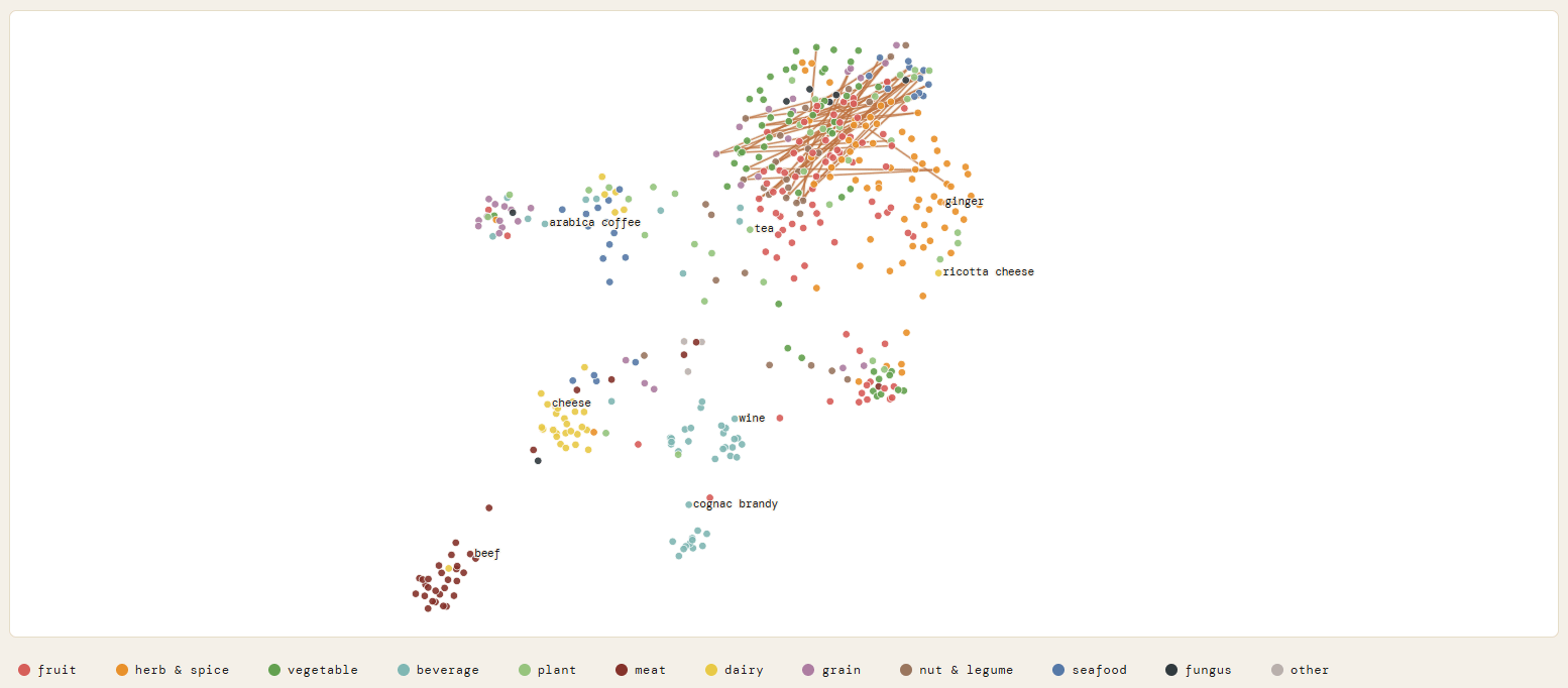
so i’ve been building a flavor pairing tool for the past few months (posted the heatmap here last week) and wanted to share the next thing i made with the same data.
i ran all 855 ingredients through UMAP using just their flavor compound profiles — data pulled from ~40,000 food science papers. the algorithm had literally zero knowledge of what category anything was. no “this is a meat” or “this is a fruit” signal. just molecular overlap.
and it kinda just… figured it out?
beef, pork, lamb, chicken, rabbit, duck all ended up in the same cluster bottom left. never told it they were all animal proteins.
wine, cognac, beer clustered together in the middle. fermentation chemistry is apparently that distinctive
cheese ended up between the dairy/meat zone which honestly makes sense when you think about it
arabica coffee sat almost completely alone which tracks, roasting creates pyrazines and furans that basically nothing else has ginger was an outlier too which i didn’t expect
the interactive version is at [compkitchen.com/flavor-map](http://compkitchen.com/flavor-map) if you want to poke around. you can hover over any point to see the ingredient and click through to its pairing data.
also built a research database of all the papers behind this if anyone’s curious about the methodology: [compkitchen.com/research](http://compkitchen.com/research) happy to answer questions, got some really good ones on the heatmap post
Is this proof that ricotta cheese is not actually a cheese?
ReddishTomatoes on
I’m not really sure what this is, but it’s pretty funny. Beef is more of a beverage than wine is. I’m going to spend some time taking a harder look at it.
Were there no tomatoes? I was hoping to see whether tomato is a fruit or a vegetable.
ASDFzxcvTaken on
What are the X and Y axis labels?
What are the lines connecting dots in the upper right cluster?
What are the various cluster groups?
Without proper labeling this data isn’t very beautiful.

![[OC] mapped 855 ingredients by flavor chemistry alone, no category labels. it kinda rediscovered the food groups on its own](https://www.byteseu.com/wp-content/uploads/2026/04/gb82zz2zthvg1-1536x674.png "[OC] mapped 855 ingredients by flavor chemistry alone, no category labels. it kinda rediscovered the food groups on its own")
4 Comments
so i’ve been building a flavor pairing tool for the past few months (posted the heatmap here last week) and wanted to share the next thing i made with the same data.
i ran all 855 ingredients through UMAP using just their flavor compound profiles — data pulled from ~40,000 food science papers. the algorithm had literally zero knowledge of what category anything was. no “this is a meat” or “this is a fruit” signal. just molecular overlap.
and it kinda just… figured it out?
beef, pork, lamb, chicken, rabbit, duck all ended up in the same cluster bottom left. never told it they were all animal proteins.
wine, cognac, beer clustered together in the middle. fermentation chemistry is apparently that distinctive
cheese ended up between the dairy/meat zone which honestly makes sense when you think about it
arabica coffee sat almost completely alone which tracks, roasting creates pyrazines and furans that basically nothing else has ginger was an outlier too which i didn’t expect
the interactive version is at [compkitchen.com/flavor-map](http://compkitchen.com/flavor-map) if you want to poke around. you can hover over any point to see the ingredient and click through to its pairing data.
also built a research database of all the papers behind this if anyone’s curious about the methodology: [compkitchen.com/research](http://compkitchen.com/research) happy to answer questions, got some really good ones on the heatmap post
[compkitchen.com/flavor-map](http://compkitchen.com/flavor-map)
Is this proof that ricotta cheese is not actually a cheese?
I’m not really sure what this is, but it’s pretty funny. Beef is more of a beverage than wine is. I’m going to spend some time taking a harder look at it.
Were there no tomatoes? I was hoping to see whether tomato is a fruit or a vegetable.
What are the X and Y axis labels?
What are the lines connecting dots in the upper right cluster?
What are the various cluster groups?
Without proper labeling this data isn’t very beautiful.