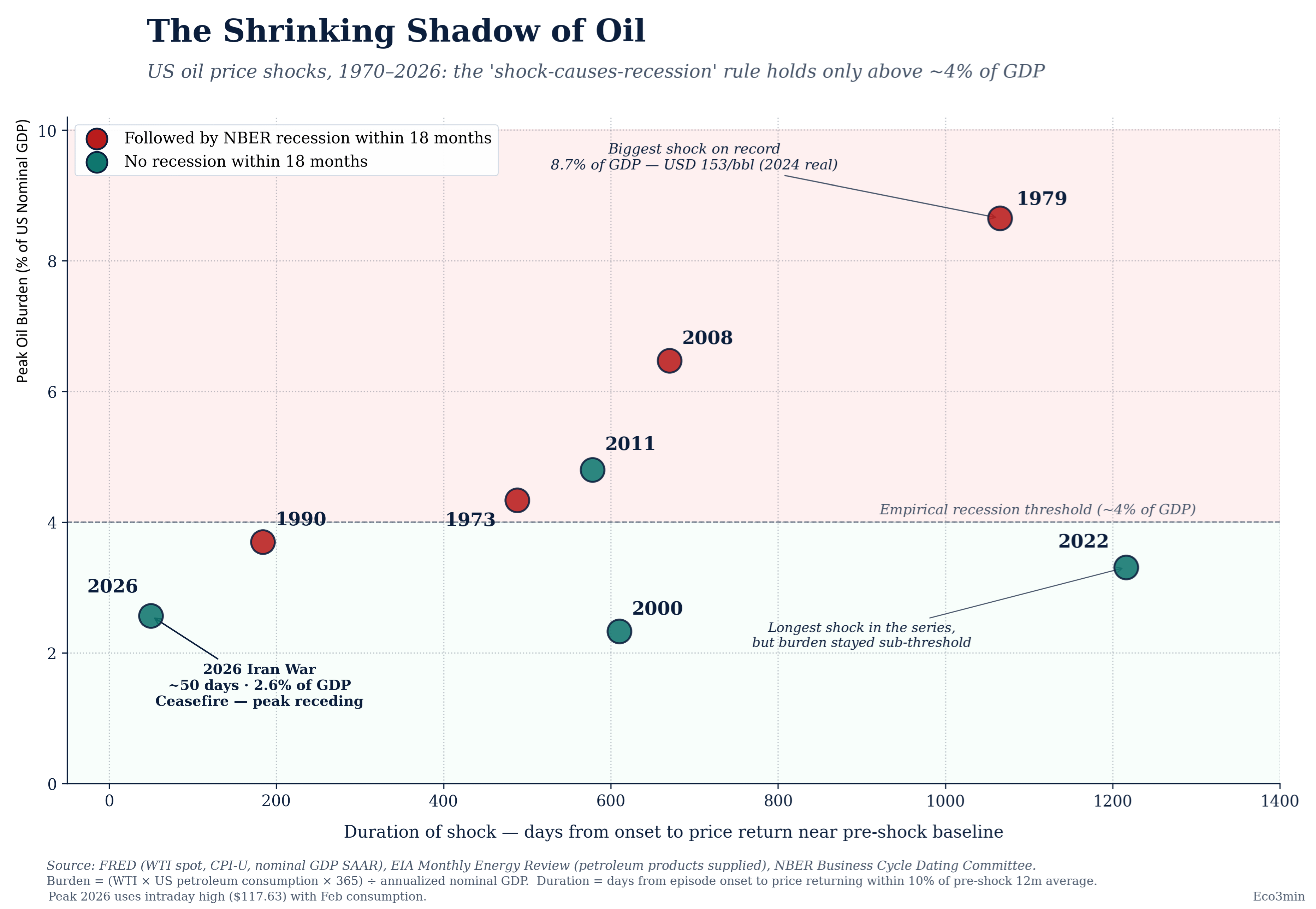
[OC] US oil shocks (1970–2026): recessions typically follow above a ~4% GDP oil burden
Posted by Low_Ability4450

![[OC] US oil shocks (1970–2026): recessions typically follow above a ~4% GDP oil burden](https://www.byteseu.com/wp-content/uploads/2026/04/lrosyre0qxwg1-1536x1061.png "[OC] US oil shocks (1970–2026): recessions typically follow above a ~4% GDP oil burden")
[OC] US oil shocks (1970–2026): recessions typically follow above a ~4% GDP oil burden
Posted by Low_Ability4450
8 Comments
Oil burden = US spending on petroleum as a share of GDP : (WTI × US consumption × 365) / GDP
During the 8 main US oil shocks since 1970 recessions almost always appeared once the burden gets above about 4% of GDP. For 2026 the same math puts the peak at about 2.6% so that is well below the historical recessionary zone ; as a consequence the data suggests this shock is much more likely to be inflationary than recessionary on its own. Those two nuances have to be underlined : 1990 is the near-miss (3.7%) and 2011 is the only clear false positive.
Sources: FRED, EIA Monthly Energy Review, NBER Business Cycle Dating Committee.
Tools: Python (Matplotlib) & Illustrator
Dataset + analysis: [https://eco3min.fr/en/oil-burden-gdp-recession-threshold/](https://eco3min.fr/en/oil-burden-gdp-recession-threshold/)
Logistic regression with that point cloud would divide the space very differently and would suggest that we are currently in danger.
Why did you include the x-a if that doesn’t factor in your analysis?
I will be honest this is really hard to understand at a glance… Which misses the point of visualization. Data viz is mean to make a message clear in a picture.
What are we saying here? There are so many dimensions with varying dimensions and colors. Years scattered, and x y axis are another thing, and then colors another.
That is 4D.
Humans can’t comprehend 4 dimensions intuitively without high effort.
We can see a cube in our minds with some effort, slightly harder than a 2D square. But seeing a hyper cube is really hard.
Wow, thanks for this. I didn’t know that prices had already returned to pre-shock levels. /s
What happens when you also plot the first 50 days of all the past crises? I suspect the current crisis will then look like one of the worst.
The signal historically is the level of the oil burden (~4% of GDP).
At about 2.6% today we’re still well below that range.
NBER declared a recession starting March 2001, which falls within the 18 month period. Which means there are only 2 data points with the full 18 months history on this graph where a recession did not follow an oil price shock.
[https://www.nber.org/reporter/fall-2001/business-cycle-peak-march-2001?page=1&perPage=50](https://www.nber.org/reporter/fall-2001/business-cycle-peak-march-2001?page=1&perPage=50)