GDP per capita is a bit misleading when most of the money goes to the Epstein class.
nath1234 on
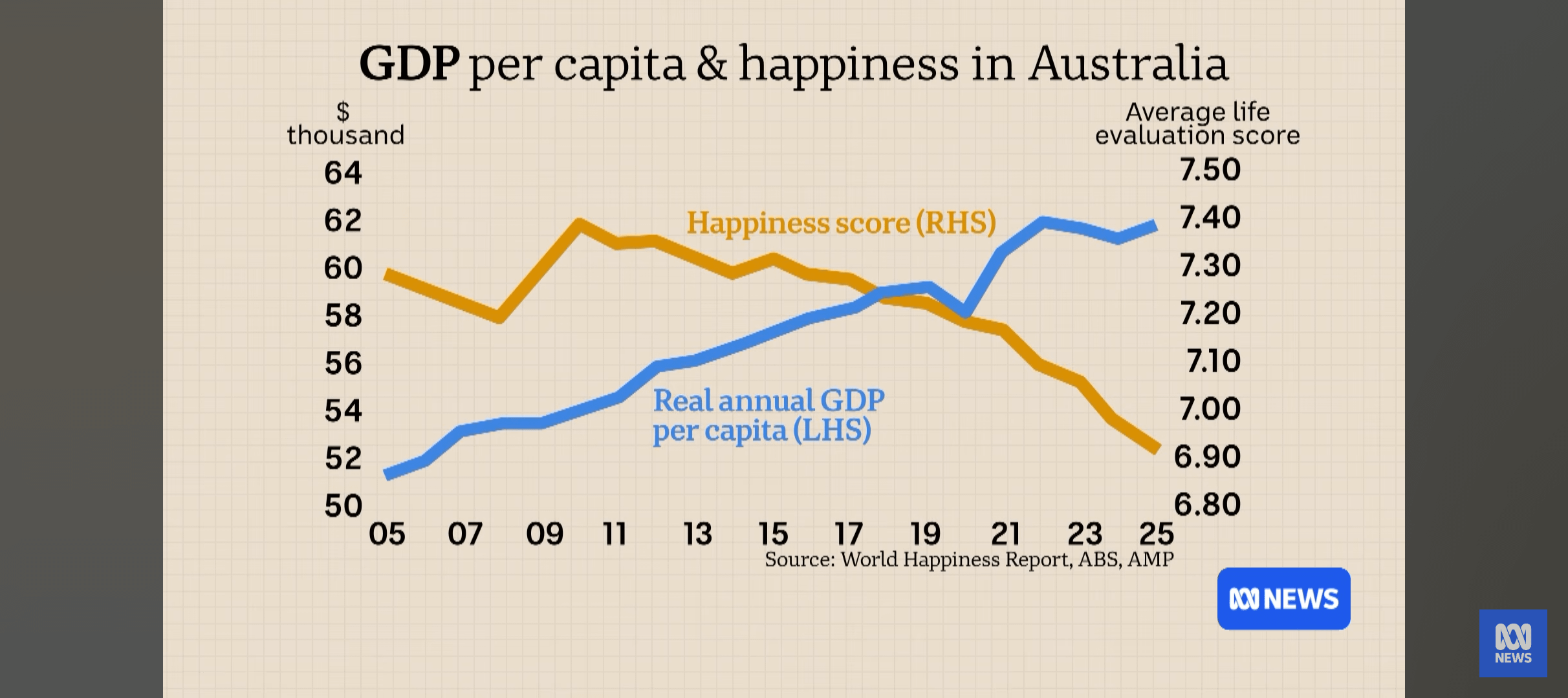
From the finance report on the ABC. Watch it for the graphs alone!
Illustrious_Hold7398 on
That money isn’t going anywhere near the average aussie
thetan_free on
Looks like we’ve sold quite a bit of happiness for about $10k per year.
Did we get a good price for it though?
ballimi on
The number of homes has gone up as well, so clearly more homes means less happiness
TheNumberOneRat on
I blame social media and the non stop waves of negativity.
blitznoodles on
Crazy how it correlates with covid
99patrol on
~7% move from the peak. Not really much.
North-Significance33 on
Does that take inflation into account?
hcornea on
Perhaps **median** household income would be a better metric on this timescale.
In a successful economy GDP numerically increases with time, as typically does wealth inequality.
So the change in happiness merely reflects the time-based effect of *late-stage capitalism*
dbnewman89 on
Maybe this is why Finland is so happy, they view housing as a right… You can buy a 2br apartment for the equiv of $200k AUD within 30m of Helsinki cbd by public transport. Even with unemployment at record highs, they can afford to live, eat, etc.
SquatchHasNoHeros on
I, too, peaked in 2009.
Cyraga on
Let’s see inflation and productivity on that chart too ABC
Hot-Job-6281 on
Reminder that GDP per capita is just an accounting measure of the monetary value of things _produced_ in the country, not even the wealth enjoyed by people in it.
A casino that eats up 100M from locals is 100M GDP, ka-ching.
karl_w_w on
No apparent correlation between the two, no evidence or even hypothesis given for why they could be causally related, but lets just lay the two graphs on top of each other anyway! Top quality work from the ABC.
Mysterious-Taro174 on
Those chopped dual y-axes are crimes against truth. Looks like the real gdpper capita is up 25% since 2005 and the happiness score, whatever it is, is down 5% in the same time.

16 Comments
GDP per capita is a bit misleading when most of the money goes to the Epstein class.
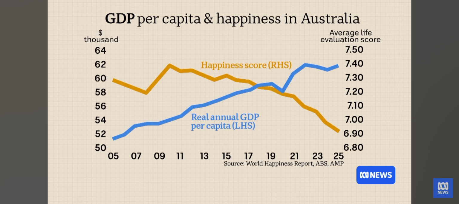
From the finance report on the ABC. Watch it for the graphs alone!
That money isn’t going anywhere near the average aussie
Looks like we’ve sold quite a bit of happiness for about $10k per year.
Did we get a good price for it though?
The number of homes has gone up as well, so clearly more homes means less happiness
I blame social media and the non stop waves of negativity.
Crazy how it correlates with covid
~7% move from the peak. Not really much.
Does that take inflation into account?
Perhaps **median** household income would be a better metric on this timescale.
In a successful economy GDP numerically increases with time, as typically does wealth inequality.
So the change in happiness merely reflects the time-based effect of *late-stage capitalism*
Maybe this is why Finland is so happy, they view housing as a right… You can buy a 2br apartment for the equiv of $200k AUD within 30m of Helsinki cbd by public transport. Even with unemployment at record highs, they can afford to live, eat, etc.
I, too, peaked in 2009.
Let’s see inflation and productivity on that chart too ABC
Reminder that GDP per capita is just an accounting measure of the monetary value of things _produced_ in the country, not even the wealth enjoyed by people in it.
A casino that eats up 100M from locals is 100M GDP, ka-ching.
No apparent correlation between the two, no evidence or even hypothesis given for why they could be causally related, but lets just lay the two graphs on top of each other anyway! Top quality work from the ABC.
Those chopped dual y-axes are crimes against truth. Looks like the real gdpper capita is up 25% since 2005 and the happiness score, whatever it is, is down 5% in the same time.