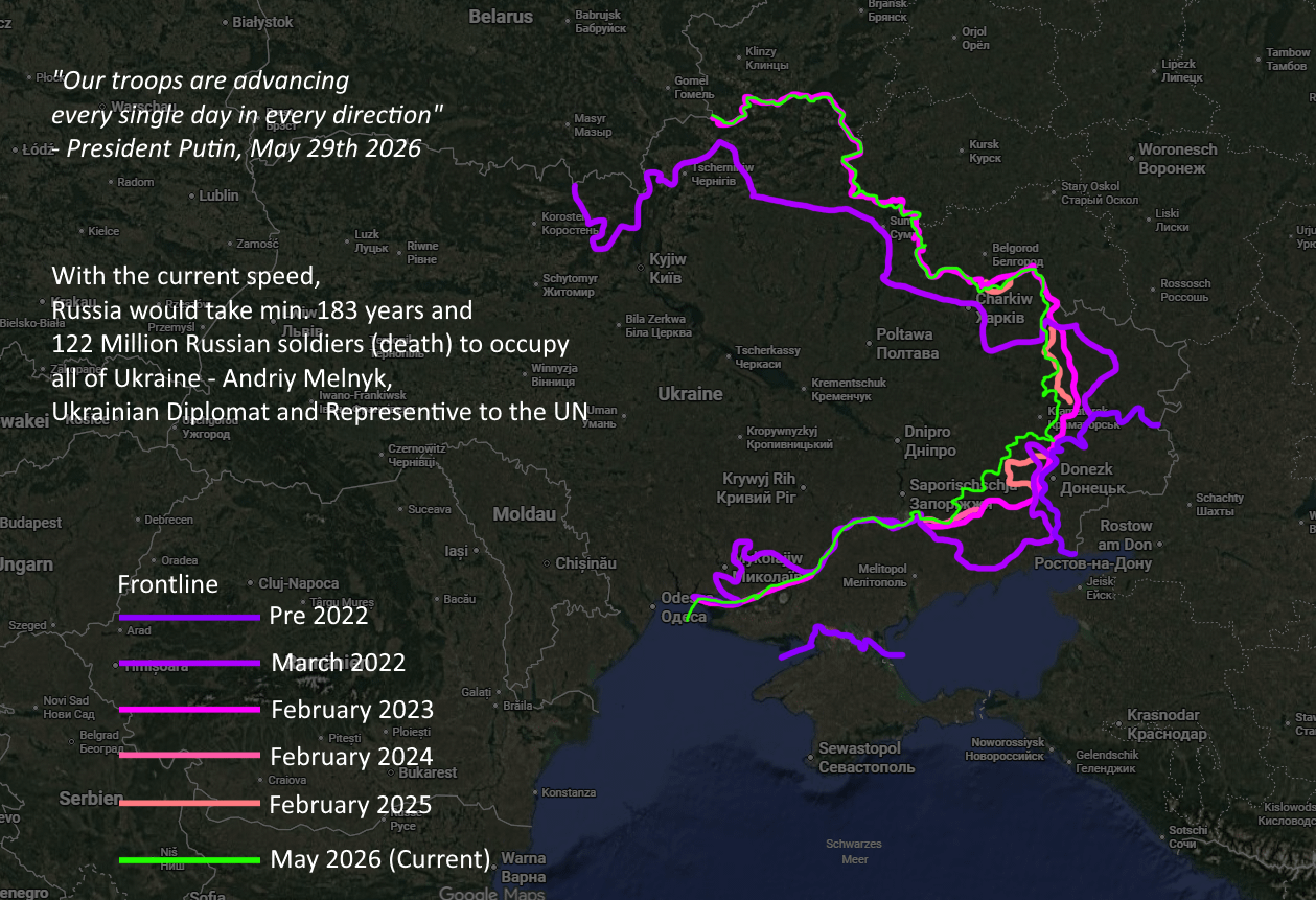
Why those shades of purple? It is very confusing colour palette
Dustonred on
Poor color choices. But insane to see how much territory Russia lost in the 2022 Ukrainian counter offensive vs what they crawled back since.
When you factor in the casualties it’s beyond comprehension.
adfx on
So much lives, violence, money, you name it… For this! Absolutely bonkers
_masssk_ on
I would make it with the same color, the further in time – the more transparent the line is.
Now it looks like the purple line is thicker and drags attention, but it is actually the less important.
(I’m working with data visualization)
Effective_Orchid7854 on
This war has never made any logical sense. Russia could have become trade partners, best allies, created economic bridges with Ukraine in the same amount of time and essentially won over Ukraine without a single life loss and gained so many benefits. Be
glumanda12 on
Sucks that there is only 6 colours in the world and 2 of them are basically just a different shade
Cringelordkekus on
3 day special operation btw, Lisbon in a week btw. Fucking animals, glory to Ukraine
AcrobaticMorkva on
What a terrible color choice!
zdzislav_kozibroda on
> With the current speed Russia would take min 183 years and 122 million Russian soldiers dead to occupy all of Ukraine.
“Ukraine will collapse any day now” – every Kremlin bot ever for the last five years
XPredanatorX on
So funny how many smart people are putting all this time into this maps and are too stupid to think: “Maybe using different shades of the same color isn’t the best idea.” 3/10
Danstan487 on
The march 2022 line is way off
JamesHuman99 on
Fck man they just dont quit
Walht on
This is map gore dude this isnt a good map
thafluu on
r/dataisugly
Geo85 on
Too many shades of violet.
There should be a line that shows the 2022 pre-invasion border, as well as the agreed upon 1991 border.
Please no more purple.
But this is actually a neat map!
Cpt_Delikan on
wasn’t there any other color for gods sake
somerussianbear on
You’re so good with colors
prof-kaL on
This is that low quality porn that makes you question your life
Ezio-Auditore-1459- on
Nice work, but use contrasting colors like yellow, red, blue, black, white
evilfungi on
Its been 4 years and nothing has changed except for more suffering. It is time for Russia and Ukraine to make peace. More fighting will achieve no ends except more death.
HospitalImpressive26 on
It’s crazy to me that in less then two weeks the war will have taken longer then WO1
Lenora_O on
All the real homies hate Russia.
moonsugarcornflakes on
Colours according to recency, opposite hue for present. everyone here has no idea what they’re talking about. The colours are perfect. Only thing I’d change is making pre 2026 lines thinner.
If the colours were all different it would be a confusing mess. Best map I’ve seen illustrating front line change over time.
nakano-star on
Lucky I know the history and timeline – my colorblind eyes are screaming at me
Sotov4ex on

Specific_Animator554 on
Eles deveriam fazer como os americanos e jogarem uma bomba nuclear tática alegando que isso reduzi a guerra e evite mortes


30 Comments
Map isn’t accurate.
Too much violet.
This doesn’t help us color blind folk AT ALL.
this will be a very civil comment section 😄
Why those shades of purple? It is very confusing colour palette
Poor color choices. But insane to see how much territory Russia lost in the 2022 Ukrainian counter offensive vs what they crawled back since.
When you factor in the casualties it’s beyond comprehension.
So much lives, violence, money, you name it… For this! Absolutely bonkers
I would make it with the same color, the further in time – the more transparent the line is.
Now it looks like the purple line is thicker and drags attention, but it is actually the less important.
(I’m working with data visualization)
This war has never made any logical sense. Russia could have become trade partners, best allies, created economic bridges with Ukraine in the same amount of time and essentially won over Ukraine without a single life loss and gained so many benefits. Be
Sucks that there is only 6 colours in the world and 2 of them are basically just a different shade
3 day special operation btw, Lisbon in a week btw. Fucking animals, glory to Ukraine
What a terrible color choice!
> With the current speed Russia would take min 183 years and 122 million Russian soldiers dead to occupy all of Ukraine.
“Ukraine will collapse any day now” – every Kremlin bot ever for the last five years
So funny how many smart people are putting all this time into this maps and are too stupid to think: “Maybe using different shades of the same color isn’t the best idea.” 3/10
The march 2022 line is way off
Fck man they just dont quit
This is map gore dude this isnt a good map
r/dataisugly
Too many shades of violet.
There should be a line that shows the 2022 pre-invasion border, as well as the agreed upon 1991 border.
Please no more purple.
But this is actually a neat map!
wasn’t there any other color for gods sake
You’re so good with colors
This is that low quality porn that makes you question your life
Nice work, but use contrasting colors like yellow, red, blue, black, white
Its been 4 years and nothing has changed except for more suffering. It is time for Russia and Ukraine to make peace. More fighting will achieve no ends except more death.
It’s crazy to me that in less then two weeks the war will have taken longer then WO1
All the real homies hate Russia.
Colours according to recency, opposite hue for present. everyone here has no idea what they’re talking about. The colours are perfect. Only thing I’d change is making pre 2026 lines thinner.
If the colours were all different it would be a confusing mess. Best map I’ve seen illustrating front line change over time.
Lucky I know the history and timeline – my colorblind eyes are screaming at me

Eles deveriam fazer como os americanos e jogarem uma bomba nuclear tática alegando que isso reduzi a guerra e evite mortes