I don’t think it’s an accurate representation of “the economy” because so much of what happens in the blue depends on what happens in the red.
jacalawilliams on
It’s on the right track, at least. This map from Business Insider is a little dated (2014), but it’s similar to the one you shared [GDP split map](https://www.businessinsider.com/us-gdp-map-2014-2)
eloel- on
r/PeopleLiveInCities
sillyhands1 on
If a companies headquarters are in a city all of their gdp is counted. Just so happens most Fortune 500 hq in select cities. Shocker. This map means nothing is definitely misleading.
antithero on
Oh gee look blue in the cities where so many people live. It’s like looking at an electoral map.
It’s hard for a low population areas like Montana to compete with LA for NYC when it comes to this kind of stuff.
somafiend1987 on
I mean, statistically, yes. The Denver, Boulder, Colorado Springs people won’t like being ignored, they fund all sorts of 1% Thinktanks. Work in the petroleum industry, but live far from the pollution it creates.
Republicans have no idea that they’re the welfare state they detest.
Xaphan26 on
For anyone who might assume so, this isn’t even close to a republican vs democrat map. Its partly a population density map but much moreso its a tech, banking, private equity, and insurance money vs everything else map. Basically all the industries with massive monetary leverage over everything else. Even with the absense of several large metro areas I’m almost surprised it isn’t even more lopsided.
OldTwoToes on
But none of the infrastructure to support them without the rest, so sort of a moot point.
Relevant_Eye1333 on
ha, i live in one of the blue areas, always knew we, the cities, carried the weight around here.
[deleted] on
[deleted]
aibotaccount5447999 on
I wonder what’s the largest city in the red? Dallas?
Alii_baba on
Yet, rich people and politicians tell you that immigrants are the main problem.
SteadyOperative on
Idk why everyone is arguing over such a simple map. Of course the dense cities have more / better jobs with a larger GDP output. Blue areas are the logistics, business, and population centers. Red has all the natural resources, agriculture, or just straight up empty land. Both need eachother. You don’t have to work yourself up making a political statement.
scylla on
The map would be even more concentrated if you included Dallas.
Winnapig on
Now do it showing food oil mines and water and you will see that the true wealth is in the red, the blue cities steal it and sell it for profit.
Euromantique on
You could probably also divide the remaining red area the same way. There are still lots of big cities in the red that make up the majority of the economy of that area too.
BMK812 on
I think the map should have used different colors than red and blue.
eh-guy on
Isn’t the blue also most of the US population?
LF3169 on
Sounds about right honestly. I’m surprised it takes that many cities to get to 50%.
bobbykinglive on
Now let’s build a high speed rail system connecting them.
MtRainierWolfcastle on
What the hell is Portland doing in there?
Ok_Material9377 on
I wonder if that is based on where citizens spend their money or where corporations that profit the most are headquartered
Schickie on
Some folks think their footprint is equal to their virtue.


26 Comments
I don’t think it’s an accurate representation of “the economy” because so much of what happens in the blue depends on what happens in the red.
It’s on the right track, at least. This map from Business Insider is a little dated (2014), but it’s similar to the one you shared [GDP split map](https://www.businessinsider.com/us-gdp-map-2014-2)
r/PeopleLiveInCities
If a companies headquarters are in a city all of their gdp is counted. Just so happens most Fortune 500 hq in select cities. Shocker. This map means nothing is definitely misleading.
Oh gee look blue in the cities where so many people live. It’s like looking at an electoral map.
It’s hard for a low population areas like Montana to compete with LA for NYC when it comes to this kind of stuff.
I mean, statistically, yes. The Denver, Boulder, Colorado Springs people won’t like being ignored, they fund all sorts of 1% Thinktanks. Work in the petroleum industry, but live far from the pollution it creates.
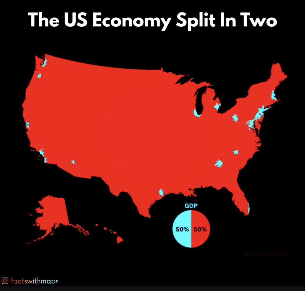
50% of the USA’s GDP is created in just 25 cities
[https://www.reddit.com/r/dataisbeautiful/comments/1lncx9v/this_3d_map_visualizes_the_us_economy_in_a_new_way/](https://www.reddit.com/r/dataisbeautiful/comments/1lncx9v/this_3d_map_visualizes_the_us_economy_in_a_new_way/)
Republicans have no idea that they’re the welfare state they detest.
For anyone who might assume so, this isn’t even close to a republican vs democrat map. Its partly a population density map but much moreso its a tech, banking, private equity, and insurance money vs everything else map. Basically all the industries with massive monetary leverage over everything else. Even with the absense of several large metro areas I’m almost surprised it isn’t even more lopsided.
But none of the infrastructure to support them without the rest, so sort of a moot point.
ha, i live in one of the blue areas, always knew we, the cities, carried the weight around here.
[deleted]
I wonder what’s the largest city in the red? Dallas?
Yet, rich people and politicians tell you that immigrants are the main problem.
Idk why everyone is arguing over such a simple map. Of course the dense cities have more / better jobs with a larger GDP output. Blue areas are the logistics, business, and population centers. Red has all the natural resources, agriculture, or just straight up empty land. Both need eachother. You don’t have to work yourself up making a political statement.
The map would be even more concentrated if you included Dallas.
Now do it showing food oil mines and water and you will see that the true wealth is in the red, the blue cities steal it and sell it for profit.
You could probably also divide the remaining red area the same way. There are still lots of big cities in the red that make up the majority of the economy of that area too.
I think the map should have used different colors than red and blue.
Isn’t the blue also most of the US population?
Sounds about right honestly. I’m surprised it takes that many cities to get to 50%.
Now let’s build a high speed rail system connecting them.
What the hell is Portland doing in there?
I wonder if that is based on where citizens spend their money or where corporations that profit the most are headquartered
Some folks think their footprint is equal to their virtue.
Have family in six and have lived in three.
It’s real.