
![[OC] Kimi Antonelli’s fastest lap telemetry from the 2026 Canadian Grand Prix](https://www.byteseu.com/wp-content/uploads/2026/06/4zcf7lixrx4h1-1024x632.png "[OC] Kimi Antonelli’s fastest lap telemetry from the 2026 Canadian Grand Prix")
I made this telemetry visualization from historical OpenF1 data using a Python project I’m building called OpenF1 Strategy Engineer.
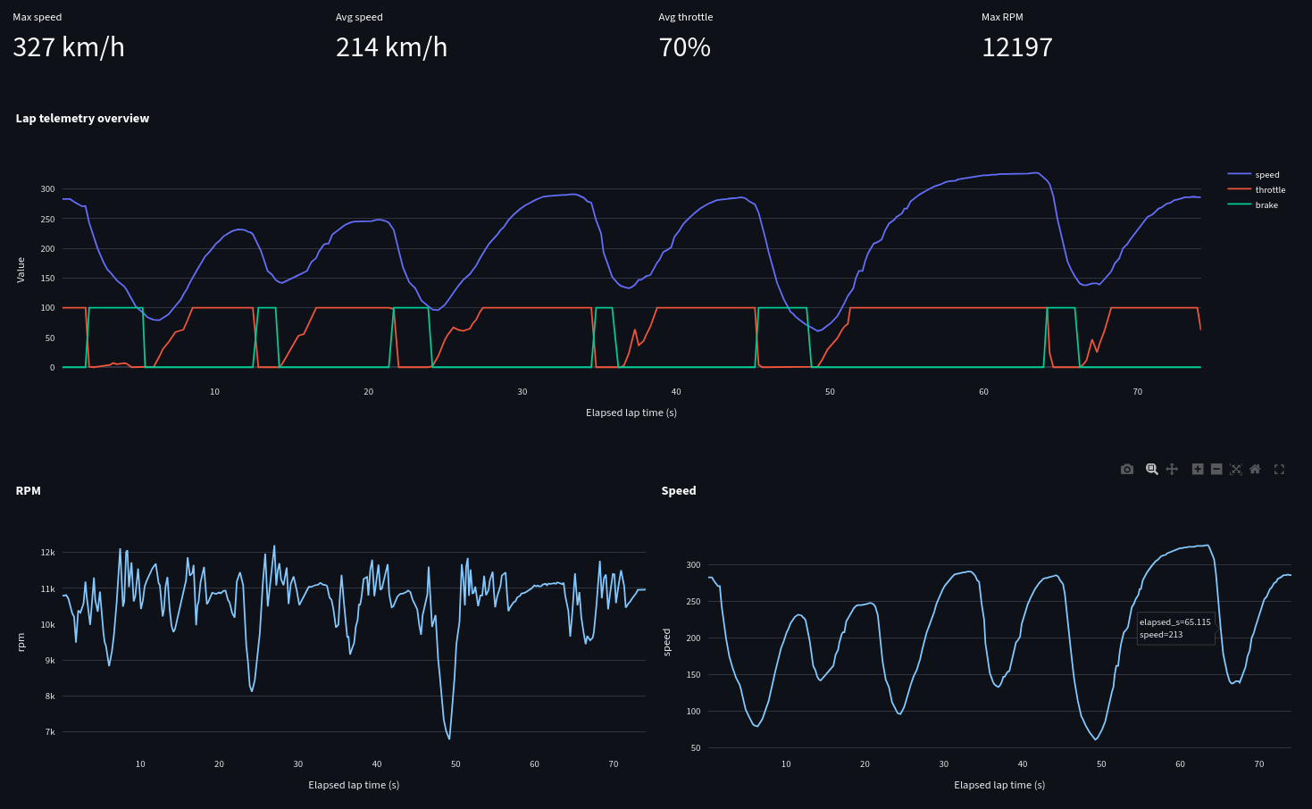
This chart shows Kimi Antonelli’s fastest lap from the Canadian Grand Prix, including:
– speed trace
– throttle usage
– brake application
– RPM
– gear/speed behavior over the lap
– summary stats like max speed, average speed, average throttle, and max RPM
A few interesting things stand out:
– Max speed reaches 327 km/h
– Average speed is 214 km/h
– Average throttle is around 70%
– Max RPM is just over 12,000
– You can clearly see the heavy braking zones followed by long throttle phases, which fits the stop-start nature of Circuit Gilles Villeneuve
Data source: OpenF1 API
Tools used: Python, Streamlit, Pandas, Plotly
Visualization type: lap telemetry dashboard
This is an unofficial fan/educational project and is not affiliated with Formula 1, FIA, FOM, Mercedes, OpenF1, or any team. All trademarks belong to their respective owners.
Feedback welcome — especially on whether the telemetry layout is readable and what other lap-comparison metrics would make this more useful.
Posted by storman121
3 Comments
Post a link to the whole project, if you have it posted somewhere. You got my curiosity.
Dr. Mike, somewhere: “That’s PVT! Chest compressions, chest compressions, chest compressions!”
I may be wrong, but aren’t speed traces generally done using distance traveled as the X-axis so that multiple traces can be overlayed atop each other while ensuring things remain comparable? Any reason you opted for time instead?