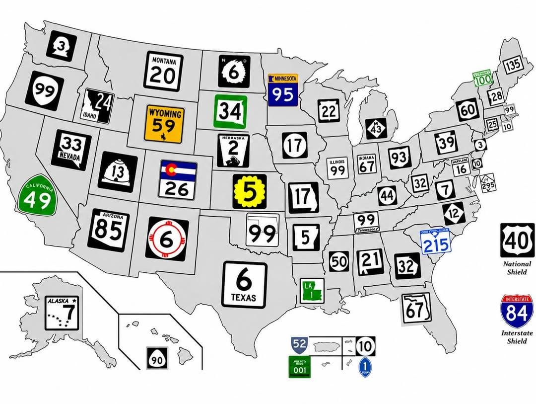
Most road signs in the United States are highly standardized, but state highway shields are a notable exception.
When the federal highway system expanded during the 20th century, states were generally free to design their own markers for state-maintained routes. The result was an unusually diverse collection of symbols, shapes and designs that still survives today.
Unhappy_Weakness881 on
Legit just assumed California’s were normal since they looked normal
adelaarvaren on
Utah’s Bee Skep and Washington’s Washington profile are the coolest 😄
JellyfishFestival on
Minnesota and Nebraska have always been favorites of mine.
Nice to see some of the states I haven’t been to much.
StealthyNoctowl on
Yet many states especially out east chose a very basic design
reverendlecarp on
DC’s route sign appears on exactly one roadway, DC 295. Everything else is National Routes and Interstates.
HandsyBusride on
I have to say New Hampshire’s is probably the most original black/white minimalist one. Alaska’s is nice too but not as easily enjoyable driving 55mph by it.
verifiedshitlord on
Most of these are so plain and boring. Easy to not even see them in the winter
My states is so much easier to see. A nice pip of color in any season. I live along 95.
vexillographer7717 on
The negative space on the Idaho sign looks like a person with a very large forehead looking down.
damutecebu on
They used to be much more diverse. Most are very similar now.
Eulalia1144 on
California’s is just iconic. But shout out to Pennsylvania’s. I love the keystone in the background rather than having the state shape, which is sort of awkward for some of these states trying to cram it into a square sign.
New Hampshire is poorly represented here. Its supposed to be a profile of the Old Man but this image makes it look awful.
fuccguppy on
I like how a bunch of them are somewhat crudely drawn versions of their state borders, especially smooshed Alabama
Firm-Brother-8195 on
I made this map. There is no Nevada 33.
Edit: I had made a bunch of 99s and realized there were too many so for Nevada I just typed in 33.
randomacct7679 on
I love the KS Sunflowers signs. Easy to see and read and give a nice little state flavor to the signs.
Warm_Shoulder3606 on
The silhouette profile of GW is so tough 🔥🔥
IcebergDarts on
As a Minnesotan, I feel like we have one of the best there is.
mon-dak on
North Dakota no longer uses that sign
GraniteGeekNH on
For b&w, Alaska wins. For color, I’d go with New Mexico; non-obvious and attractive.
batting_1000 on
Nebraska’s horse carriage sign is cool
Adam19822000 on
I live in Mass, our state highway signs suck.
Eastern_Labrat on
I’m biased positive for Michigan’s system. I like saying “M” then number because it’s short and you know it’s a state highway and not an Interstate or US highway.
caligaris_cabinet on
With how obsessed Texas is with the shape of their state, I’m surprised that wasn’t incorporated into their road signs.
whydoyou-ask on
I think California’s is the best. It’s simple but well-stylized for what it is. It serves as the perfect counterpart to the US Interstate shield.
Look_its_Rob on
Love NHs. RIP to the Old Man in the Mountain. I remember going to see it as a kid thinking it was the coolest thing ever (the actual rock not the sign).


27 Comments
Most road signs in the United States are highly standardized, but state highway shields are a notable exception.
When the federal highway system expanded during the 20th century, states were generally free to design their own markers for state-maintained routes. The result was an unusually diverse collection of symbols, shapes and designs that still survives today.
Legit just assumed California’s were normal since they looked normal
Utah’s Bee Skep and Washington’s Washington profile are the coolest 😄
Minnesota and Nebraska have always been favorites of mine.
Nice to see some of the states I haven’t been to much.
Yet many states especially out east chose a very basic design
DC’s route sign appears on exactly one roadway, DC 295. Everything else is National Routes and Interstates.
I have to say New Hampshire’s is probably the most original black/white minimalist one. Alaska’s is nice too but not as easily enjoyable driving 55mph by it.
Most of these are so plain and boring. Easy to not even see them in the winter
My states is so much easier to see. A nice pip of color in any season. I live along 95.
The negative space on the Idaho sign looks like a person with a very large forehead looking down.
They used to be much more diverse. Most are very similar now.
California’s is just iconic. But shout out to Pennsylvania’s. I love the keystone in the background rather than having the state shape, which is sort of awkward for some of these states trying to cram it into a square sign.
Honestly surprised Texas’ isn’t Texas-shaped
My favorite tidbit here is that New Hampshire’s features the Old Man on the Mountain, a rock formation that no longer exists but that the state so closely identifies with that they didn’t want to change it after it fell. [Recent Write Up](https://www.wmur.com/article/23-years-old-man-of-the-mountain-collapse-nh/71197430)
New Hampshire is poorly represented here. Its supposed to be a profile of the Old Man but this image makes it look awful.
I like how a bunch of them are somewhat crudely drawn versions of their state borders, especially smooshed Alabama
I made this map. There is no Nevada 33.
Edit: I had made a bunch of 99s and realized there were too many so for Nevada I just typed in 33.
I love the KS Sunflowers signs. Easy to see and read and give a nice little state flavor to the signs.
The silhouette profile of GW is so tough 🔥🔥
As a Minnesotan, I feel like we have one of the best there is.
North Dakota no longer uses that sign
For b&w, Alaska wins. For color, I’d go with New Mexico; non-obvious and attractive.
Nebraska’s horse carriage sign is cool
I live in Mass, our state highway signs suck.
I’m biased positive for Michigan’s system. I like saying “M” then number because it’s short and you know it’s a state highway and not an Interstate or US highway.
With how obsessed Texas is with the shape of their state, I’m surprised that wasn’t incorporated into their road signs.
I think California’s is the best. It’s simple but well-stylized for what it is. It serves as the perfect counterpart to the US Interstate shield.
Love NHs. RIP to the Old Man in the Mountain. I remember going to see it as a kid thinking it was the coolest thing ever (the actual rock not the sign).