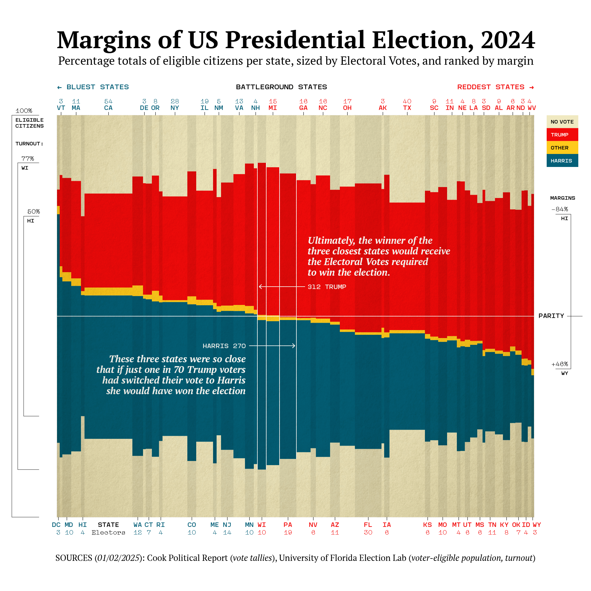
[OC] This chart is essentially a stacked bar chart of votes cast during the 2024 U.S. Presidential election. Each bar shows the percentages per state of the voter-eligible population, including votes for Trump, Harris, Other, or no vote. Each state’s bar is then sized per its Electoral Votes and ranked by margin from bluest (at left) to reddest (at right) according to the final margin. Votes cast are centered vertically in the field of non voters to illustrate the swing margin.
Data aggregated in MacOS Numbers, then imported to R for plotting to SVG with refinements in Adobe Illustrator.
The Cook Political Report, 2024 National Popular Vote Tracker (paywall):
>Votes cast are centered vertically in the field of non voters to illustrate the swing margin.
not quite grokking this.. please say more?
Tsudaar on
This is actually a great visualisation.
Turnout, results, size of each state. Very good.
burgiebeer on
I don’t understand why the “no vote” is split between and bottom. It can’t be by party registration because many states have substantial populations registered as independent or unaffiliated.
It seems to me like aggregating the “non-votes” on the bottom would show a more compelling share of that non participation by state.
ottawalanguages on
love the finishing touches!
dhslax88 on
So 69/70 people sticking with their vote for Trump and 1/70 people switching to Harris in MI/WI/PA would have won her the US election ? Nice…
BridgetBardOh on
Every state is a battleground state if the non-voters turn out.
A nation gets the government it deserves.
GreyGoblin on
Well executed OP. Not going to lie, it took a second to orient to, because it’s just so data rich. Great visualization.
Thiseffingguy2 on
Loving your visualizations, OP, keep up the inspiration!
Oneioda on
The United States of WI, MI, & PA.
[deleted] on
[deleted]
bold_water on
I want to see this same graph with popular vote margin across the last 20 or so elections.
eaglessoar on
I’d go for a longer description in the subtitle there’s a lot going on here and providing full information is always most important. Something as simple as ‘sized by electoral vote (column width) by turn out (column height) etc
Why are no votes at the top and bottom? Just split in half around the other votes?

![[OC] Margins of the US Presidential Election, 2024](https://www.byteseu.com/wp-content/uploads/2025/01/6hvmqtov8pae1-1536x1536.png "[OC] Margins of the US Presidential Election, 2024")
13 Comments
[OC] This chart is essentially a stacked bar chart of votes cast during the 2024 U.S. Presidential election. Each bar shows the percentages per state of the voter-eligible population, including votes for Trump, Harris, Other, or no vote. Each state’s bar is then sized per its Electoral Votes and ranked by margin from bluest (at left) to reddest (at right) according to the final margin. Votes cast are centered vertically in the field of non voters to illustrate the swing margin.
Data aggregated in MacOS Numbers, then imported to R for plotting to SVG with refinements in Adobe Illustrator.
The Cook Political Report, 2024 National Popular Vote Tracker (paywall):
[https://www.cookpolitical.com/vote-tracker/2024/electoral-college](https://www.cookpolitical.com/vote-tracker/2024/electoral-college)
University of Florida Election Lab, 2024 General Election Turnout:
https://election.lab.ufl.edu/2024-general-election-turnout/
>Votes cast are centered vertically in the field of non voters to illustrate the swing margin.
not quite grokking this.. please say more?
This is actually a great visualisation.
Turnout, results, size of each state. Very good.
I don’t understand why the “no vote” is split between and bottom. It can’t be by party registration because many states have substantial populations registered as independent or unaffiliated.
It seems to me like aggregating the “non-votes” on the bottom would show a more compelling share of that non participation by state.
love the finishing touches!
So 69/70 people sticking with their vote for Trump and 1/70 people switching to Harris in MI/WI/PA would have won her the US election ? Nice…
Every state is a battleground state if the non-voters turn out.
A nation gets the government it deserves.
Well executed OP. Not going to lie, it took a second to orient to, because it’s just so data rich. Great visualization.
Loving your visualizations, OP, keep up the inspiration!
The United States of WI, MI, & PA.
[deleted]
I want to see this same graph with popular vote margin across the last 20 or so elections.
I’d go for a longer description in the subtitle there’s a lot going on here and providing full information is always most important. Something as simple as ‘sized by electoral vote (column width) by turn out (column height) etc
Why are no votes at the top and bottom? Just split in half around the other votes?