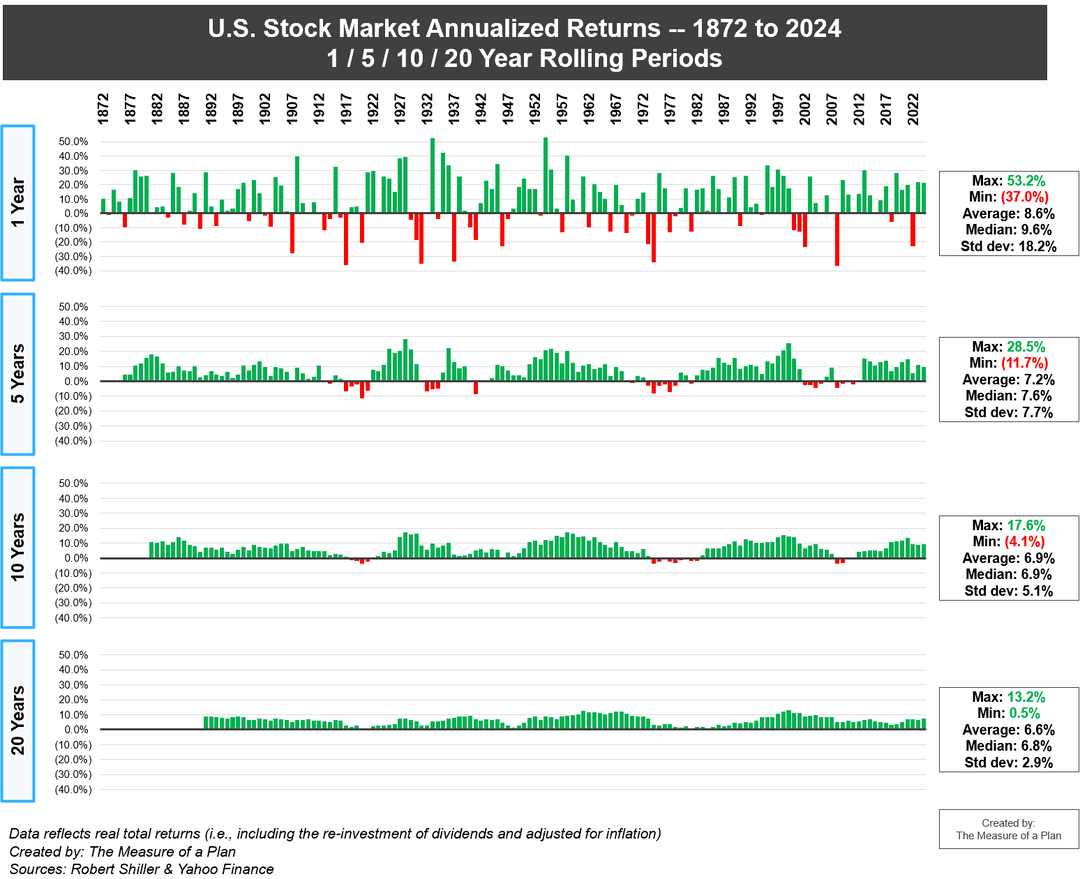
US stock market returns (1872 to 2024) — annualized real total returns over 1 / 5 / 10 / 20 year periods [OC]
Posted by getToTheChopin

![US stock market returns (1872 to 2024) -- annualized real total returns over 1 / 5 / 10 / 20 year periods [OC]](https://www.byteseu.com/wp-content/uploads/2025/01/eaiqa1s5msae1-1024x833.png "US stock market returns (1872 to 2024) — annualized real total returns over 1 / 5 / 10 / 20 year periods [OC]")
US stock market returns (1872 to 2024) — annualized real total returns over 1 / 5 / 10 / 20 year periods [OC]
Posted by getToTheChopin
5 Comments
*[Sorry for the re-post to anyone who saw my original post this morning. It was removed for using a title that did not describe the data plainly. I’ve re-posted with a purely factual title instead]*
All charts and analysis: [https://themeasureofaplan.com/us-stock-market-returns-1870s-to-present/](https://themeasureofaplan.com/us-stock-market-returns-1870s-to-present/)
Key insights:
* Simple Average: the average return of the U.S. stock market has been 8.6% per year over the past ~150 years (1872 to 2024)
* Annualized Average: the return of the U.S. stock market has been 7.1% per year on an annualized average basis, over the past ~150 years
* The market has grown in 69% of all years, and declined in 31% of all years on record
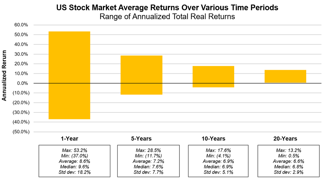
* While the range of returns across 1-year periods has varied significantly (from negative 37.0% to +53.2%), the annualized returns across 20-year periods have a much tighter range (from +0.5% to +13.2%)
* The U.S. stock market has never declined over any 20-year period in history
Tools used: excel, powerpoint
Data sources: Robert Shiller dataset, Yahoo Finance
Time in the market beats timing the market!
Nice work. Clearly shows that a longer investment holding period gives better signal / reduced noise.
Every 50 years or so something bad happens like depression or stagflation.
And the last major downturn was… the 1970s.
Not holding my breath on a good next 5-10 years.
These charts are always made incorrectly and overestimate stock investment risks. They assume that someone invests $X and then waits N years. But real people don’t do that. They invest some fraction of their salary every month. If you counted it like that, chances to be at a loss will reduce dramatically (because every major drop is usually preceded by a crazy, unsustainable rally).