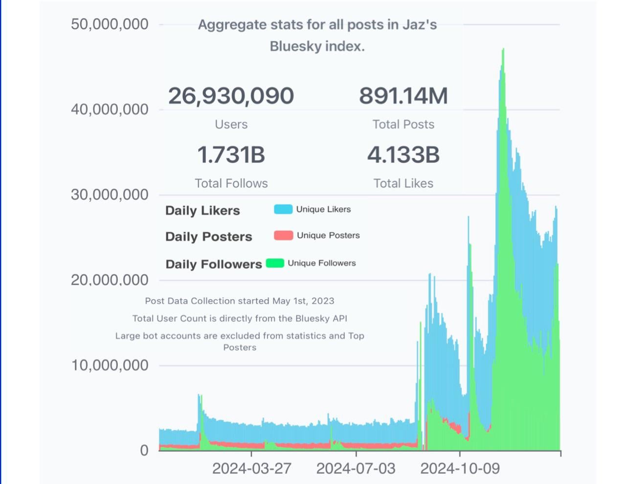
jareyes409 on January 11, 2025 4:21 am Why place the green and blue on top of the red data set? Cant see what happens with unique posters because the other two are on top.
Tomagatchi on January 11, 2025 5:45 am Is there a plausible explanation for the pulses? Are these major events or promotions, or something in the news about BlueSky v. other microblogs?
Purplekeyboard on January 11, 2025 5:52 am It would appear that the number of unique posters dropped to zero a few months ago. Somehow that doesn’t seem right.
Ares6 on January 11, 2025 6:19 am I joined it. It ended up being a bunch of people complaining about Twitter.
pperiesandsolos on January 11, 2025 6:41 am What happens to unique posters? The graph makes it look like it disappears If you’re going to use this type of layering, at least put the smallest one in the foreground

![[OC] Bluesky Activity Growth Over Past Year](https://www.byteseu.com/wp-content/uploads/2025/01/nvcyrybiface1-1024x793.jpeg "[OC] Bluesky Activity Growth Over Past Year")
5 Comments
Why place the green and blue on top of the red data set?
Cant see what happens with unique posters because the other two are on top.
Is there a plausible explanation for the pulses? Are these major events or promotions, or something in the news about BlueSky v. other microblogs?
It would appear that the number of unique posters dropped to zero a few months ago. Somehow that doesn’t seem right.
I joined it. It ended up being a bunch of people complaining about Twitter.
What happens to unique posters? The graph makes it look like it disappears
If you’re going to use this type of layering, at least put the smallest one in the foreground