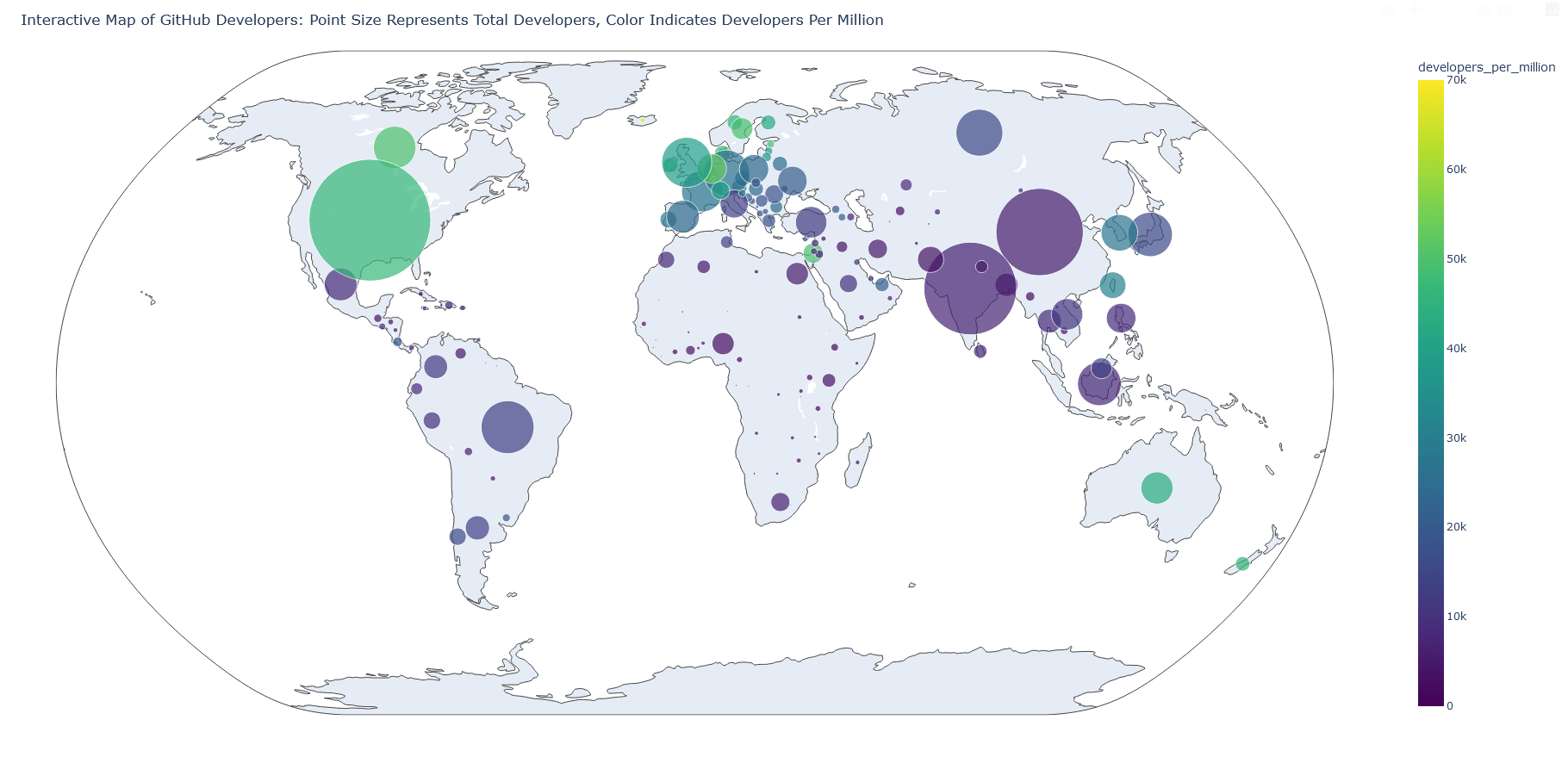
The dashboard for the worldwide programmers’ map (from GitHub), second version. I adjusted it a bit to display more information, including raw values. [OC]
Posted by alucinario

![The dashboard for the worldwide programmers' map (from GitHub), second version. I adjusted it a bit to display more information, including raw values. [OC]](https://www.byteseu.com/wp-content/uploads/2025/01/dgbjsvpkelce1-1536x742.png "The dashboard for the worldwide programmers’ map (from GitHub), second version. I adjusted it a bit to display more information, including raw values. [OC]")
The dashboard for the worldwide programmers’ map (from GitHub), second version. I adjusted it a bit to display more information, including raw values. [OC]
Posted by alucinario
1 Comment
You should color the countries instead of creating circles for each because it’s impossible to see what’s going on in Europe.