[OC] Margins of US Presidential Elections, Combined to Describe “Mandate,” 1924-2024
Posted by ptrdo

![[OC] Margins of US Presidential Elections, Combined to Describe "Mandate," 1924-2024](https://www.byteseu.com/wp-content/uploads/2025/01/j0ls15u80hde1-1536x1536.png "[OC] Margins of US Presidential Elections, Combined to Describe “Mandate,” 1924-2024")
[OC] Margins of US Presidential Elections, Combined to Describe “Mandate,” 1924-2024
Posted by ptrdo
14 Comments
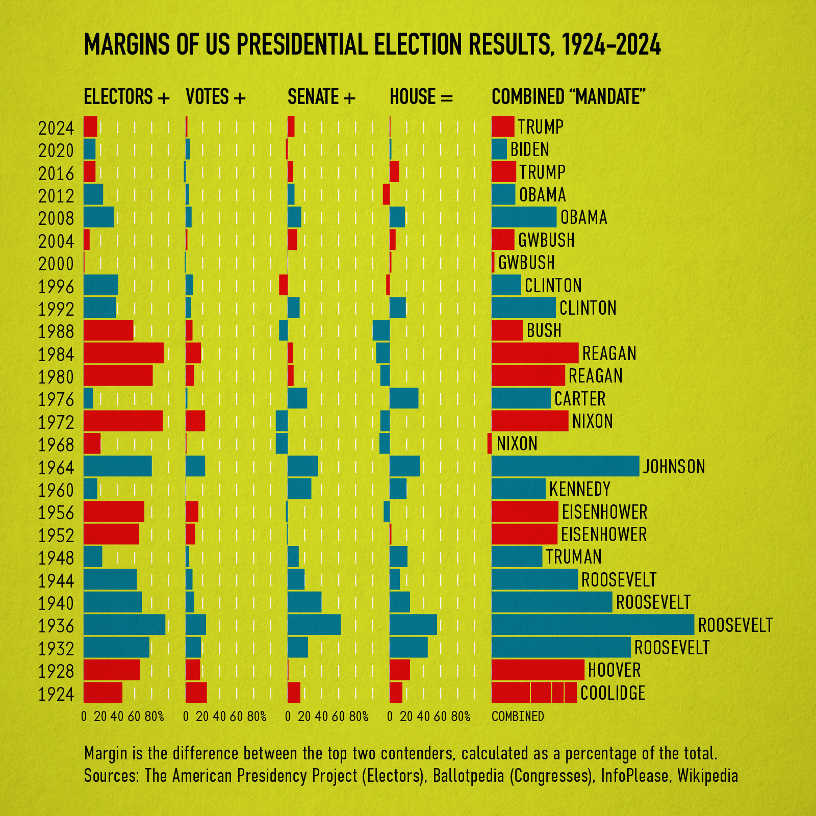
[OC]”Mandate” is a somewhat dubious term with respect to US Presidential administrations. So, this chart seeks to describe how a mandate might be measured by adding the margin percentages of the various election results: the Electoral College, Popular Vote, and the seats of the House and Senate of the incoming Congress.
For these purposes, “margin” is the difference between the top two contenders of each metric, then taken as a percentage of the whole. Independent members of Congress are not applied to either caucus. The margin percentages are then added together, including negative numbers (when a house of Congress is led by the party other than the president).
Data aggregated in MacOS Numbers, then imported into R as CSVs and plotted via ggplot and devices to SVG which was then refined in Adobe Illustrator. Sources follow.
The American Presidency Project, Presidential Election Margin of Victory
[presidency.ucsb.edu/statistics/data/presidential-election-mandates](http://presidency.ucsb.edu/statistics/data/presidential-election-mandates)
Ballotpedia, U.S. House elections in presidential election years, 1920-2024
[ballotpedia.org/Results_of_U.S._House_elections_in_presidential_election_years%2C_1920-2024](http://ballotpedia.org/Results_of_U.S._House_elections_in_presidential_election_years%2C_1920-2024)
InfoPlease, Composition of Congress, by Political Party, 1855-2017
[infoplease.com/us/government/legislative-branch/composition-of-congress-by-political-party-1855-2017](http://infoplease.com/us/government/legislative-branch/composition-of-congress-by-political-party-1855-2017)
Well, Roosevelt masterclass
Very nice chart. Regardless of how “powerful” a mandate actually is, this is a very clear visual on where the nation was at each election. Could/should be licensed to history books.
So, Carter’s was bigger. I’m sure Trump would dispute that.
Interesting that Nixon has negative mandate for his first term. ended his second in the negative as well.
Really puts it in perspective. Not a landslide at all. If 36% of you motherfuckers had bothered to show up, we wouldn’t be having a fucking fascist felon in the White House
I thought this was a size measuring contest
There wasn’t as much partisanship prior. You could vote Republican for president and Democrat for house and Senate. The house was won by Gingrich for the first time since the FDR period for example. Also the parties had more ideological diversity. Lots of liberal Republicans became Democrats and conservative Democrats became Republicans.
Nixon’s negative mandate is neat
Didn’t the Senate move blue in 2020 with the special elections in Georgia?
more fascinating is how tight each election has been since 2012. the large margins of victory have been dissipating each decade since the 80s.
Seems like we’re getting more and more lukewarm politically. (Why wasn’t the popular vote included?)
Everyone knows 2000 was close, but Congress was close too. GOP only had a 4-seat majority in the house and the senate was tied, though Vermont Republican Jim Jeffords left the GOP to caucus with the Dems as an independent not long after Bush took office.
What are the first 2 columns :
– Electors ? Total people who voted ?
– Votes ? Just for President ?