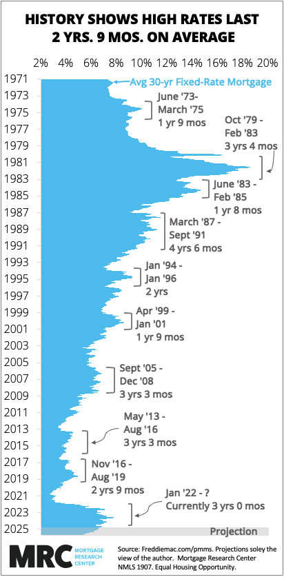
I looked at periods in history where the 30-year mortgage rate increased by more than one percentage point (100 basis points) in 12 weeks — a fairly sharp rise. The average is 2 years, 9 months. We are 3 years into the current rate spike cycle. Notes: Admittedly, there is some gray area as to which periods to include and not include. I felt the instances in the chart were the most significant in history. I added 3 periods that did not quite meet the criteria but were significant: the dotcom bubble era in April 1999-January 2001, the run-up to the housing meltdown 2005-2008, and Donald Trump’s first election win in November 2016. Mortgage rate data from freddiemac.com/pmms. Tool: Excel
cantresetpwfuck on
Mortgage rates are a direct downstream product of the Fed overnight rate. The Fed overnight rate has been kept relatively high for the last few years to limit money supply to combat inflation. We’ll see that measure drop when inflation is controlled. Mortgage rates will drop then.
the_last_grabow on
I still cannot believe I bought at the absolute bottom of mortgage rates.
Down_Low_Too_Slow on
I’d love to see a similar graph for home asking prices. Right now it seems like we’re in a “perfect storm” of high mortgage rates AND high home prices. It feels like now is a terrible time to buy.
anders_andersen on
Today’s spike is still lower than the rates through almost all of 1971-2009 (-ish….just looking at the graph)
Flaky-Wallaby5382 on
Average is a shit metric without median and mode. I know it’s on the graph but I want to know the median is lower than the average

7 Comments
I looked at periods in history where the 30-year mortgage rate increased by more than one percentage point (100 basis points) in 12 weeks — a fairly sharp rise. The average is 2 years, 9 months. We are 3 years into the current rate spike cycle. Notes: Admittedly, there is some gray area as to which periods to include and not include. I felt the instances in the chart were the most significant in history. I added 3 periods that did not quite meet the criteria but were significant: the dotcom bubble era in April 1999-January 2001, the run-up to the housing meltdown 2005-2008, and Donald Trump’s first election win in November 2016. Mortgage rate data from freddiemac.com/pmms. Tool: Excel
Mortgage rates are a direct downstream product of the Fed overnight rate. The Fed overnight rate has been kept relatively high for the last few years to limit money supply to combat inflation. We’ll see that measure drop when inflation is controlled. Mortgage rates will drop then.
I still cannot believe I bought at the absolute bottom of mortgage rates.
I’d love to see a similar graph for home asking prices. Right now it seems like we’re in a “perfect storm” of high mortgage rates AND high home prices. It feels like now is a terrible time to buy.
Today’s spike is still lower than the rates through almost all of 1971-2009 (-ish….just looking at the graph)
Average is a shit metric without median and mode. I know it’s on the graph but I want to know the median is lower than the average
1981 people were putting a house on a credit card