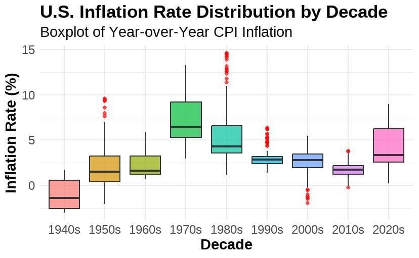
Using **FRED CPI data** ([source](https://fred.stlouisfed.org/seriesBeta/CPIAUCSL)) and **ggplot2** in R, we visualized inflation trends across time. The results?
✅ **1970s & 1980s had the highest inflation volatility** 📈
✅ **1990s & 2000s saw relative stability** 🔄
✅ **The 2020s have seen a sharp spike, but not the worst in history**
📢 **Follow Forensic Economic Services LLC for more data-driven insights!**
TheoryofJustice123 on
1960s is best case scenario — not too restricted but still avoiding outlier periods.
PG908 on
Weird thing to show with a box plot.
Aggressive_Noise_873 on
what does the red dots imply?
hammertime84 on
Something seems off. In the 1980s for example, you have 10 total years and more than 5 outliers. That’s fundamentally impossible. Your median (horizontal bar in your box plot) has to have 5 yearly inflation rates above and below it and your plot shows not that.
QuesoLover6969 on
Does this use the post-1980’s method of calculating CPI or is it a mixture of different methodologies?
Dropmeoffatschool on
This is a really unclear way to show this data
PeregrineThe on
Measuring inflation is like trying to measure global warming, but we can’t decide on the definition of temperature, so we create a committee comprised of a few scientists and several politicians to “update” the definition every few years.

8 Comments
Using **FRED CPI data** ([source](https://fred.stlouisfed.org/seriesBeta/CPIAUCSL)) and **ggplot2** in R, we visualized inflation trends across time. The results?
✅ **1970s & 1980s had the highest inflation volatility** 📈
✅ **1990s & 2000s saw relative stability** 🔄
✅ **The 2020s have seen a sharp spike, but not the worst in history**
📢 **Follow Forensic Economic Services LLC for more data-driven insights!**
1960s is best case scenario — not too restricted but still avoiding outlier periods.
Weird thing to show with a box plot.
what does the red dots imply?
Something seems off. In the 1980s for example, you have 10 total years and more than 5 outliers. That’s fundamentally impossible. Your median (horizontal bar in your box plot) has to have 5 yearly inflation rates above and below it and your plot shows not that.
Does this use the post-1980’s method of calculating CPI or is it a mixture of different methodologies?
This is a really unclear way to show this data
Measuring inflation is like trying to measure global warming, but we can’t decide on the definition of temperature, so we create a committee comprised of a few scientists and several politicians to “update” the definition every few years.