[OC] I visualized all 27 times I met my friend last year and turned it into a New Year’s card
Posted by Gotopik

![[OC] I visualized all 27 times I met my friend last year and turned it into a New Year's card](https://www.byteseu.com/wp-content/uploads/2025/01/hmrre6k01ife1-541x1536.png "[OC] I visualized all 27 times I met my friend last year and turned it into a New Year’s card")
[OC] I visualized all 27 times I met my friend last year and turned it into a New Year’s card
Posted by Gotopik
15 Comments
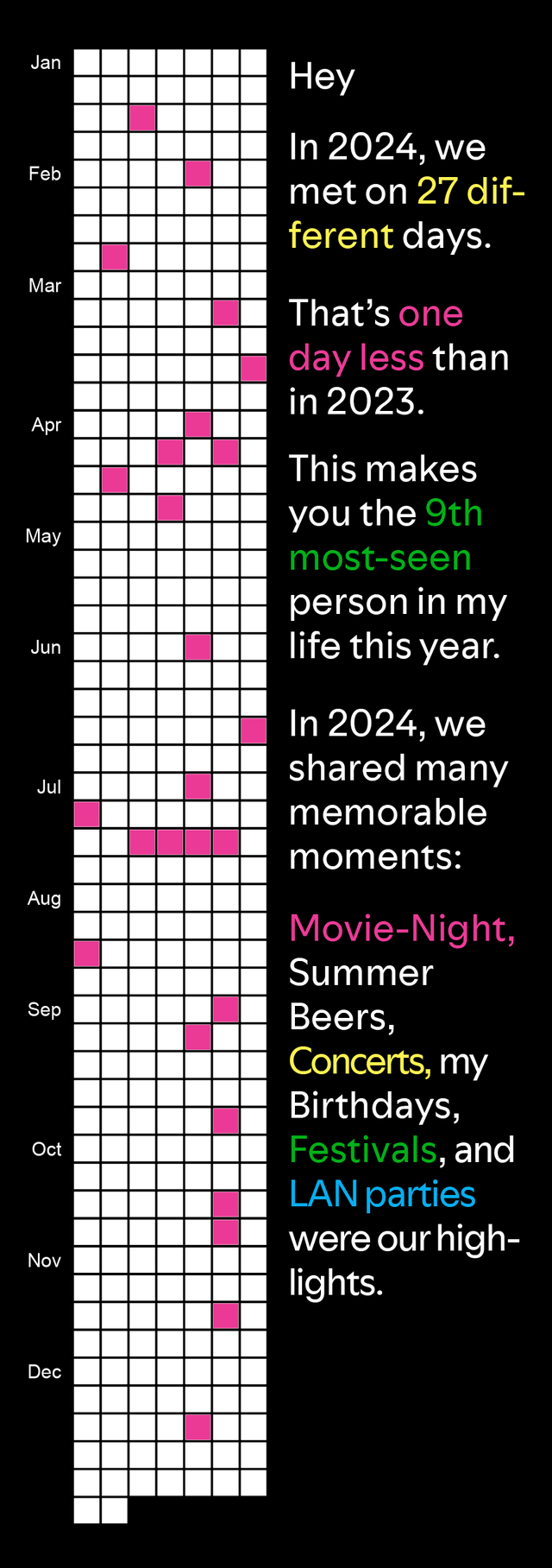
Data Source: Personal Data
Tools: Tracking how often I met my friends was done with the App Friendtastic. Data visualizations have been programmed with R and layouted in InDesign.
Not gonna lie, I would be a bit put out by this if I was your friend.
Interesting concept
I dont know anyone who would be thrilled with “you’re the 9th most visited person in my life!”
A ‘New Year’s card’?
I beg your pardon?
Damn, that’s more than twice a month. And it’s the 9^th most seen person.
I seriously need to sort out my priorities.
Colouring some activities makes it look like you only had movie-nights. And “my birthdays”..? Anyway I think it’s a cool way to be more mindful of how much time you put aside for people, especially if you want to increase it 🙂
I also give my friends alibi cards for when they are arrested.
I think it would look better if the colors coordinated with the activity type colors you listed, but otherwise v cute idea
“Oh.. thanks Dave… yeah that’s interesting. …*9th?*”
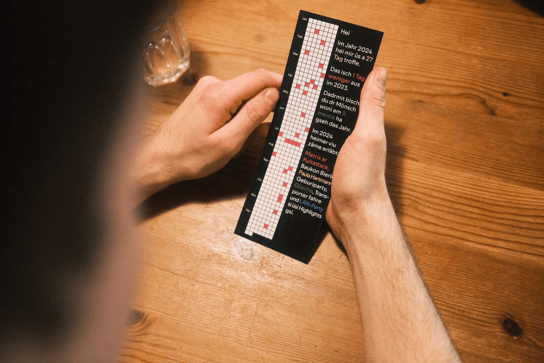
Is that a German Dialect in the second picture? I can read/understand most of it.
Maybe more effort into your friendship and less effort quantifying them?
Damn I’m still waiting on my Friendify Wrapped 2024
Is this something like the spotify (and a bunch of other apps) that summarize your year in numbers? I think you should show an example with all the color codes used and make the colors to reflect all the categories (movie night, summer beers,…). I assume the messages remains the same but changes some numbers to reflect the actual data, correct me if i’m wrong. From what you show It seems that you only did movie night.
Now, about the idea I think it is interesting, but for me it is not a nice gift to give to a friend, specially when you start classing them (“most-seen person”). Also showing the other categories to someone with whom you did just a few or maybe only one seems a bit of sad, it’s like “I did a bunch of stuff and you were not part of that” so it is not necessary to put it there imho.
Bro. Its funny because I can’t tell you why exactly, but I would be straight up pissed by a card like that. It has strong ‘yea I’m a great reader, I read 55 books a year’ vibes, or any quantification of unquantifiable concepts.
Anyway you do you..
You’re my best friend in the whole wide room.